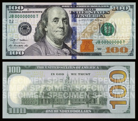
In case you haven’t heard, a new $100 bill was recently unveiled and will be rolling out in early 2011. The good news is that the new bill will be flashy. It has been updated to include some new “3D” anti-counterfeiting features. The bad news is that the design suffered in doing so.
Maybe I’m expecting too much, but the new features that this bill has brought to the table aren’t doing it for me. The few techie “3D” color-shift features are cool but clearly look to be crammed alongside and over other elements in the design. If you look at an old $100 bill, you can see that the design has more of a structured layout from element to element. As hard as it is to say, the new design actually has a couple positive things going for it, but they still don’t outweigh the negatives.
The new design adds vibrant color which something that the old bill lacked. It seems to me that if such a vibrant color is added, it should only be in one location: either in the actual numbers or as the background of the entire bill. I do believe that the spot of color on the back of the bill (second image) is a nice accent when used with the larger ‘100’ type but I can’t say the same for the color accent on the front.
With that said, it’s pretty clear that I’m skeptical about this design, but what do you think. Were these design changes for better or for worse?


sorry, this is effin ridiculous. that huge helvetica ›100‹ on the back?!?!?
and the music playing in that video is awful and reminds me of a really shitty, patriotic dolph lundgren movie.
The huge 100 on the back looks like some Word Art from 1995…
WOW your money just got uglier :p I am really glad fo my Czech Crown and for Euro in surrounding countries
Gosh, it’s really ugly.. Who designed it?!
this is the official video i was referring to:
http://www.youtube.com/watch?v=JwEBIC0a4RY&feature=player_embedded
show off…scanning in his $100 bills. knowing shelby it was a pretext to post this…post.
@M2, @Julian Indeed it just has. The small white stroke around the larger type is hindering any hope for it to really sing.
@Adrian – I wish I had $100 bills just lying around.
Looks like the traditional design and something more contemporary or modern run together at high speed.
The large 100 on the back side looks completely out of place indeed.
As I said when I mailed this, I think it’s a disaster.
It kind of reminds me of the post about redesigning airport boarding passes; why are they all so damn ugly?
Dang, Julian beat me to it.
Bad word art or someone new to Photoshop and applying every stroke effect he can find. Ugh. It cheapens it so much.
Fortunately, no one actually uses cash anymore, right?
Too messy, with no real solid layout. Plus mixing the number fonts is not helping.
For some reason this reminds me of school when someone would loose their working file and just had to clone-stamp and copy/paste all the changes on an assignment.
Seems like they went overboard on the security measures. It’s just short of having a retina scanner embedded in the paper.
I can understand why they’re doing so many security measures, but all the new bills look terrible, but this takes the cake. I miss the early 90’s bill designs. :/
I don’t know what you guys are talking about. This is the coolest 100 dollar bill ever!
Functional. Ugly. Fugly.
I’m glad you posted this. My husband and I just came back from our honeymoon in Banff and were talking about how better designed Canadian currency is compared to ours. I’m happy to see the addition of color, but aside from that I’m agreeing with a lot of the comments here. And why only updating the $100? I wish they’d do a whole sweep and keep a consistent design throughout all U.S currency.
That’s pretty terrible.
Hey Scott,
The design of this bill is just confusing, there is no real harmony between the colors. Really, orange and green, it is look like a chemical agent packaging provide by the US in 1960.
The bill is an object for everyday and for everyone, and I had the impression that bill is just an official document like a notary paper. There is absolutely no pleasure to have it in a wallet.
I guess I am going to write a personnal european opinion but : “In god we trust” ! I can’t deter to smile… Religion and money… Damned.
I shit you not, even Kazakhstan has better designed currency than the US. The coolest part about KZ is that you can buy four bottles of vodka for $3.50. Good times.
http://farm4.static.flickr.com/3472/4001973853_153902208b_o.jpg
Considering what other countries have done with their currency (beautiful!), this looks terrible. Looks like they tried to cram as much as they could on there, and forgot about designing it.
Oh man, this new hundred dollar bill design just doesn’t make cents.
HAHAHA get it? CENTS?!?!?!
What’s that big orangy thing on the front? Is that a pot of gold or something? Although Franklin looks like a pensive bad ass. At least it has elements of bad assery in it.
I think old Benjamin’s expression sums it up really 😛
It just blows that in the US good design is seen as frivolous and unnecessary. Tackiness does not equal practicality!
It’s strange, they’ve moved around some elements that were much better placed in the original bill. For instance, the ‘ONE HUNDRED DOLLARS’ on the BF side of the bill has been moved to the top, where it’s kind of crammed in awkwardly. I really don’t like the stroke on the ‘100’ either.
The US needs to get with the program on colouring different value notes in different colours. I used US currency for the first time in Cambodia recently, and I had a really hard time picking the notes apart when I first withdrew some money. That Kazakhstani money example from above is really nice. Take a look at Australian currency as well – we have plastic notes too, so you can put them through the wash! 🙂
Some Illuminati Signs this time?
Poor Design
This new 100$ bill is like Avatar. It has tons of technical advances and state of the art features but in the end it is just shit. I cant believe that blue bar right down middle. Ridic
I was just in Costa Rica. They have some nice currency. Anything with sharks on it I dig. Why can’t we have sharks? Or mountains or bears and things? Check this out…
http://cdn3.ioffer.com/img/1151305200/_i/12630065/1.jpg
Sadly…Mexicos money is twice as beautiful as ours…but worth 1/9th.
How is that possible.
I give it five more years before they redesign it…again. Once upon a time we actually had currency that was very well designed. Now I’m honestly just waiting to see when they start using star bursts behind each of the numbers on the notes.
that looks horrible
is it just me who thinks this is a bit irrelevant? I try to be just as sensitive as the next designer, but it seems like the bottom line here is form following function. I’m guessing the US govt doesn’t really care that outlining the type is a nono and the vertical blue bar is taking away from the visual balance blah blah blah. I think they’re more concerned with making them hard to replicate because I’m pretty sure thats their job.
they destroyed the bill with that big 100 in the back, at first I thought that was a joke!! It surely looks as if it was…
Is it me or is Benjamin Franklin is looking younger and younger with each new incarnation of the $100 bill. He must have good image consultants. Our USA greenbacks are turning into multi-colored rainbow backs.
Our US currency has always been rather bland. Hopefully one of these days we’ll get some that actually looks progressive.
Being Canadian, I’ve always been use to visual cues based on the colour of our different bills. The time I spent in NYC made me wonder how you guys deal with all your bills being green. It always slowed me down at the cashier line up.
Colour is good. Security is good.
The new bill is still pretty heinous though.
Ill take the real $100 design any day…
http://mindset30.files.wordpress.com/2008/06/ben_franklin_100_dollar_bill1.jpg
I think Ben Franklin is scowling at this new “design”.
Busy, elements that don’t fit (the huge ass 100 on the back for starters), and seemingly random placement of those elements.
I feel like there’s a much simpler solution that still allows for the trendy 3D pieces while staying within a traditional US currency style.
Whatever, regardless of how ugly it may be, I’d be happy to see some hundos on my desk 🙂
-RB
The money’s been bad for a while now.
…the design of it has been as well.
Perhaps it is a good representation of the
awkward phase America will no doubt go
through while growing into its new role.
Gah, I just realized why the huge 100 is on the back!
http://en.wikipedia.org/wiki/Federal_Reserve_Note#Suit_by_sightless_over_U.S._banknote_design
I was reading up on US Currency on Wikip. and there is a bit about the 2006 ruling that declared the lack of differentiation in US Bills exerts undue burden on the blind. But then the Treasury said Nope. Too much work and puts undue hardship on the vending machine industry.
But y’know what we CAN do?! Put a giant 100 and 5 and slightly less giant 10, 20 and 50 on the bills because the blind will be able to see that better. Y’know, like when you have to shout at a deaf person.
Yeah, I think the US should just keep the dollars monotone… leave it to Canada to have the flashy colored bills.
In its ugliness it is beautiful.
Worse!
The classic look was gone..
I think your currency should be greener 😀
It says Las Vegas! to me
I found another set of design by Michael Tyznik on KitsuneNoir.com and thought some of you might enjoy it. http://kitsunenoir.com/2010/04/30/u-s-currency-redesign-by-michael-tyznik/
@Steve
Wow, that is a stunning set of bills. I do think that a border on them would make them feel like they have more substance, but regardless I wouldn’t mind having those…although I probably wouldn’t spend them.
I’m not a big fan of the new design. It seems like each time they re-due currency design it just crazier and less intentional. This new one hardly seems designed at all, instead it more just fit together.
Agggggh! The world’s preeminent currency looks like a bad series of printing errors. Does no one in the U.S. treasury have even the slightest notion of taste, composition or beauty?
So what kind of message are these ugly, messy things sending to the rest of the world? A symbol of the decline of the American economy perhaps? An inability of American to produce the best? An indication of poor American quality?
Wow! So awful, and so completely unnecessary given that other countries have taken these same anti-counterfeiting measures to produce bills that their countries can take pride in. What an embarrassment!