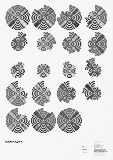
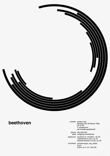
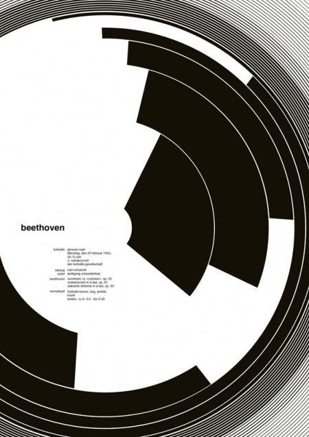
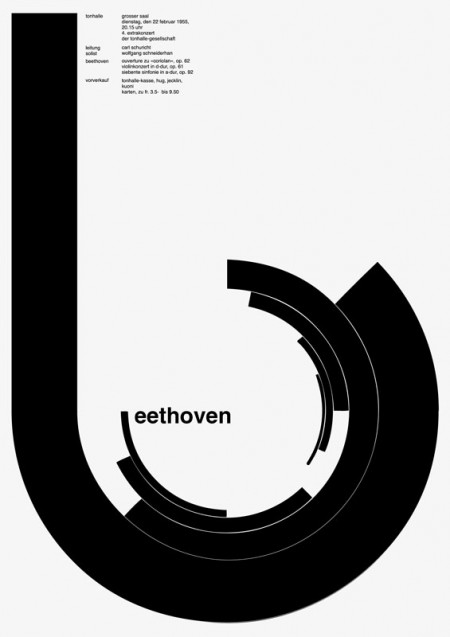
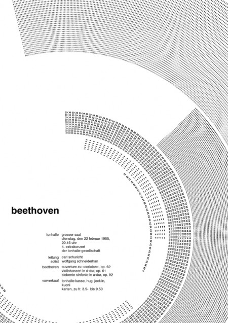
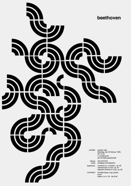
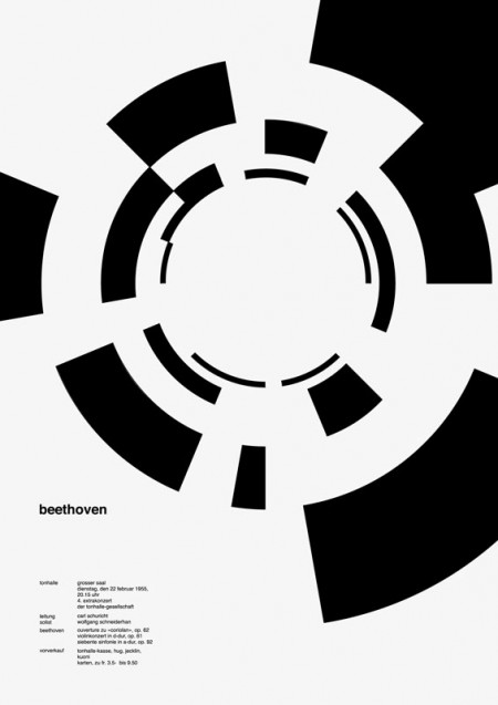
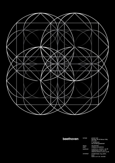
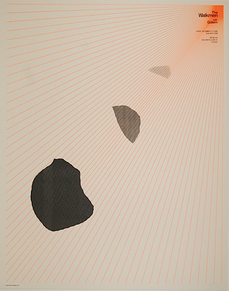
Came across these interesting variations of the great Josef Muller Brockmann’s Beethoven poster and was pleased to see the alternate use of negative space. These variations were created during a 100 day workshop by Jessica Svendsen—see more versions here.
Via Designspiration


printing for my cubicle now! love it.
These are nice! Cubicle printing is a good idea.. hope i don’t get in trouble for ‘wasting,’ paper. My first thought of the one really reminded me of the seagate logo. Loving the flow on that one!
Not these again, good grief.
How fortuitous! I was just musing on this design as I was working on a circular drum machine interface. Perfect.