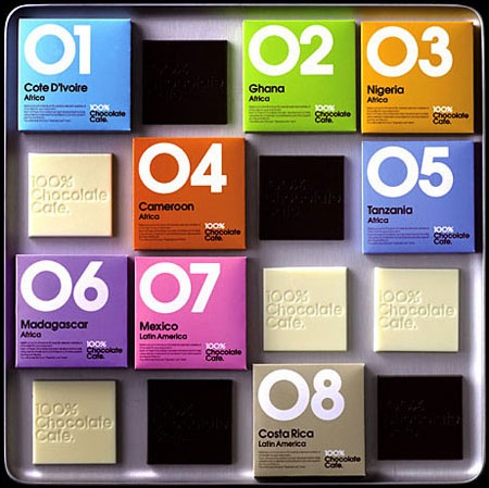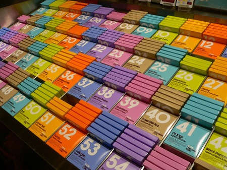
 At least someone is getting packaging design right these days. These shots are from the 100% Chocolate Cafe in Tokyo. I somehow missed this while I was there, would have been nice to bring some home.
Via Dieline

 At least someone is getting packaging design right these days. These shots are from the 100% Chocolate Cafe in Tokyo. I somehow missed this while I was there, would have been nice to bring some home.
Via Dieline
Comments are closed.
Ooh, those are nice.
They are perfect, even how they are laid out is stunning! If only Japan wasn’t so far away, I’d hop over and grab me a load of these.
Slightly off topic – But how did the photos of London turn out, any chance of posting them, if you’ve got the time.
Cheers
maybe i’m being too critical, but i find these really, dare i say, played out. yes, they ARE nice. but this sort of functional-sansserif-type-with-big-numbers-&-teensy-type-on-different-coloured-packaging-only thing has been done sooooo much. no?
don’t get me wrong, it is nice. it just doesn’t make a single hair on my body stand on end because it’s waaaaay too familiar in this day and age. it’s classic, but it’s TOO classic. i dunno…remix it, give it some pop, add a little extra somethin’ somethin’ to it…
It’s been done much, but it’s still nice – just not perfect 😉
Yesterday you gave me a great birthday gift!!! Finally a website/weblog totally dedicated to packaging design!!! (The Dieline) Thanks a bunch,… if there are some more around, don’t hesitate to tell me! 😀
lovely font! what’s is name?
fasdfasdf
Wow, cool man, big thanks! http://xxsbkllmiw.com
does’nt say chocolate. Overuse of avant garde – boring
When I was in Tokyo last year, I made the mistake of reading a map like every map I’ve ever seen – alas, for some reason its North was on the bottom. Anyway, heading entirely the wrong direction led me to this place, where my wife and I ended up having an early lunch. It was terrific. And gorgeous.
http://www.flickr.com/photos/tenderisthebridge/815258873/