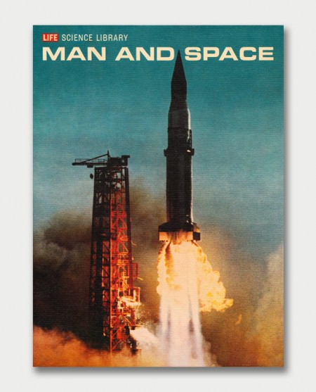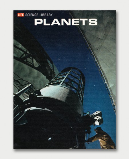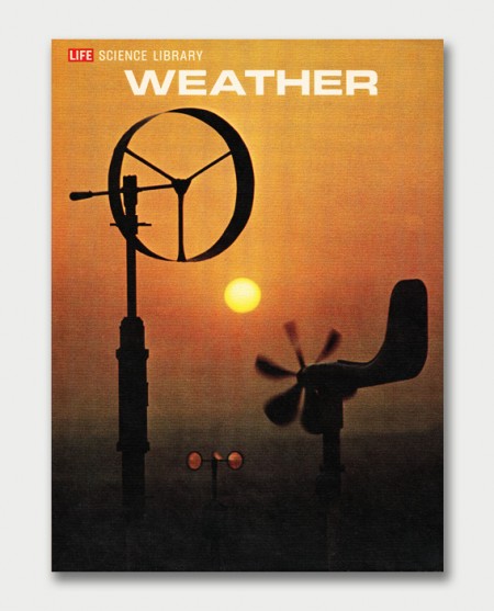


The 1960s had some of the most interesting design. The typography and photography really pushed design in a beautiful direction. These 1960s Life Science book covers and graphics bring on such a wave of nostalgia. The typeface used in these was perfect.
Shared via Wanken / AquaVelvet.


I found a bunch of these at the Salvation Army and scanned the pages for my blog. You can check it out if you’re interested: http://3×5.co/life/
I found a decent amount of these in a phone booth and now use them to raise my monitors:)
I grew up with this entire series – except they were all in Dutch.
Pretty sure that’s Eurostyle Extended for the title, and maybe Condensed for the “SCIENCE LIBRARY” bit. Great font for 70’s style sci-fi stuff.
Would really love to check out ‘planets’ in particular. I believe Carl Sagan contributed to it
I have the majority of this series– it should be noted that the inner contents are loaded with incredible pics and graphics (not to mention great writing). But the graphic icing on the cake is the unique symbol for each subject found in the lower left corner of the back cover.
The 60s design is dope, love the nostalgia.
It was these very series that first stirred my childhood mind’s curiosity into the subject of science. Love these books so much.
Weird, I swear I saw these as a kid and thought “wow, these are really cool covers”. I think they came in a set with a silver box and little knob handle to pull them out.