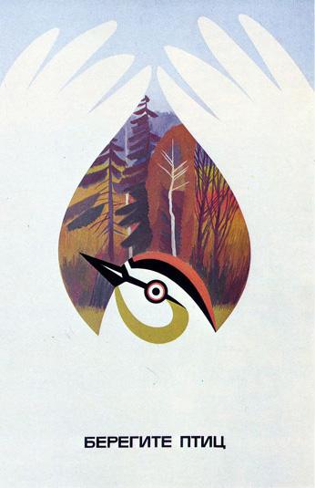
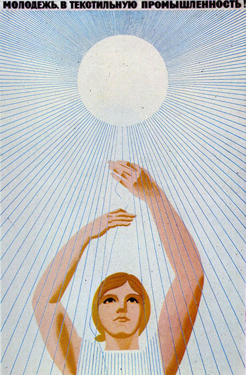
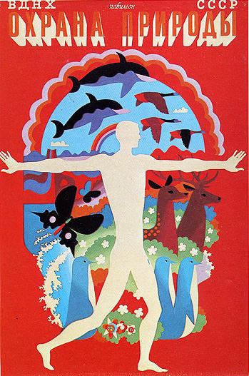
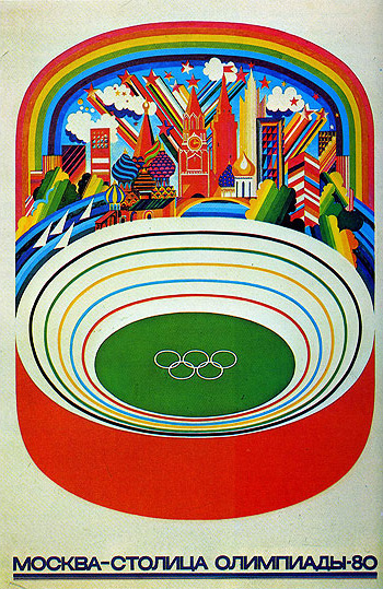
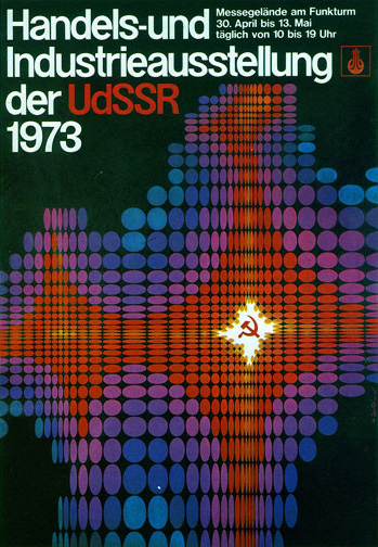
Dave over at Grain Edit scored a book full of amazing 1970’s-era Russian posters. Incredible stuff, I really wish someone with access to these would reprint them. That first one with the bird has got to be my favorite.
1970’s Russian Posters
10.29.2009


Beautiful stuff. The third one down is almost like a flattened version of some of your designs, thinking specifically of the colour scheme and animal imagery. First post for me by the way, but I’ve been coming here every day to read your blog.
Plus I’ve sent everyone I know the link to your store. Hey its nearly christmas!
Keep up the great and inspirational work, for all our sakes!
love.it.long.time
These are amazing.
I would really like to know how to make colors and textures like these in CS4. If you have any tips please share, or if you know of any good tutorials I would love to see them.
justinleblancimages@gmail.com
I like the first best as well. The last one isn’t really my cup of tea but it strikes me this seemed to be made in 73. Which makes it incredible nonetheless.
that bird poster is ridiculous. i really love it when there are symmetrical elements to a design but the designer obviously cares enough about the details that they didn’t just take the wings, duplicate and mirror them.
I really like the last one, with its ’70s sci-fi kind of vibe. I love old sci-fi / futuristic art and design because it’s forward thinking and dated at the same time.
Love the Olympics one. Thanks for the heads up on this post to jetstreamprojector.
1. Take care of birds.
2. Young people in the textile industry!
3. Poster for the pavilion «The Nature Conservancy». (ВДНХ — Exhibition of Achievements of the National Economy. СССР/USSR — Union of Soviet Socialist Republics)
4. Moscow — capital of the Olympiad 80.
5. Trade and industry exhibition of the USSR 1973 (Exhibition Center at the radio tower. April 30 to May 13 every day from 10 until 19 clock)