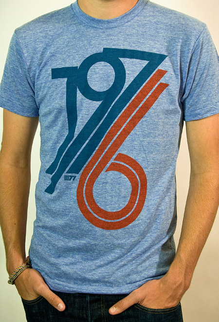
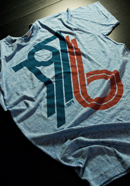
With spring all but here (at least in San Francisco) I thought it would be a good time to whip up some new tees using American Apparel’s summer-friendly Tri-Blend Heather shirts (50% Polyester / 25% Cotton / 25% Rayon). The result is this new 1976 on American Apparel Tri-Blend Heather Blue. When I first designed the original version of the 1976 tee, I had this sort of vintage track tee vibe in mind. At the time, AA didn’t offer a Tri-Blend shirt in blue so I ended up going with the cotton baby blue — which I think has it’s own thing going on — but once I saw the new tri-blend blue I knew it would be perfect for a subtle remix.
Shirts have always been a fun design challenge for me. Unless you’re a pretty big company, you’re pretty limited in your color choices when it comes to blank shirts. Sure, American Apparel (one of the blank shirt manufacturers with the best cuts and colors) has a great selection of colors, but most are pretty straight-forward, bright colors. For most of my designs I envision washed out, faded colors and there really aren’t that many companies offering that kind of blank these days. AA’s tri-blends come very close and the fit and feel are incredible, so I usually end up going with that combo. But it can be a rather daunting task to balance your Pantone ink choices with the dye colors to try and reproduce the style and look you’re going for. You can always mock it up in Photoshop, but you really never know what it’s going to look like until you print one up and see the real thing.
After all that comes the task of trying to get photos of the shirts that accurately reproduce the color and texture, which can be even harder than designing the shirts in the first place. This time around I had a Gretag card and some color-correct CF lights so it went a little more smoothly. I shot in NEF format RAW on the Nikon and got some pretty usable output this time. The process of brining the RAW shots in is always a bit tedious, but it definitely yields more accurate and flexible results. I usually try to get one shot that’s as color accurate as possible (first shot above) for the storefront, and then another, more effected version (second image above) to give another perspective on the shirt. I’m still planning to rent a better lens for a day or so and see if that helps any, although after this most recent session I am feeling a little more confident with my D80. Also, a quick thanks to my little brother Kirk for modeling the shirt! I usually have to hold the remote while taking the shots of myself and it’s a lot harder to frame up shots and get the settings down that way.
At any rate, the ISO50 1976 Tri-Blend Heather Blue is now available for your enjoyment, get them while they last!


Very cool, I’ve been meaning to pick up some of your shirts and I’ll add this one to my list.
Who do you go to for printing the shirts? I’ve only ever used a service like Cafe Press, since ordering a single shirt is no problem. But the quality isn’t very good and placement is limited. I could really use a quality printing service that doesn’t charge a boat load for small quantities. But I’m probably asking for too much in that regard haha.
But a recommendation for screen printers would be awesome! = )
I own the grey 1976 tee, and it’s one of my favorite shirts, so soft and comfy…
Dear Mr. Scott Hansen,
I am an Assistant Research at Ithaca College (IC) in Ithaca New York, and I’m working with Dr. Steven Seidman whom is a professor at IC. Currently, he is publishing several scholarly articles at the Journal of Visual Literacy, about political communication, which focus on election campaigns and visual design. He is excited about including a poster of your creation “Progress” in these articles and in his forthcoming book. Dr. Seidman is the author of the book, Posters, Propaganda, and Persuasion in Election Campaigns Around the World and Through History.
Therefore, I would very much appreciate if you can give us your authorization to reproduce this image in two articles tentatively titled: “The Visual Design of Election Campaign Posters” and “The Obama Campaign and Visual Design” and in his forthcoming scholarly book tentatively titled: “A History of Political Marketing and Consulting”. Dr. Seidman will of course give you credit and send you copies of his work. So, please sign and date the permission form (see attachment), and return it to me via email as soon as possible.
Regarding this petition, I would also appreciate if you can email me a high-resolution, black-and-white or color copy of your work – at least 300 dpi and 2 inches by 3 inches- to me at rocio@alumni.ithaca.edu.
Thank you very much for your assistance.
I was wearing the original baby blue 1976 tee -shirt the other day when my father-in-law, an honest-to-goodness cowboy who doesn’t leave the house unless he’s wearing a pearl-snap button down, said “that t-shirt looks like something somebody gave away”. I don’t think he meant it as a compliment, but I took it as one.
I like what you’ve done here and I’m looking forward to more shirts…they’re just about the only thing I wear.
I’m not trying to be a hater – your shirts are truly the shizz, but have you looked into a company called Alternative Apparel? The guy who runs American Apparel is notorious for sexually exploiting his female employees as well as having been convicted of numerous labor law violations for invading the privacy of his employees in order to quash union activity. Dov Charney (the founder of the company) is notorious for his extremely creepy behaviour.
I’d rather support a sexually harassing slimeball (and really, who in the fashion industry isn’t) who manufactures his products in L.A. than a ripoff company that sells Chinese made shirts under a soundalike name.
Oh, and nice shirt! It looks a lot cooler on the heather.
serviceburo-
I know his antics all too well. like I was saying though, there really aren’t that many options when looking for shirts. The main reasons I went with AA were the fact that they’re made in California, the cut, and the selection. there are overseas companies but few provide any verifiable information about the method of manufacture until the New York Times does an exposé or something. so like frank said, I’d rather go with a company who’s CEO engages in some shady behavior, but that I at least know and understand the level of shadiness, than a company like Hanes who’s labor workforce has been proven to include children in bangladesh.
Feeling a bit regretful, I tried googling a company that I used to know about that sold goods that were manufactured overseas, but only in carefully monitored Union run shops – but no luck. They actually went so far as to suspend sales on products where the operators of the factor violated labor agreements. If anyone has any idea what their name was, hit me up please.
I love how your shirts fit me…it’s hard to find shirts that fit skinny and tall fellows like myself. so I will surely be ordering one of these real soon…
Haha, nice. Looking good Kirk!
Scott,
Just curious… The print looks slightly scaled down on this new version… is this so? I have the previous version, but I might have to pick this one up as well.
Jonathan-
what size shirt do you have? he’s wearing a medium in the image above, and we don’t re-scale the print for the shirt, so depending on the size you have it might look bigger or smaller. it should be about the same size though, but there will always be slight variations between runs.
Just ordered one, thanks Scott!!
sick dude, glad you’re bringin this one back!
the blue is perfect! hope you still have some left when i get my next payday!
the blue is perfect! hope you still have some left when i get my next payday!
The heather grey ’76 is my favorite shirt when I’m kicking back on a saturday afternoon. Love the fit and soft feel. I’ll definitely be ordering the heather blue. I’ve decided to use AA on a few of my own designs simply because I was so impressed with the grey ’76.
My 2¢ on the AA issue, do what makes sense for your business. Grabbing interns’ bums & doing lines of blow off the warehouse floor* is his (CEO’s) prerogative, They make great products, right here in the U.S.
If he’s operating his business even remotely near the confines of U.S. law — it’s got to be far better than overseas sweatshops who have little to no oversight with regard to child labor, compensation or working conditions.
*I can’t back that up. 😉
Nice shirt, i also own a gray one, love it
Just out of curiosity what types of ink do you use? I was especially curious on the shirts with white ink on colors… the hand is soft leading me to think water based, but I’ve heard white on colors can be tricky and yours look really nice.
Thanks,
Ty
alternative earth has some cool blank shirts that are pretty comfy
Scott, I dig the shirts, but the black “77” ones are sold out already. Can you print more than seven next time?
hey scott –
i really dig your designs and music – i’ve purchased both in the past. i want to order me a 1976 t-shirt on heather – but im stumped as to what the 1976 means. can you enlighten me? maybe its a stupid question – i dont know – but i like to know the meaning behind the logos i wear on my chest. thanks!
Does the gray women’s version come in the unisex american apparel sizes or are they the women’s shirt sizes? The size chart on the store page goes to a unisex / mens chart
Great colours and design. Keep up the great design Scott.