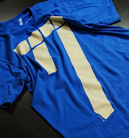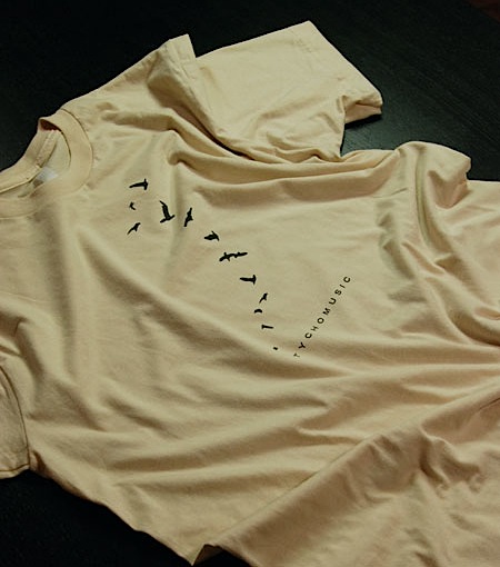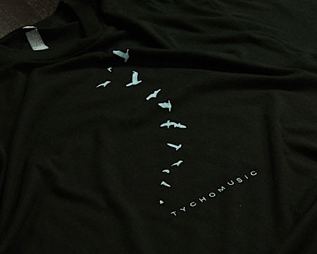

 There are 3 new T-Shirt designs now available at the ISO50 shop. “77” Cream / Royal is printed on American Apparel 100% Cotton and comes in all Men’s and Women’s sizes. The two Tycho shirts are new typo / colorways of the original “Tycho Avian” shirts which have been out of print since last year. “Tycho Avian” Cream / Brown is printed on American Apparel 100% Cotton and “Tycho Avian” Black / Aqua-Grey is printed on American Apparel 50/50 Cotton/Poly. Each are available in all sizes, M/W. I’ll bee officially releasing these through the newsletter on Monday but I thought I’d post them up here so the blog readers could get a crack at them first. The product images at the shop page are temporary, I’ll try to get some close-ups and alternate angles posted up tomorrow. Enjoy!
On a side note, I can’t seem to get enough of Trade Gothic Bold Extended lately (the face used on the Tycho shirts above). I’m currently redesigning the interface of the shop and laid most of it out in TG with headers being Extended. For those in San Francisco: There’s an old California Savings (closed) on 16th & Mission (across from BART) with a very cool sign that looks a lot like TG Bold Ext. Has anyone seen that? Is it TG? It’s for sale so they’ll probably redo the exterior, I’ll try to walk over tomorrow and get a couple shots before that happens. Probably not a big rush though, 16th & Mission isn’t exactly hot property.


These are great. What was the inspiration for the 77 design?
Awesome, I’ve been waiting for the black shirt for a while
Like the 77 one, well also the others but kinda seen them before. I think that 77 shirt would look hot in the same colours as that Bild Nine print. Basically the reverse of that Tycho Avian Cream / Brown. But I guess you can’t have every colour variation known to man.
I hear ya with regards to Trade Gothic Extended. I’ve been using it a lot lately as well. Here’s something I did recently using it (not the bold variation, though): http://www.flickr.com/photos/gregoreverb/2907929958/in/set-72157602423082994/
oh wow the 77 one is sweet and I’ve been wanting that black one for some time now…hey Scott, how fast do you think you will sell out of these puppies? do I need to get on my horse and buy one asap or can I chill for a few days on it?
thanks and amazing work as usual
Definitely dig the new shirts man. I was addicted to Trade Gothic Bold Condensed No. 20 for along time.
Good stuff.
By the way, did you ever mentioned where you get your shirts printed?
NEW HONDA “DUAL” BIZ
http://www.novabiz125ie.com.br/biz/
Wow. Something look familiar. Ha.
Looking at street view on Google Maps, it looks like the face on that bank is somewhere between TG ext. and Bank Gothic… or maybe it’s all the sun flare on the Google image…
Holy crap Andre, that is a complete rip off of Scott’s work.
Yeah that is pretty bad, yikes!
It shows how trendy scott’s work is.
option5 –
You’re the man now daaaaaaaaaaaaaaaaawg
77 is totally hot, must PURCHASE!
Honda site – It’s really rip off of Scott. And it’s slow as hell even on my great computer and fast net. I don’t mind when someone gets inspired by someone else’s work, but I hate copyist!
Oh Scott nice 77 t-shirt by the way 🙂
There I went and bought 77 plus the 76 thermal. Whoo!
Scott, sweet shirts! I have the 1976 Heather shirt and love it. As I was born in 1977, this new ’77’ shirt will definitely be coming my way soon.
PS.
I also love the Trade Gothic. Regular is OK, but I agree Extended as well as Condensed (with proper kerning of course) make any clean design shine.
Thanks.
I need to get one of these!
Proper kerning =)
if you guys are even comparing that bologna, slow as shit website to Scott’s work in the slightest then you guys must not truly look that deep into his creations because those were some ugly simple wood textures and a basic Illustrator CS2 pattern in the background…nothing special and I don’t really see that much similarity between that and Scott’s work. maybe just some inspiration perhaps…
@Rent
“you guys must not truly look that deep into his creations”
Lol haha. No need to get super spiritual on us dude. Aside from their choice of typeface, use of colour, the fine rays effect, the flowing rainbow trailing the name, clouds behind the type and city skyline in the background there are absolutely no similarities!
It stops being inspiration when the composition is copied. Oh and I think it goes without saying that people aren’t referring to the scooter part of the design. I also thought is was similar till I double checked.
spiritual, definitely not dude…I’m just pointing out that if you guys think that shotty work is comparable to Scott’s then it’s basically a slap in the face.
I can obviously see that it has Scott’s influence with typeface, clouds, wanna be texture, and rays, but seriously…not that comparable to his work. it lacks everything that is great about Scott’s work, there’s no depth.
sounds like somebody has a crush on scott.
Rent … just go for it man. just ask him! what do you have to lose?
hell yeah nicholas…good call
Honda Commercial –
I agree it does have alot of cheesy elements that aren’t even close to being good. Its just the lack of creativity that bothers me, he could of at the very least changes some color and shape instead of just ripping it off like it was free for the taking. Might as well of just put some Tycho in the background and a link to buy the poster 😉
I see now which poster you guys are comparing it too and didn’t notice all of the exact same elements…booty
Ordered the nice 77 shirt.
Will probably get the 77 shirt, it looks great!
love the new shirts, definitely ordering the 77, it looks amazing. you should make more thermals though, the 1976 one i have is amazingly comfortable and my girlfriend loves it.