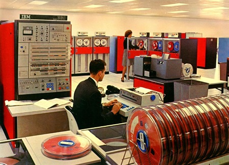
This time French Canada comes with the design skills. Not much info on this one, feel free to fill in the details in the comments.
Archive for October, 2007
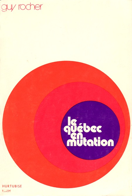
Le Quebec En Mutation
Avant Garde Poster Contest
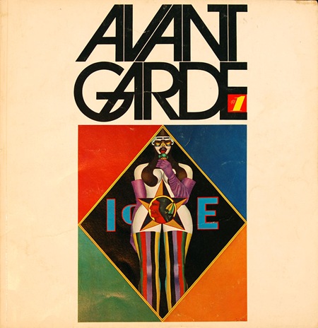
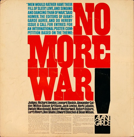
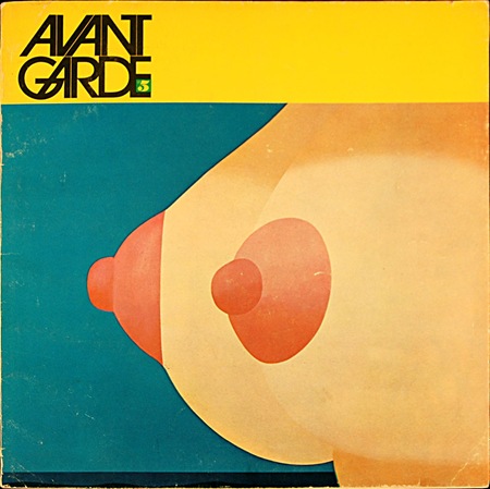
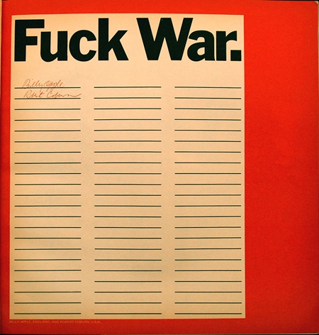
There was a massive anti-war protest across the street this weekend, thousands of people everywhere. All of the signs and posters reminded me of the Avant Garde "No More War" poster contest. I dug around and found these two issues, #1 and #5. On the back cover of Avant Garde #01 (1967) they printed a call for entries for the contest and announced the judges, Herb Lubalin being among them (quite intimidating for the contestants I’d imagine). The winners of the contest were announced in issue #5. I’ve posted my favorite example above, an entry by Billy Apple (England) and Robert Coburn (US). Efficient and to the point, I think the key here is that it goes beyond merely engaging the viewer and calls for active, on-the-spot participation. The choice of language also plays a large role in the impact of the design; in 1967 this was still a very shocking word to see in print for most people.
Although this was 40 years ago, the message is as poignant today as it was then: we once again find ourselves mired in an unpopular foreign war with dubious motives and no clear end in sight. I have to wonder if imagery like this was more effective in it’s time. People today have seen so many things and become so jaded to visual input that it’s very difficult to jar them awake with something like this anymore. I think the 60’s were one of the first times it became almost mainstream for people to question the government, so ideas like these were still new and somewhat disquieting for many.
Kiel 1972
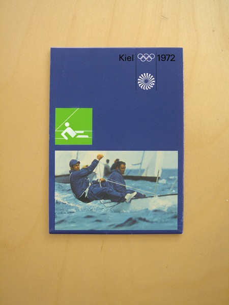
Design: Otl Aicher / Kiel Design Team
Broadsheet containig maps and information for the Kiel sailing events of the Munich Olympics. Via Alphanumeric
OFFF NYC 07 – SOLD OUT!
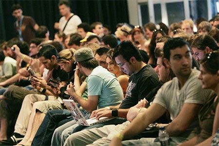
Tickets for the OFFF festival in New York (and, consequently, the ISO50 workshop) have sold out. Sorry to anybody who missed out. I will however have an ISO50 booth with prints, shirts, music etc. in the public area (no ticket required). I’ll be around all 3 days (Nov. 2, 3, 4) so stop by and say hello, ticket or no ticket!
Yamaha Comes Correct

After all the recent B&O bashing I thought I’d post something about a consumer A/V company dropping some proper ID. Behold the latest from Yamaha, a SCD player and Amplifier. Clean clean clean, not black, not champagne, no LCD display on the Amp, looks like you could throw it from a moving vehicle and the CD wouldn’t skip. And are those wood end cheeks? Bravo…Way to keep it minimal. More info over at engadget.
Argentina ’78 World Cup Poster
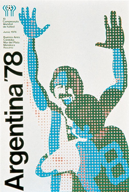
Very cool poster from the ’78 Argentina World Cup. If anyone has info on the artist behind this post it in the comments.
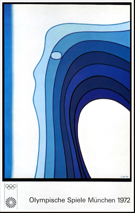
Olympische Spiele Munchen 1972
Photoshop Tip #001 – 2GB+
I’ve added a new category to the blog: "Photoshop Techniques". I’ll be posting random tips and techniques I have found to be useful when working with Adobe Photoshop. To kick it off I’ll start with a pretty simple one that a lot of you may already be aware of. When working with large files in Photoshop the file size can become so big that Windows (yes, I use Windows, not mac!) cannot write the file, this limit is 2GB in the case of Windows XP (x86). I’ve found that the PSD file format is rather wasteful and does very little (if no) compression. You can simply save the file as a layered TIFF with the lossless "LZW" or "ZIP" compression enabled and shave the file size down by over 50% while still maintaining complete editability.
I have been working through the process of recreating my prints in the 24"x36" @ 300DPI size so I have run into this problem a lot more recently (I originally design everything around the 12"x18" format). If you’re on a Mac, you no doubt have a 64bit OS and so don’t have to deal with file size limitations like this and you also have a really cool looking aluminum sculpture in your workspace, but this tip is still useful if not just to save a bit of disk space. I would love to make the switch for design purposes, but I use the same machine for making music and design and in my opinion the Mac just can’t hang with the PC when it comes to recording and music.
Next week I’ll be covering hardware setups for large format stuff.
UPDATE: After reading about it in the comments of this post, I tried using the PSB format on a very large document last night. Saved after 5 hours of work, woke up this morning to find the file was highly corrupted with errors in a lot of the complex gradient masking. The errors were all isolated to masks on layers and layer groups. I have seen corruption like this before, but only when the computer crashed while trying to save a file. This time, the PSB saved fine and everything seemed to be going as planned, but the file was still corrupted. The file in question was 2.2GB with about 350 layers and 60 or so masks on various layers and groups. Anyways, this could obviously be an isolated incident and no testing was done to reproduce the error. Whatever the case may be, I won’t be using the PSB format again, I’ll stick to the TIFFs.
Macbeth M5
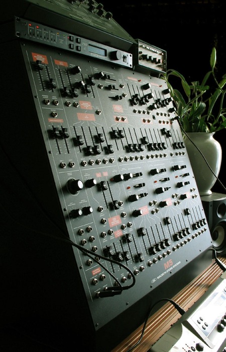
I use a lot of analog synthesizers in my music so I thought it was time to start posting some nice examples of musical instrument design. I have always been obsessed with vintage analog synthesizer interfaces and although the Macbeth M5 is a modern analog synthesizer, it adheres to the design ethics of and pays homage to the modular synthesizers of the 60’s and 70’s. The color scheme and layout is evocative of the classic Arp 2600. There is something so raw and utilitarian about the construction and layout of these that’s just beautiful. If you look at the interfaces of modern digital synthesizers it’s all plastic eye candy and blinking lights. I must admit, I have never played an M5, but it looks so good I think I can give it a pass sound unheard. Photo Via Macbeth. I will start posting some examples from my studio soon.
