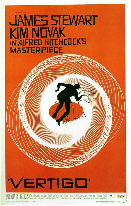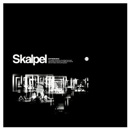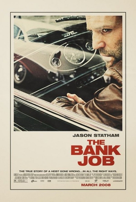
I saw this poster plastered all over a construction site by my house a while back and was really struck by how well executed it was for a modern movie poster. I had been meaning to post it but had totally forgotten until Joris commented on it in the 100 Greatest Movie Posters post. You really don’t see design of this caliber and style in the movie industry anymore. I am assuming this was an early version of the poster. I read somewhere that the big studios will commission an early, more subdued / subversive version of movie posters far in advance of the release and then they come with the tried and true (and boring as hell) final version replete with giant heads and random quasi-illustrative open space backdrops. It’s so formulaic, but I suppose they’ve done their homework and that’s what moves the masses. Sad. Thanks Joris for the reminder on this one!
Extra Credit: This seems to be a similar still to the one used for the poster, give you an idea of the sort of photo manipulation that went into the poster version, very nice. Also, here’s another, infinitely worse, version of the poster.
