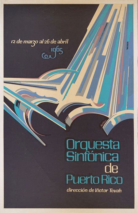
Some awesome typo going on in here, found it over at The Ministry of Type. It’s apparently by Puerto Rican artist Lorenzo Homar, there’s a full bio on him at the bottom of the page. Really very nice hand lettered style, The Ministry briefly discusses the possibilities of creating a digital typeface based on the top font up there, let’s hope that happens at some point. The bottom one, although obviously hand lettered, looks familiar…But I can’t put my finger on it. Any ideas?
Archive for July, 2008
Orquesta Sinfónica de Puerto Rico
Rod Laver


I don’t pretend to understand sneaker culture, and rarely indulge in buying shoes for any other reason than that they look and fit good. But there are a few designs I hold dear, shoes I used to wear a lot or that just remind me of growing up. One shoe in particular is Adidas’ Rod Laver, I used to wear the white/greens all the time. Sort of burnt out on them (if that’s possible) so I don’t currently own a pair. I came across these new "Laver Classics" on Zappos today, but of course, they are out of stock. Guess I’ll have to actually venture out of the house to find them, perhaps one of the billion boutique shoe stores up on Haight Street will have them. Anyways, these are amazing, can’t wait to score a pair.
Dettinger + Koivikko + Pantha Du Prince

Here is a small collection of tracks that might be filed under techno or dance but i would listen to as background music while i work. All 3 are pretty heavy on the lush and deep end and move along nicely, i guess you could file it under ambient techno or some other odd sub genre. The photo above is Pantha Du Prince, his whole record on Dial Records from last year was outstanding. I’m not sure what Dettinger does anymore since this track is from 1999 but has released since on Kompakt. The Sami Koivikko track is a remix by the duo Daso & Pawas from Cologne, DE. If you like these kinda of tracks, i’ll try to post more in the future. I’m just trying to change it up every once in awhile.
Funki Porcini
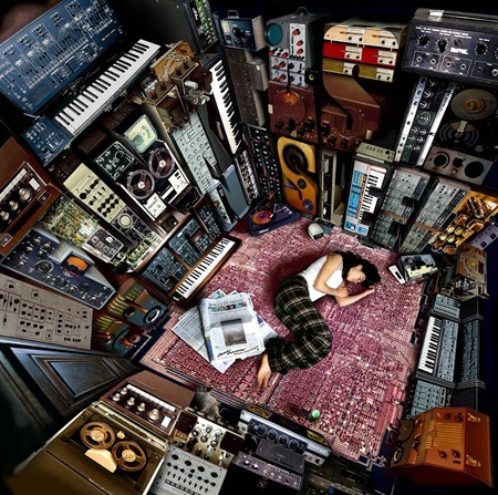
This classic from Funki Porcini’s album Hed Phone Sex always hits the spot. I’ve been wanting to post it, but not wanting to post it’s poorly designed album cover. So I’ve posted the cover to another Porcini release, Fast Asleep, which is amazing. If you look closely you’ll see that the titling is all done in vintage audio gear, pretty clever.
Kick Ass Speed Boats




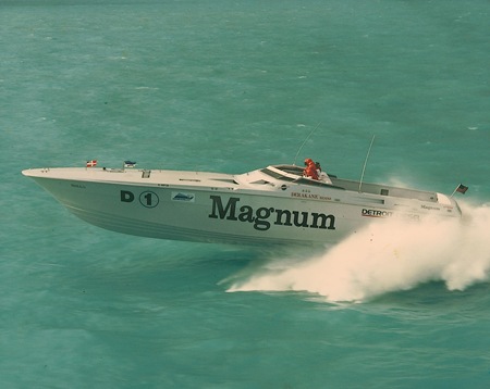
These are some hi-res shots from a 70’s speedboat cup held by Benihana (Yeah, the Japanese restaurant. Apparently the owner used to be into boats until he almost died when his disintegrated in the San Francisco bay). I’ve had these pics laying around for a while and figured I’d post some of them. I really like the photographic style, very nice colors. And check out the paint jobs on the first two, rad.
Loscil + Helios + I’m Not A Gun + Tim Hecker
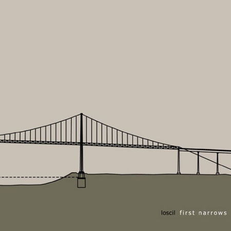
Accuse my absence, my macbook needed to get repaired, so i decided to post 4 tracks for you today. First, Loscil who’s on Kranky Records and i have his cover up at the top of this post which is honestly in my top 5 favorite covers of all time no questions asked. I’ve read abit about Loscil, he gets his warm tones by sampling ticks and hisses from cassette tape and stretches out the sounds and thats how he gets such full warmth in his sound. As for the cover, i’m not sure who did it, all i know is that if there’s a poster of it somewhere out there send me a link to buy it please.
Helios is the second track, I’ve looked on my play count on iTunes and this track is in my top 10. It’s just a wonderful organic track, Keith brings in layer upon layer of melody from each instrument and add hints of adjustments that are all easy to just listen to and enjoy.
Third is a John Tejada side project with Takeshi Nishimoto as I’m Not A Gun, it’s very similar to musicians like Aeroc or Mercury Program which i posted earlier in the year. The attention to detail that John takes towards his own production always has me checking out everything he does. They go off a little on an experimental session in this track but bring it back to what catches my ear the most which is that first 8 second melody which i think could just go on forever in my opinion.
Finally, I had to add Tim Hecker “Dungeoneering” this song floors me, not to get cheesy but it feels like i’m in a air tunnel when i listen to this track. For someone known for doing lo-fi noise this is as pretty as it gets.
[audio:narrows.mp3] [audio:coast.mp3] [audio:garden.mp3] [audio:dungeoneering.mp3]Banksy Revealed?
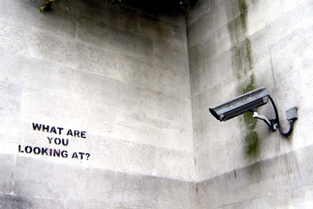
Banksy may be one of the most famous artists in the world but his identity has been a closely guarded secret, perhaps until now. The Mail UK has printed an article that supposedly reveals Banksy’s true identity and has even gone as far as to print a photography (allegedly) of him. I find it funny how the media are always so concerned with the background of people like this. We have no control over where we come from or how we were brought up, we can only control where we go after that. And besides, it’s the message, not the messenger. If accurate, this article will surely put a dent in Banksy’s ability to create in the future. So it begs the question: if you care enough about art to care who Banksy is, why would you destroy what he is trying to do by writing an article like this? Article Link
Photo via nolifebeforecoffee
Newforms
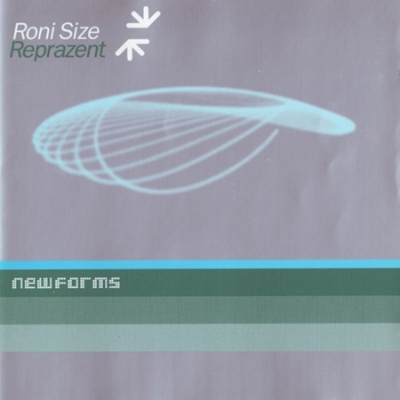
My introduction to electronic music came via the UK drum n bass movement of the mid to late 1990’s. Logical Progression was and is one of my top electronic albums of all time. I was also a big fan of the Bristol scene and labels like Full Cycle and Dope Dragon so when Roni Size & Reprazent dropped New Forms in 1997 I was hooked. This album won Britain’s coveted Mercury Prize (and mind you, this was the same year OK Computer and Fat of The Land were released) and sort of signaled the peak of Drum n Bass as a whole. In my opinion the genre pretty much backslid from that point forward until it completely devolved into some sort of dance floor-fodder, cookie cutter noise-fest; but that’s beside the point. New Forms stands as a classic album without qualification, it can sit beside great records from more traditional genres and still hold it’s own.
Three G’z
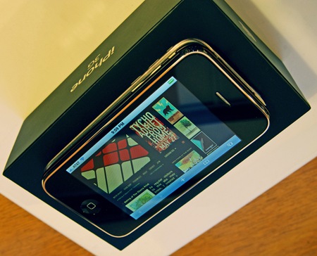
Unless you live in an actual cave or have an actual life, you know / care that the iPhone 3G is now available and that the entire world is completely freaking out. When the first one came out I tried to play it cool and pretend like I didn’t want one; but once the lines died down about a month later, I caved in and got it. I was planning on doing the same this time around, but thanks to a bit of luck I was able to get one at an overlooked AT&T store by my house after only 30 minutes of waiting. Apparently everyone thought the only place that was selling them in San Francisco was the downtown Apple Store, because there were like 15 people in line at the Mission AT&T.
I always really enjoyed the original one, it’s a huge help while traveling, and as a designer, the slide show functionality is invaluable for client meetings and giving impromptu portfolio viewings. There were definitely a lot of little (and not so little) problems I had with the old one, and while most have been addressed in the new version it still leaves a bit to be desired. Regardless, it’s without a doubt a major triumph of design and usability; the user experience Jonathan Ive & Co have delivered is light years beyond anything else out there. The original iPhone was the first Apple product I ever owned and the experience led me to switch over to Mac for my work. It’s a pretty major feat to distill an all-encompassing user experience like that found in OSX and nearly replicate it in the form factor of a phone. That was enough for me to take a harder look at OSX as a design / work platform.
There are countless articles written about the iPhone by far more informed people than myself, so I won’t go into detail about my opinions (but needless to say I am loving this one even more than the last). But I am interested to know what the design community thinks of it: Do you have one? As a designer, do you feel devices like this benefit your workflow / business? Do you see it as a successful design? Do you want to bang your head against a wall every time you hear about the f&*$%ing thing? Let us all know what you think.
Type Driven
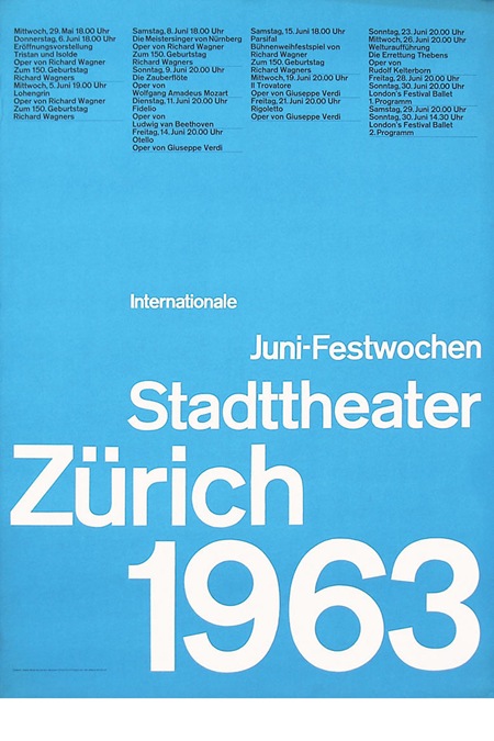
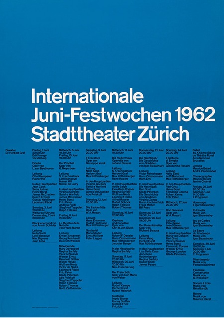
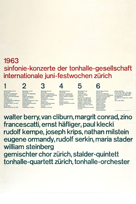
Some wonderful type / grid driven pieces here via helloairecords. There isn’t much info up there about the posters, perhaps someone can fill in the blanks.