So the much anticipated / extremely controversial Beijing Olympics are in full swing and despite the issues surrounding the host country, the games themselves have been incredibly entertaining. From a visual perspective the whole production is off the charts. If you didn’t see the opening ceremonies, do yourself a favor and watch the replay. I can’t even begin to describe it so I’ll just say there was a roll-up LCD screen about the size of a football field and a mass-scale drum display that looked like some sort of giant human Tenori-On.
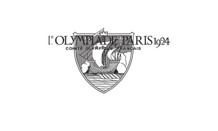
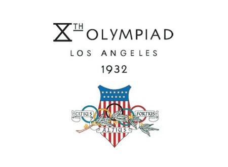
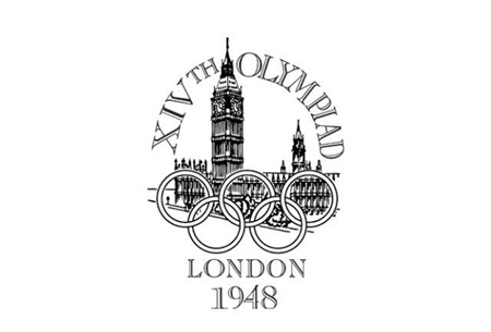
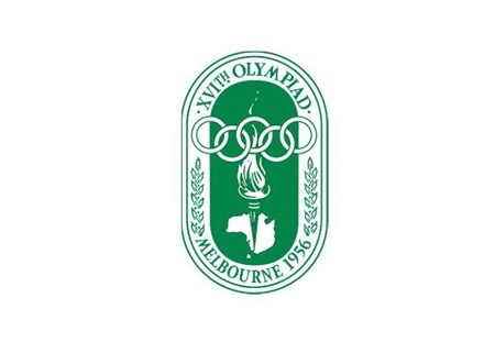
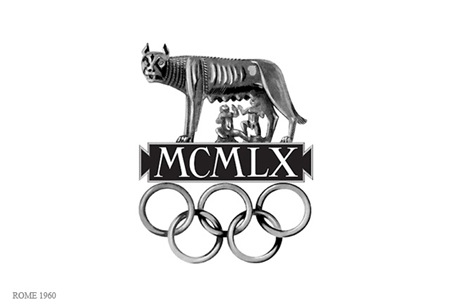
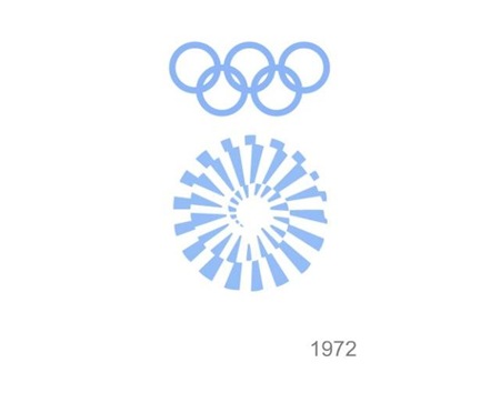
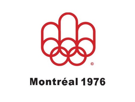
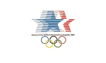
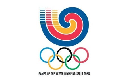
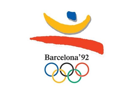
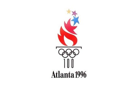
Obviously branding and information design are central to each Olympic experience and while I’ve posted a lot on past Olympics, I thought it would be good to get all of the logos together in one post. It’s very interesting to scan through these; the stylistic transitions say a lot about the country and historic era of origin. Helsinki kicked off the modern approach, but then Melbourne and Rome had to go and screw everything up for 8 years. Tokyo ’64 started what turned out to be a 24 year winning streak of incredibly well thought out, masterful logo designs which continued unabated until Seoul decided to kill the party with something that can only be described as inexplicably bad. From then on out it was a lowest common denominator free for all of middle of the road mediocrity. This, of course, coincided with the dawn of cheap, accessible desktop publishing where everyone all at once decided to forget everything they had ever learned about typography and color theory. I think this was also around the time that the Olympics was maturing into the massive corporate money machine it is today, so the shift in style makes a lot of sense given the new set of imperatives driving the branding (i.e. MAKE AS MUCH MONEY AS HUMANLY POSSIBLE).
Although there were 8 games prior 1924, I’ve started with Paris as it seemed to be the first of the modern games that had a specific logo mark associated with it. Most of the earlier games had posters but nothing you would consider a logo. Also missing are 1940 (Tokyo > Helsinki) and 1944 (London) which were both canceled due to World War II.


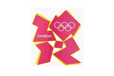
And it wouldn’t be completely without a peek into not-so-distant, yet oh-so-hideous future (London 2012). To tell the truth, something about this is starting to appeal to me. At the very least I can say I prefer the 2012 logo to some of it’s more boring ancestors (i.e. 1988-2008).

Most images via Sachin Tomar
Comment on this post


