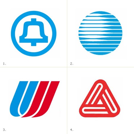
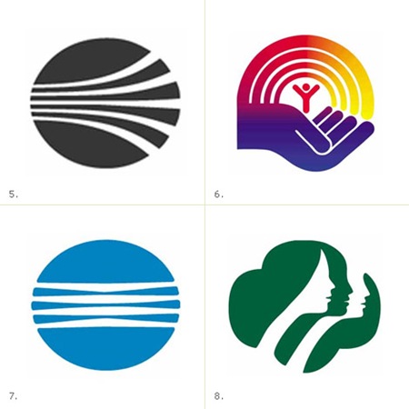
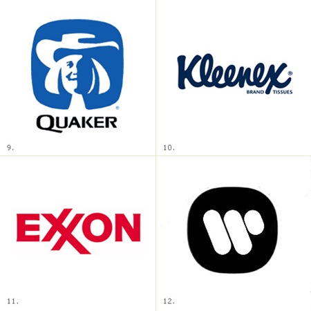
James White has posted a very nice collection of Saul Bass logos at his site, Signalnoise.com (also very nice). Going through this list, I am pretty amazed. I knew Bass did a few of them, but some of those are big surprises. Link
Archive for September, 2008
Saul Bass Logos
Ryan Fitzgerald Photography
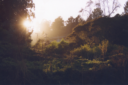
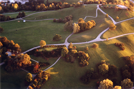
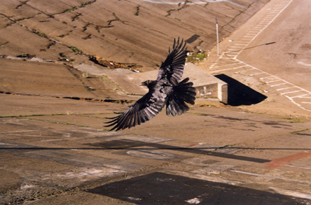

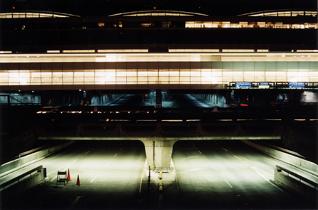
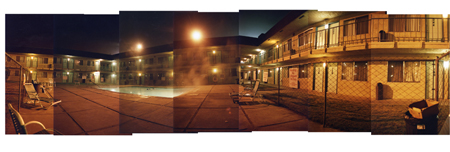
Ryan Fitzgerald who is half of Broker/Dealer, has some wonderful overhead shot photography and i think most of them are in and around San Francisco, I was grabbed in by his shot of that crow. Here at Ryan’s site eyewitnessphoto where you can view the the photos larger.
Miles Davis
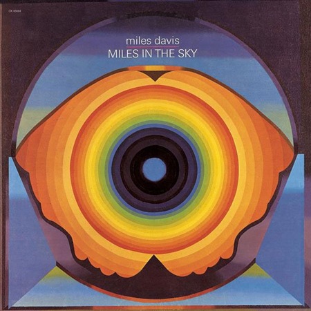
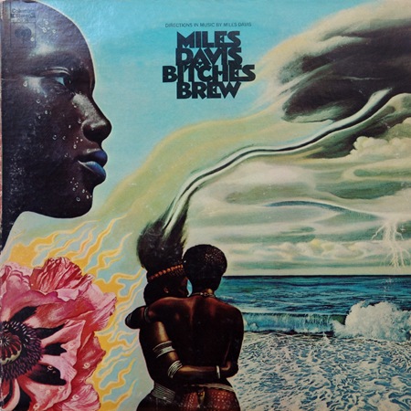

Beautiful images and beautiful music, they don’t make either like this anymore. Bitches Brew ranks up there as one of my all time favorite album covers.
Some images via Sleevery
Pocket Protectors
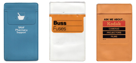 Go ahead and laugh but these dress shirt saving vinyl badges at one time we’re great because advertising designers could have that extra chance to put their logo somewhere in a creative way. I love the layout on these, there is a whole huge collection here.
BMW Art Cars
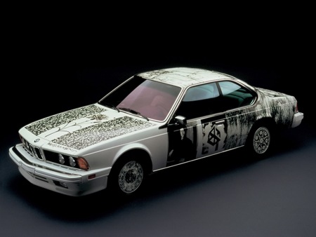
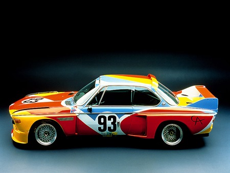
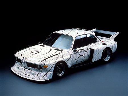
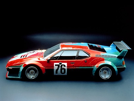
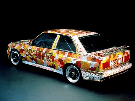
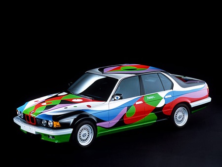
As Michael J. pointed out in the comments of the previous Sharpie Lamborghini post, Robert Rauschenberg was way ahead of the game on the whole "drawing all over badass cars" thing with his photo transfer 635 Csi way back in 1986 (first car pictured above). As it turns out, he wasn’t alone either. Among others, but perhaps most notably, Andy Warhol took a shot at the concept (see videos below) as part of the BMW Art Car program. More Info and pictures on all the Art Cars can be found at the US Auto Parts Art Car Site. You can also find some nice big wallpapers of the Rauschenberg car over here.
And no, this site isn’t switching format to an automotive blog; regardless of the recent spike in vehicle related posts. Thanks again for the heads-up on the Rauschenberg car Michael.
Michael Doyle – Solvent Flyer
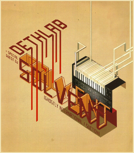
Our friend over at Burnlab did this flyer a few years back, still to this day it might the best flyer to come out of Michigan. Michael Doyle runs an experienced music/culture blog called BURNLAB.
Nikon D90 Video: Holy Smokes
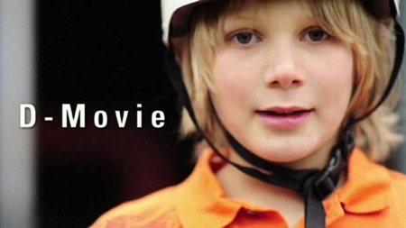
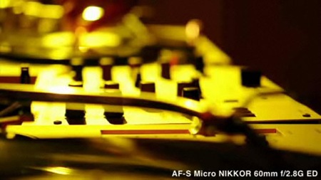
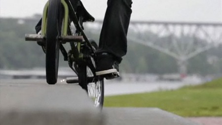
The above stills are taken from HD video shot with the forthcoming Nikon D90. Nikon has posted some video samples highlighting the video prowess of their new pro-sumer DSLR. Needless to say, they’re incredible; this opens a lot of doors into the world of professional quality video for everyone. I have to admit, at first I too was skeptical of the HD video feature as a mere gimmick. But after seeing these videos I am close to sold. Of course I’d have to reserve final judgement for after I’ve done some hands on testing, but these videos are strong supporting evidence.
I’ve been wanting a new DSLR and want to get my first video camera soon too. The D90 just might kill those 2 birds with one relatively inexpensive stone. The only problem with this whole scenario is that by adding such an alluring feature to the D90 exclusively, Nikon has made it really hard to justify buying their new pro offering, the D700, which lacks the D-Movie feature. I want the added performance of the D700, but getting this level of HD video quality in the significantly cheaper package of the D90 is just about enough reason to ditch any delusions of pro-level-gear-grandeur and make due with the lesser of the Nikon DSLR range, spending the surplus afforded by it on a high end lens.
Head on over to Nikon to view the full videos or Gizmodo for a third party take on the action. The Gizmodo article does make a good point about the sound quality, but for my purposes sound would be irrelevant as most of the stuff I’d be shooting would be set to music with no original live audio. Looks like the race for next-gen DSLR superiority just got a lot more interesting.
Your New Favorite Browser
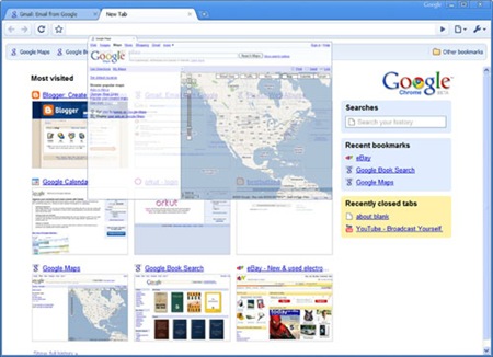
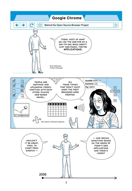
My friend turned me on to Google’s entry into the browser market today and I have to say I am pretty impressed. Chrome is a lightweight, search-centric take on the web browser which aims to speed up the browsing experience. So far it’s lived up to that lofty goal for me, all while taking up only 34MB in memory (less than half that of FireFox). The installer is a svelte 475KB and it even did a seamless import of all my Firefox settings. You can take it for a spin over here. Sorry, but it’s Windows only for the time being; chalk that up as at least a temporary win in the Windows UI/UE column.
Via Steve Kustin
Update: Alex / HDP noted that a nice graphic explanation (pictured below) of the purpose / uses / drawbacks of Chrome can be found here. It all starts to hit home when you read the line "we’re applying the same kind of process isolation you find in modern operating systems". Now, when you consider the overarching concept of web apps (I am now completely dependant on Gmail and Gcal) and the still nascent concept of Instant-On Operating Systems, well, you start to get the big picture: Google is potentially positioning itself as an operating system. If you thought MS had a monopoly, imagine a world where the same company makes the OS, browser, and search technology you use. The only thing missing is the hardware, and who knows, I am sure there is a hardware research division somewhere deep within the sprawling Google campus. Oh, and that’s not even counting the fact that your phone could soon be running a Google OS.
Benedict Redgrove: Pininfarina
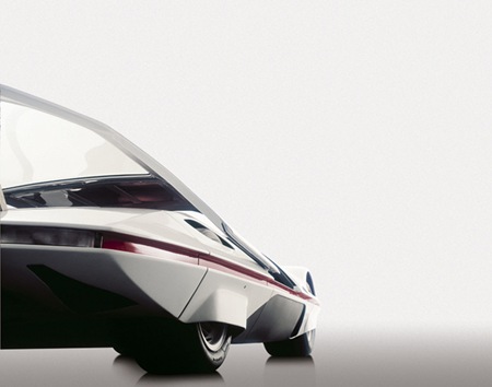
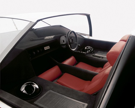
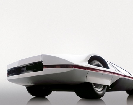
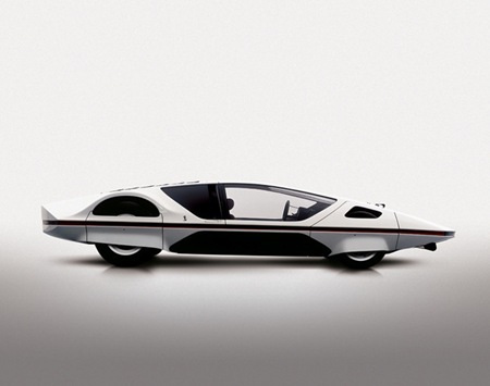
A Pininfarina concept photographed by Benedict Redgrove.
iPhone GUI PSD
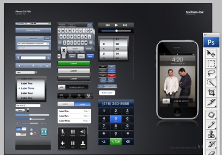
I started out my career in graphic design as an interface architect so I’ve always had a soft spot for GUI’s and user interaction theory. I happened across this post at Teehan+Lax about the GUI for the iPhone. They’ve posted a PSD with most of the assets from the iPhone interface, all in freely-scalable shape layer and PS effect formats. Technically it’s been posted to provide an easy way to create iPhone mock ups but I think it’s a great reference for anyone trying to learn how to create interface graphics in Photoshop (for web or otherwise). Reverse engineering PSDs like this is a great exercise in working with scalable graphics in Photoshop. You can download the PSD from the Teehan+Lax site.
