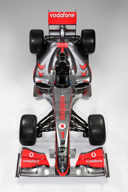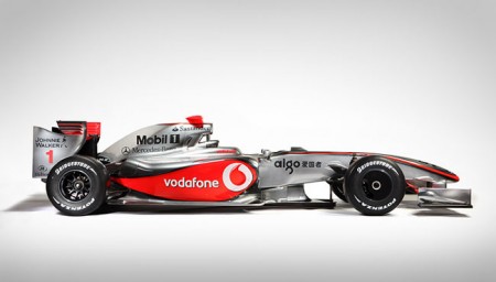

Wired has an interesting article about the new F1 rules and the resultant car designs (McLaren MP4-24 pictured above). It details how new rules for the sport — which many expected to create a significant design challenge — have actually served to beautified the new models. These things are starting to look like they can fly and if it weren’t for the fact that your work would be ruined by about 800 ads, designing the paint for one would be a lot of fun. Check out the Wired article here.
2009 McLaren F1: Not Ugly
01.30.2009


but they are still not as beautiful as the old Tyrrell P34 F1 car 🙂
just wanna say: i’m following this blog now for over a month
and every time there is something worth checking out, good work !
cheers pete aka ichi.one
That car is a nice nod to the old Ferrari’s of the 70’s. This thing is so much more graceful than the usual body designs that I’ve seen for Formula cars. You can practically see the airflow in a wind tunnel when looking at the profile shot, the red “vodafone” panel is particularly brilliant as I can see it providing some much needed downward force to the back end of the car. It’s almost a shame that you have to put the front wheel mechanism on there, those lines are so nice.
And I have to agree with ichi.one, this blog does have some of the most consistently read-worthy content.
McLaren has consistently had the best looking car in the field for the past several years (my opinion!). It is nice to see that this season will be the same! That silver is always amazing.
offtopic_
youre going to love this screensaver.
http://www.halproject.com/hal/ 🙂
I completely agree with the “800 advertisements” on the cars today. Ferrari usually introduces their cars to the public with no graphics on them, just racing red. Side-note, here’s an oldie but a goodie with no ads:
http://www.ultimatecarpage.com/pic.php?imagenum=10&carnum=3172
@Serviceburo :
actually that new rear wing provides less downforce… to promote overtaking…
the same reason the cars are now more streamlined… without those aerodynamic tricks and bits, the cars can now roll closer to each other without turbulence, thus… promoting overtaking.
either way that tall rear wing and the big front wing are just silly looking…
No, still ugly.
actually McLaren is pretty ugly this year me thinks, the nicest looking one is Ferrari and then Williams
Scott, the cars actually CAN fly… I watched an F1 documentary a long time ago, and at the time (not sure the specifications now), the motors were only about 300hp, and due to the extreme light weight and shape, they could literally drive upsidedown in a tunnel at 100mph. I forget the name of the film. I want to say it was in IMAX, but maybe not. The demonstration was incredible, nonetheless. The rear wing serves as basically the opposite of a typical airplane wing because there is so much lift. Pretty interesting…
I personally think that its the color scheme design that makes the cars look ugly, the McLaren is by far the best looking because of its aggressive design and the fact that its using silver.
I do however think that the cars will take some time getting used to and there are plenty more teams still to release their cars for this year. Last year the McLaren was by far the best looking and has been ever since they introduced silver to the design.
Hopefully this year we will see a far greater contest between ALL teams and i really hope that these new changes improve the competitiveness of the sport.
I think everyone has their own opinion and taste but i really love Mclaren cars mainly F1 from the design up to performance which is proven the best.Also,i read an interesting article about the F1 Mclaren successor to be launch on 2012.Heard about it?