Archive for January, 2009

Hecker+Manual+Pan American+Belong

Belong October LanguageI’ve collected a few upcoming wonderful ambient releases to look forward to in early 2009. Since the only released artwork really is this Belong art, it will have to do but it’s actually really beautiful I think. I saw a small version of Tim Hecker‘s art for his release in February of “An Imaginary Country” but it was a bit too small to use. The beginning of Sea of Pulses is like jumping into the middle of a Fennesz/M83 collaborative concert that is slowly finishing up a 9+ minute piece. The song slightly dies down and it sounds like a voice takes over for a bit which at that moment it has already knocked off Animal Collective’s Brother Sport as my favorite song(for now) of 2009.

If you haven’t heard of Manual before then be ready to put your coat on because your heading over to your local record store. Moonlit Shores is the first song i’ve found off the upcoming Danelectro LP and this track gives me so much hope that ambient music will really take off in 2009. In just a few minutes into this 12 minute piece you can feel out what setting Manual wanted you to experience when hearing this song, the simplicity of it lets you focus on whatever beautiful part of the song you want to hear, well done my friend.

Pan American is back, that’s pretty much all I have to say to some people. Can we take a second and thank Kranky records for what seems to be the starting of an uncanny new year.

For some reason I thought I already posted this Belong song, I was almost positive. When listening to this song make sure you have a little bit of bass rumble to accompany the exquisite drown going on, it almost makes me nauseous in the best possible way. Have you started listening to the song yet? are you at least 2 minutes in? beautiful right?

Tim Hecker – Sea of Pulses

[audio:pulses.mp3]

Manual – Moonlit Shores

[audio:moonlit.mp3]

Pan American – How Much Progress One Makes

[audio:progressone.mp3]

Belong – October Language

[audio:octoberl.mp3]

Metal Heart: Tilt-Shift Video

Here’s another nice example of some time-lapse tilt-shift by Keith Loutit. This one is so good it’s hard to believe that it’s real, it just looks like a big stop-action Hot Wheels diorama. The crowd shots are the hilight for me though; I’m loving those seat colors.

Keith also has a couple other good tilt-shift examples up at Vimeo: The North Wind Blew South and Helpless.

Animal Collective + Airiel + Juan Maclean

Animal CollectiveFirst off, your going to have to excuse the cover choice but it was the best one out of the 4 songs for today. Let’s get right to it, there’s a new Animal Collective record coming out January 13th and from what i’ve read it sounds really promising. I listened to a lot of Animal Collective songs last night just to figure out what i’m attracted to in their songwriting and I noticed all the songs I do want to hear over and over like Leaf House, Grass, #1, Peacebone, Brother Sport and Visiting Friends all have either these driving low tom hits or have repetitive loopy melodies that I don’t mind hearing for minutes upon minutes. What I love about the new songs like “Bluish” and “Brother Sport” are the vocal styles though, like in “Brother Sport” the last 1:30 might be my favorite section of an Animal Collective song.

I found this Airiel song yesterday which i’m kind of on the fence about after I looked at their myspace. On one hand I wonder if this is the real thing meaning do they really love this style of music because their over stylized haircuts and upfront vocals make me think its just to get girls but the thought out catchy elements of the song make me love them, so I guess sometimes its best if I don’t meet the musicians and let myself just enjoy the songs.

I love The Juan Maclean, he doesn’t ever do anything that I dislike, from his remix of Matthew Dear to his classic sounding “Happy House” track to originals that put him on the map like “You Can’t Have It Both Ways”. This new remix for The Twelves has this unstoppable disco guitar and perfectly placed vocals in the mix because they’re never overpowering.

This A Sunny Day in Glasgow group out of Philly reminds me of Ulrich Schnauss at times but its like they only took a section of a song and repeated it unlike a growing shoegaze track. The mix of the song is a little rough too because the bassline that comes in is really nice but never really comes to life and that higher pitched synth note that comes in and out could be more drowned out. The girls vocal definitely has her moments 2 mins in and the overall dreamy effort makes me go back to it.

Animal Collective – Bluish

[audio:bluish.mp3]

Airiel – Cinnamon

[audio:airiel.mp3]

The Twelves – Be My Crush [The Juan MacLean’s Rio Mix]

[audio:crushjuan.mp3]

A Sunny Day in Glasgow – Watery

[audio:watery.mp3]

Tom Kundig: The Nature of Design

kundig4
kundig2
kundig3
kundig1
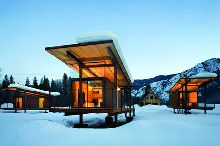
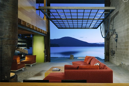
I stumbled across this great article about architect Tom Kundig’s work on WSJ today. That first house is off the charts amazing, I’d move in tomorrow despite the fact that it’s in the middle of nowhere (at least I’d get a lot of work done). Kundig’s goal is to find balance between the structure and the landscape and from the looks of things he’s doing just that. Once again though, after browsing his portfolio I am realizing if I ever want an amazing house like this I’ll probably have to move to a more rural setting (and find a bag full of money on the way out there). It must be so amazing to be in, for example, Mazama, Wash., and come across structures like these in the wilderness.

Camera+40 Thieves+Soccio+Flying Lotus

Camera Obscura
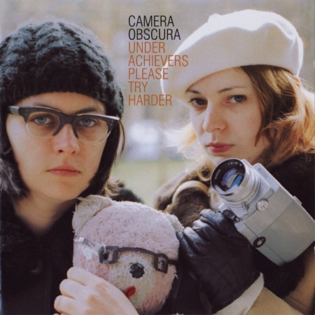
I really never got into Camera Obscura, Belle & Sebastian, Death Cab For Cutie, The Decemberists, Wilco etc in the past but I always knew everyone else had it covered but after looking for more music thru blogs I am trying out everything. This song “Keep It Clean” is really nice, kinda reminds me of if Stereolab didn’t oversaturate their old sound. The cover has a great layout and is pretty Indietastic(one of the best Human Giant skits featuring the Other Music record store).

If you’re liking any of the slower disco on the blog check out the label Permanent Vacation which usually features some great compilations. This 40 Thieves track came out on Permanent Vacation last year and has been on repeat on my computer and also has these great elements that warm a crowd up early on to get people ready to fill the floor. Once you have the dance floor filled this edit by Prince Language of Gino Soccio might be my favorite song to play and dance to.

Los Angeles indie Hip Hop had some great moments in 2008, Flying Lotus and Samiyam paved the way for a lot of new faces. One of my favorite tracks was Roberta Flack and this remix by Mike Slott kept all the outstanding parts in there highlighted but added some great new pieces, well worth your time to check out.

Camera Obscura – Keep It Clean

[audio:keepitclean.mp3]

40 Thieves – Don’t Turn It Off feat. Qzen

[audio:qzen.mp3]

Gino Soccio – Love Is (Edit De Prince Language)

[audio:loveis.mp3]

Flying Lotus – Roberta Flack (Mike Slott’s Other Mix)

[audio:robertamike.mp3]

Where the Wild Things Are

wildthingsbeastboy1200wthsas
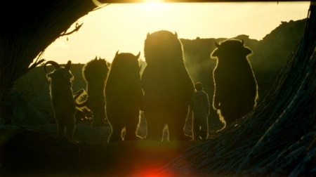
Spike Jonze is about to make the movie of a lifetime in my opinion. The music/movie director will be releasing my(maybe everyone’s) favorite childhood book Where the Wild Things Are onto the big screen. Just look at these shots, they’re golden, and I just want to see more. Rumors around the web say that there will be no effects just large puppets, I think as a fan I couldn’t of asked for more.

Vintage Sony Radio

3150961411_c3fcf6691d_b
3150961307_35432149bb_b
Saw these nice shots over at the Mid-Century Modernist today. In high school I worked at this place called “Good Guys” in Sacramento, it was a consumer electronics place and they had this really nice vintage Sony replica radio. If I’m not mistaken, it was modeled after this one. I remember it being pretty nice, but now looking at these shots, it really didn’t do the original justice.

Images by 33 and a Third via Mid-Century Modernist.

WordPress 2.7 = Success

27
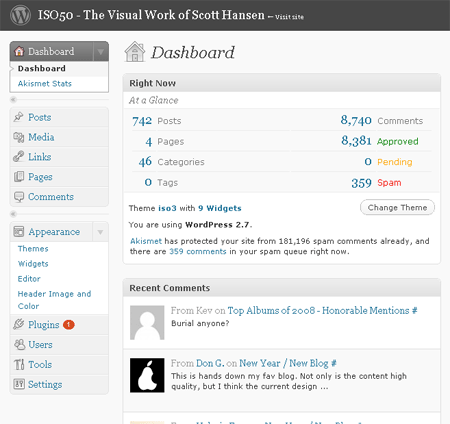
I just successfully upgraded the WordPress install for ISO50 to the new 2.7 version. I must say, this new version is incredible. I was running 2.1 for the longest time as a result of some early edits I made to the core files when I first installed WP (not recommended, but I didn’t really know what I was doing back then). There is a detailed guide on how to upgrade at the WP codex, but I decided to use a plugin that does everything automatically. It literally took 1 minute and I didn’t have to really do anything. The plugin, Instant Upgrade, is available here. If you’re running an older version of WordPress, you really should upgrade simply for security reasons alone, but the new admin interface and features are definitely worth it on their own.

Anyways, let me know if you notice anything weird on the site, I will be trying to flush out the bugs this afternoon.

You probably won’t notice any big differences now, but this is the first step on the path to the new redesign which I posted on a couple days ago. I want to say thanks to everyone who commented, it was a huge help to get such great feedback from all of you. I will be working through all the suggestions and deciding which will benefit the blog the most. As many of you pointed out though, most read the blog via the RSS feed so they rarely even visit the page. With this in mind, I try to make the page sort of the anti-RSS reader version, not stripped down, and not super clean. This isn’t Engaget or something, people come here for more than just the content I think, that is why I’ve never focused too much on things like the inverted contrast, Sifr titles, etc. I still want the blog to maintain a unique visual aesthetic, especially considering 99.9% of all blogs out there essentially look exactly the same. That’s not to say that I won’t be taking steps to make it faster and cleaner in the redesign, I definitely will, I’m just going to try to find a happy medium between form and function. Because those looking for pure function will always opt for an RSS reader.

As for the multiple authors issue a lot of you brought up, this is something I will really focus on clarifying. But to make one initial clarification, a few of you mentioned that you felt I was simply “letting my friends post” on the blog. This really isn’t the case. First of all, Jakub is an A&R, a label owner, and a DJ. I count him as a friend now, but this is from working together (he handles a lot of the day to day stuff for my Tycho music project and ISO50). Besides, he is who I look to when I want to find new music, we have similar tastes, and he is well qualified. This isn’t simply a case of me putting on my childhood friend or something. If I had the time to find new music and put as much effort into it as he does, I would most likely be posting the exact same stuff as him, so I’ve sort handed off a lot of the music posting duties to him and I think he does a superb job (my iPhone is pretty much just a big playlist of everything he has posted on the blog). Beamer is a friend of mine, but he also happens to be the most knowledgeable person I know when it comes to early electronic music and he has a very large collection of rare electronic / ital-disco vinyl. Alex Cornell is a student and my intern here at the studio, his posts are meant to bring a student perspective to the mix. I have been in design for way too long to really see it from that early, super-objective point of view. The point is that I put these guys on the blog because I truly respect and value their opinions and tastes. I am very lucky that they are willing to participate in the blog and I think they are a big part of what makes it what it is. If it was just me posting here you’d all be inundated by a never ending stream of me ranting about what the best version of Windows is for swap disk latencies and MP3s of late nineties IDM. At any rate, I will definitely be making author pages for each of them to make things clearer.

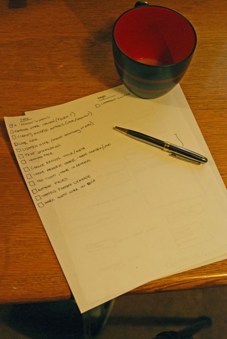
Finally, here’s a tentative list of fixes/upgrades based on your suggestions, there are some other, larger features that will be added but that list is still secret!
coffee-and-lists2

New Year / New Blog

The ISO50 blog is now approaching it’s second birthday and with the new year I thought now would be a good time to rethink the layout and functionality of the interface. The blog runs on the superb WordPress platform (highly recommended) so it’s extremely flexible and I want to take better advantage of that flexibility. When I first designed and built the blog I admittedly had no clue what I was doing. At the time I wasn’t really an avid blog reader so I didn’t really understand the finer points of a well thought out blog design. Thankfully, WordPress supports themes so I snagged the classic Kubrick theme (now K2) and hacked it into the form you see here. I learned a lot during the process and during the following year or so of working with the blog so I feel better equipped now to give it another shot. But as anyone in web design knows, it’s very difficult to be objective about your own interfaces and to understand the difficulties end users may have with your design.

So I wanted to ask you, the readers, what you would do to improve the blog. Is there anything about the interface or the layout that’s confusing, cumbersome, or just plain broken? Are there any features that you feel are missing or would be a good addition? I am in the early stages of the redesign, I have some mock-ups and wireframes going and a development install running here locally, so now would be a great time for suggestions. I look forward to reading any ideas or suggestions you might have in the comments

Update: Based on Michael J.’s comments I have added to this post in the comments.

Casa BF / Humberto Hermeto

370345119_bf-05.jpg  1006863892_bf-04.jpg Saw this incredible house by Brazilian architect Humberto Hermeto posted on Notcot today, amazing! I guess the plan is to first save up and buy a bunch of Herman Miller pieces, then build a house like this around them. Though aesthetically pleasing, I often wonder if would actually be fun to live in a house like this. I have a lot of odds and ends around here, wires hanging out from behind stuff, basically crap everywhere. That probably wouldn’t look very hot next to a stark, modern backdrop like this. But I suppose if you can afford this kind of house you can probably afford some sort of crap organization system, from Design Within Reach. More info and pictures are here