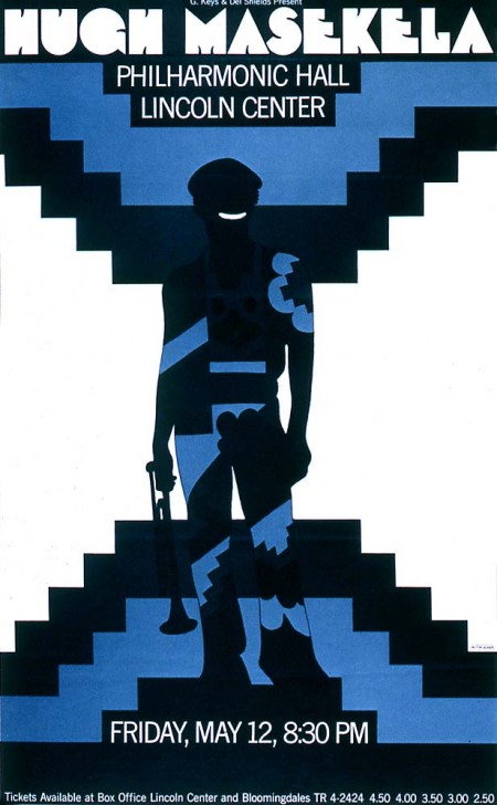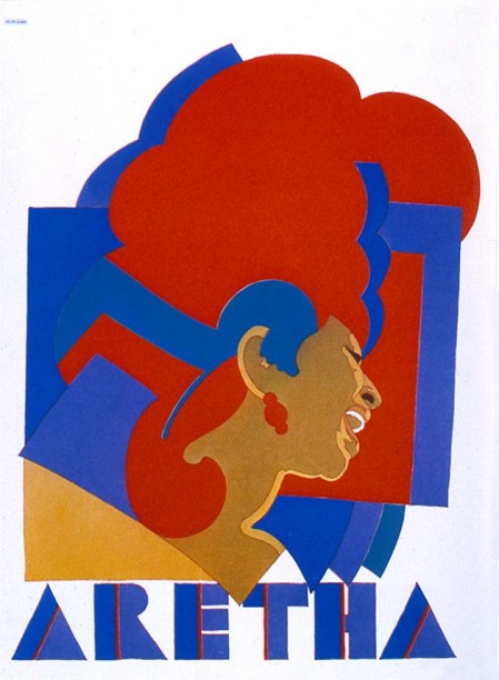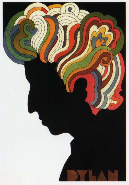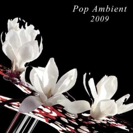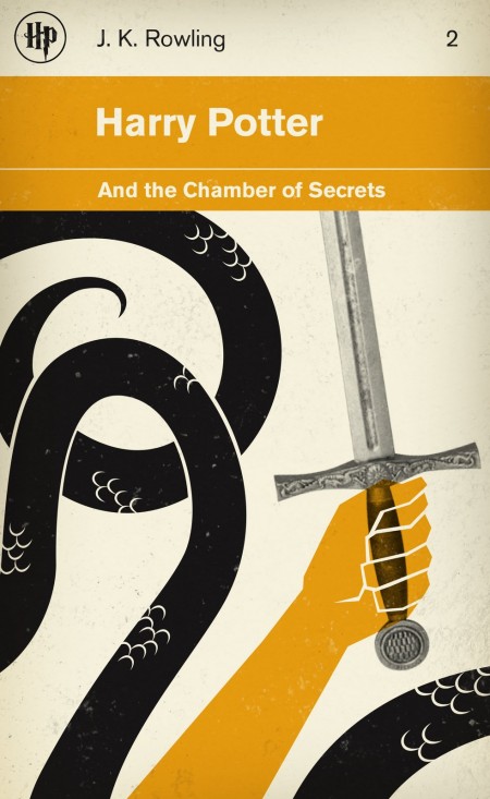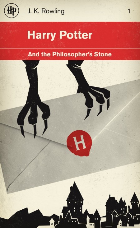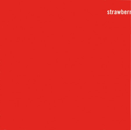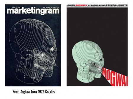
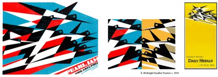
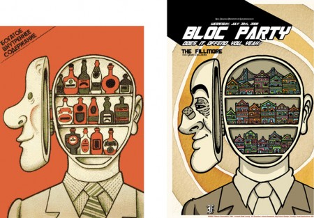
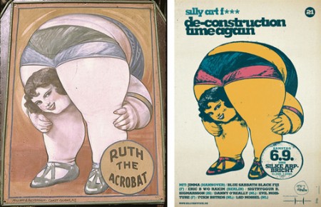
Hot on the heels of our recent, and thoroughly rousing, discussion on the subject, I came across B.Caruther’s gallery of “inspired” designs and their original counterparts. I thought it was an interesting illustration of the the whole concept of “borrowing” artwork. If you’re going to make the argument that someone like Shepard Fairey is stealing (and therefore their work has no merit), you would have to make the exact same argument for each and every one of these and the countless others out there.
Sure, that argument would be pretty easy for a lot of them. Many are sort of tongue-in-cheek riffs on design classics while others are what I would characterize and blatant rip-offs. But some do stand up as something new and engaging for reasons other than the imagery they borrow. The “Clockers” poster is a perfect example. Yes, it borrows heavily from Bass’ original, but it takes the imagery and re contextualizes it in a way that creates something fresh and provocative. Nevertheless, Bass regarded the poster as a “rip-off” while it’s creator, Art Sims, called it an homage [source]. I guess with an issue as subjective as this, people will never reach consensus, but it’s fun to try!
