Archive for February, 2009

WhatTheFont – iPhone App

img0341
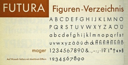
MyFonts released an iPhone version of their WhatTheFont identification tool last week. It has a very simple and easy to use interface. You basically just take a picture of a font, crop and upload it, and it will run the characters through a recognition database and give you possible identities for your mystery font. Works well so far (at least it was able to recognize Futura above), but it will be interesting to see how it does with some more challenging typefaces.

Image via 20th Century Type

Verner Panton Pt. II

363
158
1328
312
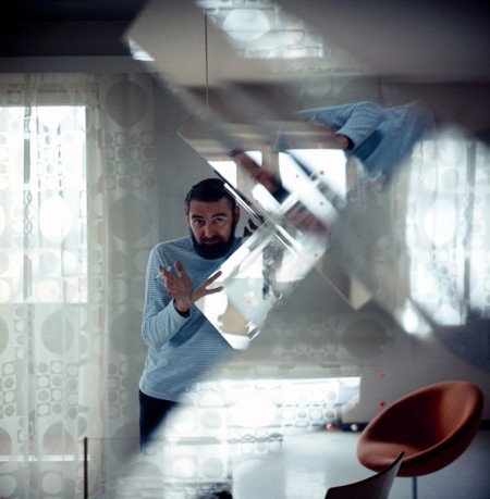
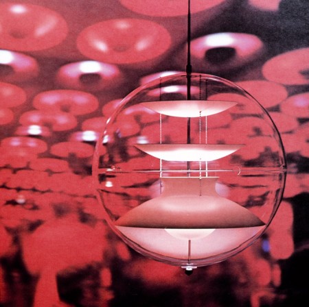
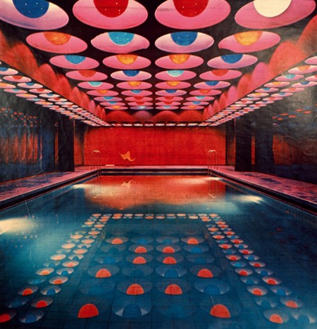
I’ve posted on him before, but today I saw some nice shots of Verner Panton’s work that I’d hadn’t yet seen posted up at the suberb “but does it float” blog. That green ceiling is looking very familiar

Nothing Is Original

jim_jarmusch
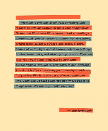
I saw this and thought it made a nice counterpoint to some of the views expressed in the AP Sues Shepard Fairey post. Make what you will of Jim Jarmusch’s suggestions, but in the year 2009 you pretty much have to agree with his initial assertion. Or do you?

via Today & Tomorow

Kim Holtermand – Photography

1_background
picture-3
picture-4
I’ve become seriously addicted to Dropular recently, and it seemed (at least up until their servers went down yesterday) that just about every other dropped image was one of Kim Høltermand’s stunning photographs. His work gets a lot of love in the blog community, and it’s great to see a talented photographer getting the recognition he deserves. I love his compositional style, subject choice, and I find his color palette sophisticated and appropriate. His images are imbued with a profound and mysterious tranquility which, given his urban subject matter, is a remarkable feat. There is a difference between solitude and loneliness—his photographs convey the former.

Ratatat+Terje+Troxler+McCartney

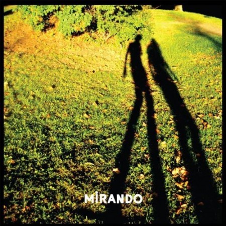
Ratatat - Mirando - Animal Collective RemixAnimal Collective keeps pulverizing the 2009 year, this time with a remix for Brooklyn’s Ratatat duo. This isn’t a song you skip around on and decide you don’t like because you sit thru the first 2 minutes and it might not do anything for you but where they build from there to about the 7 minute mark is a complete mind bend that can only be described by me as if the NES game Jackal(where you drive around in the Jeep’s) completely went spastic into some stuttering dream sequence which sounds awful but its a good thing.

One of the first records Tom Croose ever played me was this Paul Simon edit by Todd Terje, now I always ask him to play it whenever he dj’s out around town.

I’ve known Seth Troxler since he was in his teens, a definite talent in the house/techno world. He has this ear for perfecting tweaked vocals and keeping a song interesting by getting a new sound out of what works on the dance floor. The part where he comes in is where he disassembles tracks and follows the paths of people like Arthur Russell and Matthew Dear.

To keep with the older music kick recently I wanted to share/confess i’m not a big Beatles fan but I am a fan of this Paul McCartney song, some friends of mine have tried to play me some Beatles but I just couldn’t do it until I heard one record they did and it really grabbed me but I can’t for the life of me remember which one it was, its not that important, its not like there music is going to disappear anytime soon.

Ratatat – Mirando (Animal Collective remix)

[audio:mirando.mp3]

Paul Simon – Diamonds Dub (Tangoterje Edit)

[audio:tangoterje.mp3]

Seth Troxler – Love Never Sleeps

[audio:sleeps.mp3]

Paul McCartney & Wings – Let ‘Em In

[audio:letem.mp3]

Interview: Sam Grawe [Dwell/Hatchback]

Sam Grawe
Name: Samuel Grawe

Occupations: Editor-in-chief at Dwell Magazine / Musician in Windsurf & Hatchback

So, you started Dwell Magazine in Oct. 2000 but your first full length as Hatchback was put out in Sept. 2008, I have a feeling you’ve had this album in you for awhile now but i’m sure Dwell takes up most of your day?

Right. Being the editor-in-chief of any magazine is time consuming, but with Dwell, I’m also working on our website, our conference, various brand extensions, and so on, so that keeps me fairly busy. Hatchback and Windsurf are what I like to do in my down time—mostly weekends, late nights. Sometimes I wish I could have a little more flexibility, for instance, I could wake up and say, ok, this morning I want to play Rhodes for an hour and then record a drum track, and then I’ll go to work. That would be ideal.

Can you list off 3 of your favorite pieces of furniture and 3 favorite instruments and one of each that you personally own?
This list is pretty arbitrary, it would probably change tomorrow, but here:

Furniture:
Ultima Thule by Tapio Wirkkala, a 30 meter long sculpture of laminated plywood carved to look like a wind-blown glacial ice field made for the Finnish Pavilion of Expo 67.

The Sausage Chair by Nana Ditzel, mmm… sausage.

High Back Alcove Sofa by Erwan and Ronan Bouroullec, this piece has an Empire Strikes Back quality which I admire.

Instruments:
roland_jupiter8-1jpg
Roland Jupiter 8, they don’t make synths this sexy anymore.

Synthi AKS, I got to play with one of these once, I had no idea what I was doing, but it sure was fun.

Fender Rhodes, the creamy keys. Every song I really dig tends to have some Rhodes on it.

My favorite furniture I own is probably my Bertoia Bird Chair and my favorite instrument is the Korg MS-20

Does Dwell ever feature or use music on any level?
Not really. Every now and then we’ll feature a home where the resident is a musician. I was able to include a rhythm ace drum machine in a caption once.

Who did the Hatchback album cover? Do you feel like the cover best describes your sound and does it seep into a design style that you like as well?

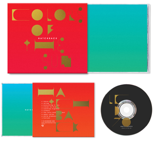
The design firm Non-Format did the cover for my album, and most of the Lo Catalog. They’re really talented graphic designers and certainly great typographers. I had envisioned something a little more handmade originally, and perhaps inspired by folk art from India or Mexico or pornographic sci-fi like Boris Vallejo, but ultimately I really dig what they did.

I think your sound is the future of slower tempo music with depth that can be listened to by a broad crowd, could you share who got you into this type of music? And maybe suggest a few records to ease someone new to your sound into it.
I’m not really sure what style my music is honestly. Maybe I’m not a good marketer, but I tend not to think in genres or that I should make a slower trac or faster trackk. That said, I tend to listen to older albums and soundtracks—I’m usually the last to know about really good new music.

I think Vangelis’ Bladerunner soundtrack continues to have a huge influence one me. The synthesizers on that are so on point, and the songs have a really emotive quality. Its pretty much as genius as it comes. You should also check out the Bilitis soundtrack by Francis Lai and La Planete Sauvage by Alain Goraguer.

Can you go thru for us a busy day that would have you working on both Hatchback and Dwell?
Dwell: 9 am – 7:30 pm Hatchback: 10pm-4am

If I had a best songs of 21st century list going i’d seriously include “Everything Is New”, do you ever share any of the music at the Dwell offices?
Wow. Thanks! Yeah, the designers have all my older jams and keep threatening to release a bootleg one of these days.

What plans do you have for Dwell in 2009? Any style architecture that we should be looking into?
We try not to espouse style per se. We’re more interested in the timeless quality of modern design and the relationship between a building and its context—how does a place influence the architecture and how does architecture influence a place. Right now, green design is coming of age and really becoming mainstream—but the best green ideas are often timeless notions of building that have either been maligned or ignored by trends of the last 100 years, things like solar orientation and natural ventilation. These are things we need to re-learn fast, and couple with emerging technologies. Buildings, not cars or anything else, are the biggest contributor to green house gases and consume roughly 70% of the energy in this country, so its going to be critical that architecture addresses the environment above all else.

As you’re going into your 9th year with Dwell, what directions have you taken the company that you never thought you’d be doing but your glad you did?
Well, when I started as the editorial assistant (a job I found on craigslist in 2000) I never dreamed that 7 years later I’d be the editor-in-chief. I’m really proud of the magazine we make and just want to keep the quality level high and the content interesting while having it be an entertaining read.

Is Hatchback available for a Tycho remix? I’m sure we’d all love to hear that.
I’m up for it. I just might have to take the day off.

Links
Dwell Magazine
Hatchback on Myspace
Michael Bierut – Design by Hand

115805043_c5dac1db3c_b
A great article by Michael Bierut about how things have changed in the world of design since the incorporation of the computer. An excerpt:

Design work that would have taken me a week in 1980 can now be done on a personal computer in less than an hour. Cutting and pasting, when needed, is done in the basement, often by interns. I get the impression that this kind of work, to which I once applied myself with the pride of a master chef, is now viewed as a chore like dishwashing. (The New York Times)

image via threedots

Mum+Studio+Aeroplane+UR

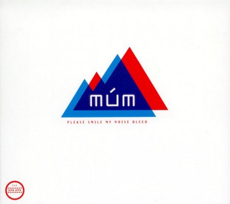
Mum4 stunning and steady tracks for a monday afternoon, i’ve included more Studio which I re-fell in love with over the weekend and some recent purchases of tracks that I only had on vinyl. The Underground Resistance track is a must listen if you want to get a taste of the melodic side Detroit Techno.

Múm – Flow Not So Fast Old Mountain Radio

[audio:flownot.mp3]

Studio – Origin

[audio:origin.mp3]

Aeroplane – Aeroplane

[audio:aero.mp3]

UR – Abandoned Building In Mono

[audio:mono.mp3]

+81 Magazine

pluseightyone
pluseightyone4
pluseightyone3
pluseightyone2
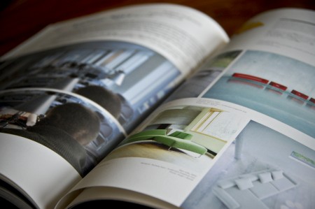
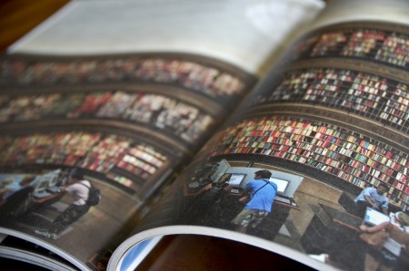
I had a chance to travel to Japan last June and I came back with many new sources of inspiration. I spent a lot of time digging through little design shops and actually had to leave some clothes behind to fit all of the great books I found. One of my favorite finds was +81, an interview driven magazine about graphic design, fashion, photography, cities, etc. They present a ton of work in each issue and it can be a great source of visual inspiration when you are looking for something stylistically very different than what you see in most American design publications. With articles presented in both Japanese and English, you see a lot of very creative layouts and unique type treatments. They experiment quite a bit, and with each issue focusing on a different theme, you never really know what to expect. Definitely worth checking out if you’re looking for a change.

You can usually find it at Japanese language bookshops here in the States (I know Kinokuniya carries it in SF), or you can check out their website for subscription information. (Currently about 40% of their readership is outside of Japan)

OZ And Other Scenes

oz14cov
oz07cox
oz06cov
oz21cov
oz17cov
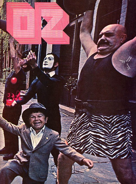
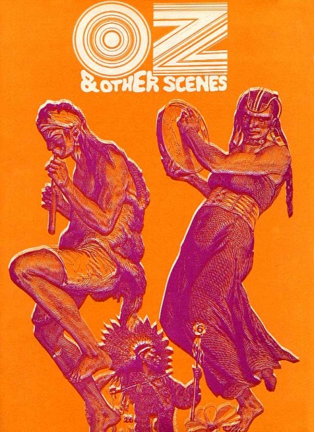
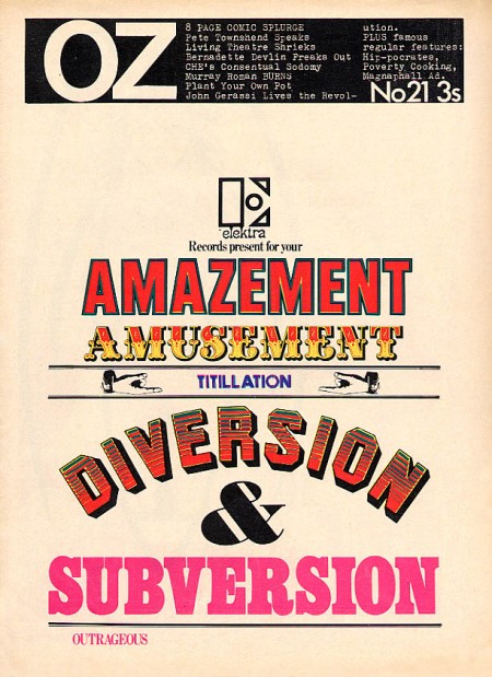
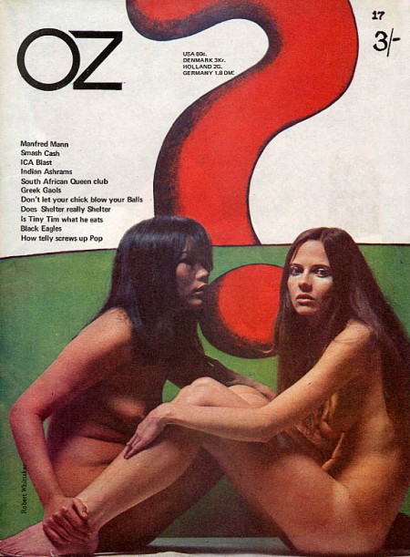
I love the 60’s because everyone was tripping balls all the time and then they would come out with crazy magazines to prove it. Case in point: OZ. These covers need no explanation, they are simply incredible. The overall idea of the magazine is definitely reminiscent of Avant Garde, but a lot of Herb Lubalin’s work seems somewhat tame and reserved compared with the over the top stuff (at least for the time) we see in OZ. My favorite cover is the one featuring The Doors “Strange Days” album photo with maybe the most awesome magazine logo ever slapped right on top of it. Also, the date and cover info are printed in the weight lifter’s armpit so that’s a bonus. It must have been nice back then when all you had to do to “freak out the establishment” was put some naked girls or a midget with circus people on your cover.

OZ started out as an Australian satirical humor magazine but then moved to the UK and began life anew as a “psychedelic hippy” magazine (I am sure the genre was overflowing at the time). Featuring art by Hapshash and the Coloured Coat and design direction by Martin Sharp, issues of OZ have become collectors items in the years since it’s demise [source].

You can browse cover scans of all the of UK issues of OZ here. On a side note, Google books features the some of the text of “Graphic Design: Reproduction & Representation Since 1800” which makes mention of OZ and Sharp.