Archive for February, 2009

Dropular: 24hr. Beta Signup

dropular
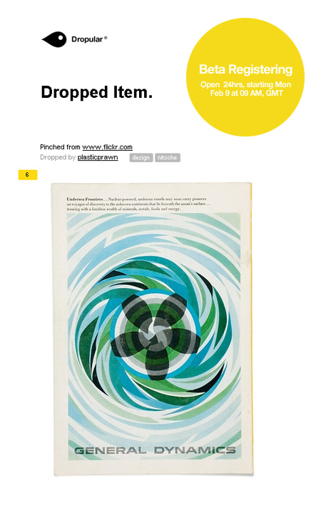
If you’re at all familiar with the excellent FFFFOUND and it’s ilk, you’ll no doubt recognize Dropular as yet another social bookmarking site. I’ve always enjoyed FFFFOUND and it’s clever grouping, it’s really easy to just keep digging and finding more and more good stuff over there. But I guess I missed their public sign up phase (if there ever was one) because I never got my own account and was never able to participate. So when I heard about this new site and last week’s beta I jumped at the chance. The good news is they have opened the beta up for another 24 hours which spans all of today (Monday, Feb. 9) so anyone can join in (just click “register”).

Dropular has a slick interface and an ever slicker bookmarking system which is absolutely seamless and dead simple (click for video demo). I am not sure if Dropular will suffer for it’s open registration model — I always felt the exclusivity of FFFFOUND served it well — but at the very least, Dropular is a great way to organize all the images and video you love. You can follow my Dropular stream here (there’s not much up yet but I’ll be adding every day).

Layer Tennis Starts At Noon!

00
01
Update: My opening serve is live here.

Today’s Layer Tennis match starts with my serve in 20 minutes (noon PST)…Don’t miss it! Layer Tennis: Around the World In 10 Layers

Bishop+Deodato+Starbuck+Mangione

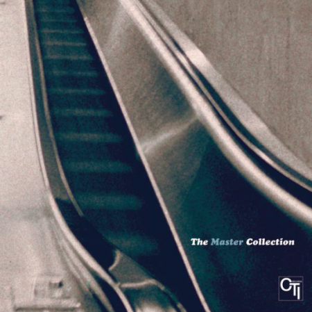
DeodatoFirst of all, i’m going over this Deodato(which is the cover art above) live version of Do It Again and I realized I heard the best thing ever which is just ONE guy whistling really loud in the middle a key solo like it was the only record he had at home. These 4 tracks have something in common other than just being old, you can file them all under Yacht Rock which is an amazing genre of music if you like your brass section epic, your bass guitar lines soft and smooth, your keys saturated like off white stage light glare and most importantly strings being played like your in a 70’s spy movie chase scene in speedboats. It’s an easy genre to rip on i’m sure for people that don’t dork out on the certain instruments that I mentioned before but if you take all the labels off of it or any bad memories then this music has a lot to offer in my opinion.

Stephen Bishop – Save It for a Rainy Day

[audio:rainy.mp3]

Deodato – Do It Again

[audio:doitagain.mp3]

Starbuck – Moonlight Feels Right

[audio:moonlight.mp3]

Chuck Mangione – Give It All You Got

[audio:giveit.mp3]

SF Chronicle Redesign: Archer

dsc_0027
dsc_0051
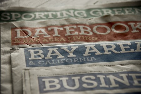
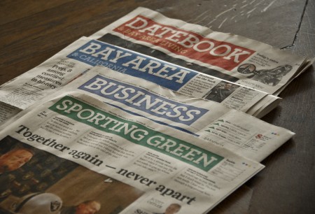
The San Francisco Chronicle just unveiled a redesign of their print edition this past Sunday. According to them, the new look is “brighter and more modern” and retains “its distinctive, classic character.” I’ve never felt like the Chronicle was fantastically designed, but this most recent incarnation is definitely a step down for me. The colors give it a USA Today-esque vibe, and I don’t feel like I can take it seriously at all.

Central to the new look is the incorporation of Archer, the “colorful slab serif” by H&FJ, as their principal headline typeface. I like Archer, always have. I really like the ball terminals on some of the uppercase letterforms, and I think they did a great job crafting a distinctive and more exciting slab serif. I’ve found it very useful for clients that want to look reliable, safe and friendly, and still seem unique and exciting. Given my general fondness for the face, I was surprised to feel such disgust when I saw Archer staring back at me on Sunday morning.

I think it’s a combination of things that ruined Archer for me. First, it’s played out. As much as I love it, I see it everywhere these days (assignments at school, adverts for just about every paper company, home and garden magazine, etc). That sort of typeface proliferation is fine for something like Helvetica, but Archer is too distinctive to work in so many different scenarios effectively, let alone a national newspaper. It reminds me slightly of what happened to Papyrus over the years. It was distinctive font that was rendered completely useless by millions of people browsing through their font list and picking the most “unique” looking. Of course, Archer is not included on your computer when you buy it, or as specialized as Papyrus, but a similar thing seems to be happening at least to some degree. Either way, I was sad to see two things ruined for me on Sunday morning: Archer and the SF Chronicle.

What do you all think? Is Archer the next Papyrus? Any Bay Area readers still receive the print edition of the Chronicle and like the redesign? Let us know in the comments.

AP Sues Shepard Fairey

3212113517_91c971bb1b_o
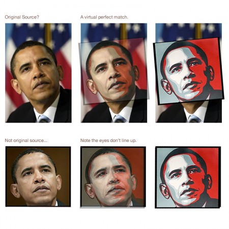
It was only a matter of time I guess. It seems like we just learned the source of Shepard Fairey’s iconic image for the Obama campaign and now Fairey himself is being sued by Associated Press for his appropriation of the image. This is when sorting out exactly what qualifies as “fair use” starts to get a little tricky. Fairey says he didn’t make any money from the image (frankly, I don’t see how that’s possible, but I’ll give him the benefit of the doubt), but AP alleges he made a boatload of it. Whatever the case may be, credit is due to the original photographer, but I don’t believe Fairey should be held liable for his use of the image. I think it could be — and hopefully will be — successfully argued that Fairey modified the image sufficiently. What do you think, does vecotrizing and coloring an image go far enough to differentiate the artistic product from the source? Sound off in the comments.

Update: Supertouch has posted a sort of official response to the general criticism Fairey has endured of late. Definitely worth a read if you took the time to read all the detractor’s sites.

Image via stevesimula

Obama Logo Design Event

260785015
Sol Sender and Scott Thomas, the minds behind the Obama logo, will be in San Francisco in a couple weeks to talk about the process and development of the campaign. (Recall the Obama Logo Design videos that circulated a while back) I love hearing designers talk about their work, and even though I’ve heard just about everything possible regarding this logo, it should be interesting to hear them explain and answer questions about their process, in a live setting. The event is free. Register here.

Designing Obama
February 19th / 6-8:30pm
Morgan Auditorium
491 Post St at Mason
San Francisco, CA

Layer Tennis Tomorrow

lt
I’ll be participating in my second Layer Tennis match tomorrow, Friday, Feb. 6th (here is an archive of my first match). For the uninitiated, Layer Tennis is a live event where two designers volley a .PSD file back and forth, adding to the image each time and playing off their opponents work. All of this is commentated in real time by the event organizers — Coudal Partners — at the Layer Tennis site. This will be the season opener so the format will be a bit different. They’re calling it “Around The World” and this time there are ten players who each play in succession, based on their global location. Here is the list of players with serve times (Chicago — where Coudal is based — time in parentheses):

Layer Tennis – Around The World – Friday, Feb. 6th, 2009
Scott Hansen – Noon in San Francisco (2:00 CST)
Armin Vit – 3:15p in New York (2:15 CST)
Evan Melnyk – 3:30p in Montreal (2:30 CST)
Tom Muller – 8:45p in London (2:45 CST)
Adriana de Barros – 9:00p in Lisbon (3:00 CST)
David Rondel Cambou + Nathalie Melato – 10:15p in Paris (3:15 CST)
Armin Osmancevic + Werk – 10:30p in Stockholm (3:30 CST)
Briana Bolger – 11:45p in Kiev (3:45 CST)
Jose Illenberger – 6am Saturday in Manila (4:00 CST)
Fanny Khoo + Tom Merckx – 6:15a Saturday in Singapore (4:15 CST)

You can catch all the action live at the Layer Tennis site.

Random Crouwel

st23_a1
crouwel_new-alphabet
wc
httpv://www.youtube.com/watch?v=I5y3px4ovxE

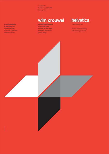
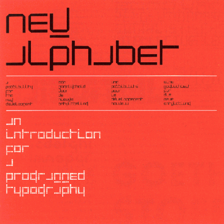
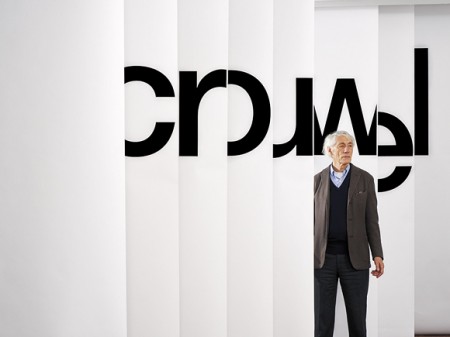
Just some random perfection from Mr. Crouwel for a perfectly random Thursday. Experimental Jetset has an interesting article about the invitation shown above (the third image down).

Ghostly Swim Official Release CD/Digital

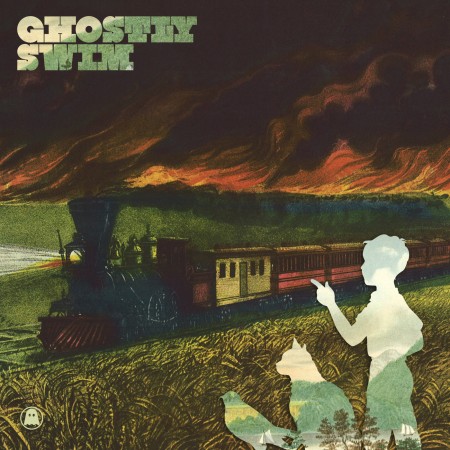
Ghostly Swim compilationWe have written about this release before here with the Tycho free single and here with a bit more information about the project, now after the free download its officially out in digital retail stores with an exclusive Solvent track and available in physical CD format. Here is what Ghostly International had to say about the release thats #5 on iTunes Electronic charts – “Cartoon Network’s genre-defying [Adult Swim] programming rearranges comedy’s basic building blocks into oddities like Aqua Teen Hunger Force and Tim and Eric Awesome Show, Great Job!; Ghostly International’s artists scramble the language of dance and pop music into something strange and artful. It was only a matter of time before the two found each other and made adorably freakish babies.

The Ghostly Swim compilation is a collaboration between Ghostly International and [Adult Swim], a 20-track mix (curated by label founder Sam Valenti IV) of tracks from Ghostly’s avant-pop mainstays like Matthew Dear, Michna, and School of Seven Bells, alongside kindred spirits like Milosh, FLYamSAM, and Mux Mool. Ghostly Swim’s best tracks embody the label’s trademark mix of playful darkness and irreverence – Deastro’s lurching robot-rock anthem “Light Powered,” The Chap’s bizarro-world pop hit “Carlos Walter Wendy Stanley,” Michna’s slinky-smooth “Triple Chrome Dipped” – making them an ideal accompaniment to, say, pissing in your pants over Harvey Birdman: Attorney at Law.

Ghostly Swim was initially released in early 2008 as an exclusive free download on [Adult Swim]’s website. Now, the groundbreaking compilation is available both on iTunes and as a limited-edition CD (available only through the Ghostly Store, free with a purchase of $20 or more), and includes a bonus track: Solvent’s banging cover of Madonna’s “Hung Up.””

FLYamSAM – The Offbeat

[audio:offbeat.mp3]

Deastro – Light Powered

[audio:powered.mp3]

Mux Mool – Night Court

[audio:nc.mp3]

Michna – Triple Chrome Dipped

[audio:dipped.mp3]

Objectified Film

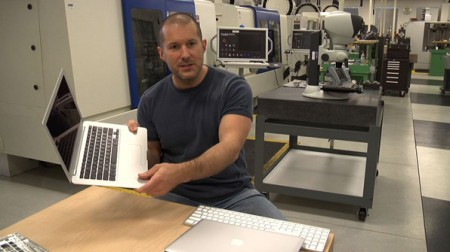
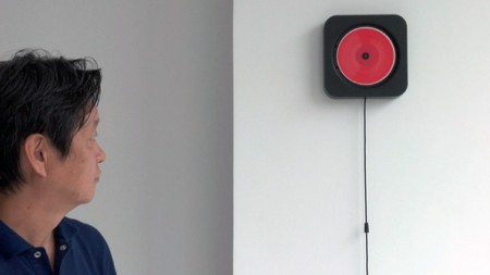
ive2naoto3httpv://www.youtube.com/watch?v=S9E2D2PaIcI

Objectified, the upcoming documentary on industrial design by Gary Hustwit, will be premiering soon at the South by Southwest Festival in March. It will take an in-depth look at the designers and creative processes behind some of today’s most popular objects, and should provide a great introduction into the field of industrial design.

I enjoyed Hustwit’s last film, Helvetica, and I thought it was a great way to give the general public some perspective on the world of graphic design. I am constantly asked what graphic design “is” by friends and family, and it was nice to have a film I could show them that pretty much summed it up. It was also interesting to see how the film’s release affected the use of Helvetica at school. Despite the fact that it was ubiquitous already, students suddenly became afraid of using it at all, for fear of further saturating the design community with more Helvetica, or doing something predictable.

I’m sure a lot of you will have heard of the release by now, but be sure to keep an eye out for a screening in your area. The fantastic Sundance Kabuki Theater, here in San Francisco, will be showing it on April 21st, with a Q&A with Hustwit to follow. More dates and screening information can be found on the Objectified site.