Archive for April, 2009

Mark Weaver

777071240244096
The Rosette Nebula (H-alpha)
7770712404991021
The above are from Mark Weaver’s Make Something Cool Everyday project. I’ve seen a number of these types of projects, especially on Behance, and Mark consistently has some of the more impressive results. The top image is my favorite by far; drastic big/small differences in type always appeal to me when done well.

I’ve never really put my daily “coolness generation” skills to the test; I usually make something cool over a period of weeks or months. Once I have a visual aesthetic defined, I can churn out work pretty quick, but the development of this always takes at least a week. Maybe I should start my own ‘everyday cool’ project to speed up my workflow…

Flying Lotus – Live At Plastic People

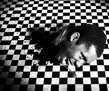
Flying Lotus - Saccenti photography
While Scott was in New York for F5 we got a chance to meet up with Tom Croose, Eliot Lipp, Mux Mool and head over to see Kode 9 and Flying Lotus play live at his new monthly in New York called Brainfeeder which is held at Club Love. I wish I could explain the energy and sound in that room and the heat too but maybe what’s best is if I post this live set of Flying Lotus from Plastic People so you can get a taste. The mix starts really becoming proper right around the 12 minute mark and on, if anyone has a track ID for the first song i’d greatly appreciate it because i’ve been pulling my hair out trying to find out.

Flying Lotus – Live At Plastic People 04.05.09

[audio:k9fl.mp3]

Your Business Card is Crap!

why1
httpvh://www.youtube.com/watch?v=4YBxeDN4tbk

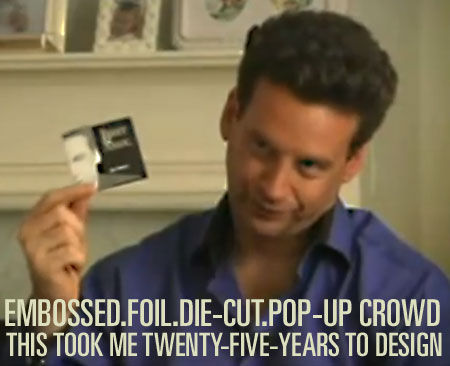
Hilarious, this guy is like the Tony Robbins of business cards or something. “It took me TWENTY—FIVE—YEARS to design this.” Link

Maya Lin – Lecture Series

sur1
05kino3_650
picture-21
05kino2_650
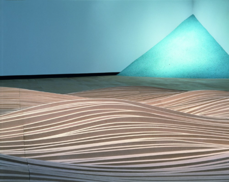
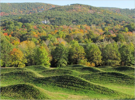
I saw Maya Lin speak this past Tuesday as part of the City Arts & Lecture series. The event was in part sponsored by the California Academy of Sciences and was a conversation between Maya and the Academy’s Ryan Wyatt, Director of Science Visualization. They walked through many of Maya’s projects, old and new, and discussed her approach to art and science. Much of the work that was shown (some of which is pictured above) I was not familiar with. As I am from Washington DC, I have always been aware of her design for the Vietnam Veterans Memorial. I was very much impressed with the way her work has evolved since then. (She was only 20 years old when she designed it.)

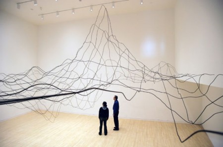
Science plays a major role in the work she is doing now. She is very intellectual in her approach and conducts a massive amount of research for each project. For example, her first of two pieces for the Academy of Science, entitled Where the Land Meets the Sea, was based on data from a US Geological Study mapping the topology of the San Francisco Bay. As with her Systematic Landscapes, she takes great care to humanize this data and give it new depth and life. The piece looks like a drawing, floating in space above the terrace, and she describes this melding of art and science as a “way to visualize our world in an effort to more fully understand it.”

Maya has a tremendous passion and curiosity for the world around her. She surrounds herself with mountains of research and works tirelessly to translate cold hard facts into more accessible and relatable pieces of art. Some of this stems from what she calls a “child like curiosity” to just see what it will look like, but there is also a very political aspect to her work. She wants to make people aware of the environment they take for granted, and she said a few times, “If we can’t see it, we pollute it.” Through constant collaboration with scientists, Maya is trying to help us see what we’re missing.

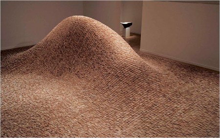
The work pictured above is: Systematic Landscapes (2), Topologies, and Wave Field, all of which can be seen on her website. All are very experiential, something she laments is lost in the stillness of a photograph. Better to visit in person if you can.

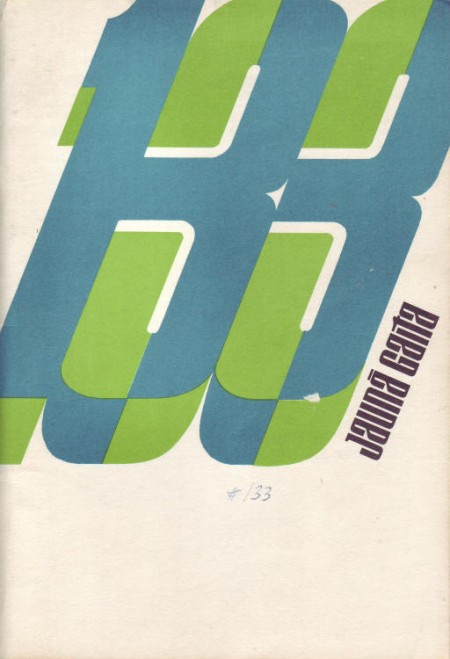
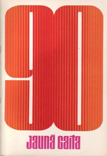
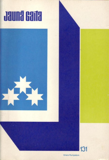
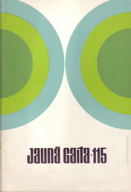
Jauna Gaita 90/115/131/133

jg133_vaaks
jg90_vaaks
2391569107_ae2d88ce79_o
2391524967_b3a624f110_o
Some more great covers from Mikus Vanag’s Jauna Gaita archive. Sooooo good.

Rick Wade – Harmonie Park Revisited

Rick Wade
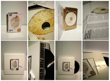
Michigan’s Detroit House producer Rick Wade has worked with musician’s like Kenny Larkin and Theo Parrish over the years and the label Rush Hour has compiled a wonderfully detailed compact disc of some of his big hits. This all takes me back to some of the first vinyl I ever brought when I started DJing in 1997, just that faster disco house that i’d buy up at Melodies and Memories out in Detroit, MI. The tempo isn’t a trendy one and neither is the sound and that’s made me want to spotlight just this album alone, I hope you can find something special in this 70’s funk/disco style of midwestern house as I did.

Rick Wade – Fade Away

[audio:fadeaway.mp3]

Rick Wade – Pimp Factor

[audio:pimpfactor.mp3]

Rick Wade – Contact

[audio:contactrw.mp3]

Some Vintage Film Titles

laura1
sisters1
susp0
susp14
susp15
contempt6
bluelagoon10
wait21
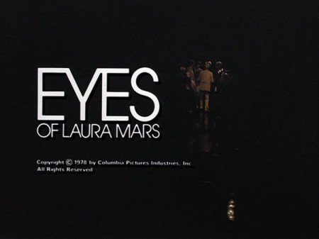
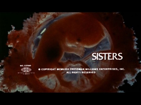
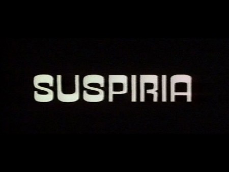
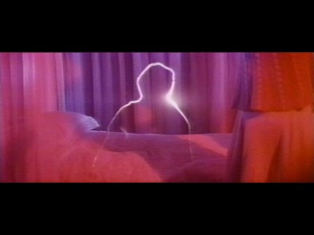
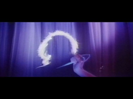
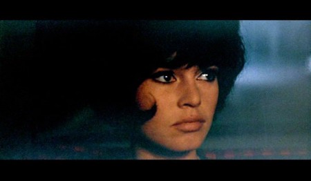
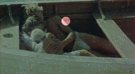
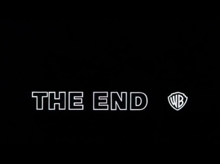
Came across this today via @grainedit’s Twitter. The I <3 Hot Dogs Blog has some great stills from classic films up. I love how type renders when it’s hand set and transferred to celluloid. If someone could make a filter that lent that perfect edging effect to type in Photoshop I’d be the first in line for it. I once met a guy who printed out all his type first, then photocopied it with an old Xerox, then scanned it back in. He got great results, I need to find a way to do that with film.

Images From Where? and By Who? Part. I

IFW?001
IFW?002
IFW?003
So we all download and save images of items, graphics and photos from the internet daily and some of the time you have no idea where to give credit besides maybe the guy that posted it first or second randomly on a blog. I ‘d like to get some answers on a few of these but also just post some interesting pieces that we come across that might have been sitting on our drives for awhile that are go to for inspiration or just found randomly on a forum with no info attached and just look great. Either way hopefully the point that gets across here is that they are inspiring in some sort of way to you as well.

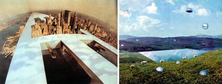
For the 3 images up here: the first one we’ve tried to replicate for an album cover for Shigeto, the second one always grabbed me and made want to put blurry dust spots on everything, the third one is perfect looking, if you could see it on a large screen it’s just stunning in detail, i wish i would illustrate like that, reminds me of Scott’s post a few weeks ago with the space colony.

Maybe while you rack your brain looking for who we should give credit to for doing certain designs you can listen to one of my favorite songs by someone I can’t believe we haven’t posted about but its good because we can spotlight him here on this post.

Outputmessage – Sommeil

[audio:sommeil.mp3]

Objectified – San Francisco Premier

rams2
bangle2
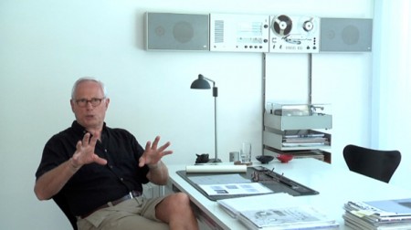
I had the chance to go to the San Francisco premier of Objectifed last night. It was the first of four screenings here in the city, and part of the film’s journey as it makes its way around the world, showing in over 100 cities. After the screening, there was also a short Q&A with the filmmaker Gary Hustwit and a few designers from the film. It was sold out, as it is for the two showings tonight, but if you’re in the area, it’s definitely worth going to check out anyway. There were more than a few open seats and I think they release a few tickets at the door. If not, Gary mentioned it would return in June to the Yerba Buena Center, and possibly release on DVD later in the year (though this seems really soon).

I feel like it takes two viewings for me to really formulate my opinion on a film, but my initial reaction to Objectified is very positive. I really enjoyed it and came out a lot more inspired than I was going in. Hustwit has a very accessible style; he is able to quickly engage the viewer regardless of prior knowledge or experience. His subject choice is fantastic as well, and he captures some poignant and salient remarks from incredible minds working in the field. My favorite segment was probably the one on Marc Newsom (or maybe Rob Walker) but it’s hard for me to remember. I wish I could have taken more notes!

When I posted on the film a while back I didn’t really have any idea what the film was actually going to be about. I had heard it was about industrial design but that was about it. After the screening tonight, I’d say it’s really about everything; design in a general sense. (Interestingly, the term “industrial design” only occurs once or twice.) As with Helvetica, what is said about the chosen arena of (industrial) design can really apply to all design fields. Discussions of utility, objectivity, and efficiency come up regardless of whether or not you work on paper or in steel. The film is really about design thinking and the creativity designers bring to whatever problem they are solving. There was a mention, and I forget by whom, that designers are the philosophers and intellectuals of the future. For me, this sums up the film. Sure it focuses on industrial design, but the real takeaway is that designers are becoming increasingly valuable to society for their way of thinking and problem solving, not just for making pretty objects.

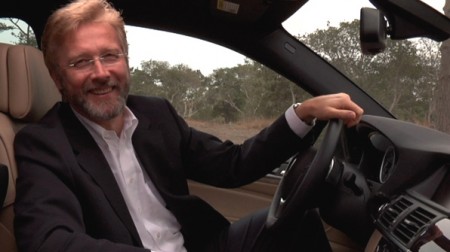
Comparisons with Helvetica are inevitable, and the one thing that Objectified was missing was an opposing perspective. Erik Spiekermann had an unforgettable segment in Helvetica that pretty much made the movie for me. His passionate hatred of the typeface was not only hilarious and entertaining, but also extremely valuable in that it provided a counter-argument to make the film more well rounded. Objectified is very optimistic and hopeful, and it stays this way throughout the entire film. As one of my classmates pointed out, there is no downer interview that provides an alternative perspective. Everyone is drinking the Kool-Aid so to speak. Regardless, it was fun to discuss this issue with my classmates after the film, and I would really recommend seeing it with fellow designers.

Seeing it in San Francisco was definitely a treat. The design community here feels very small, and I love it when there is an event which brings a lot of us together. After the film, everyone emptied out onto the street and hung around discussing the film and design in general. You could really feel the energy of so many people being creatively inspired all at once. I felt really excited and proud to call myself a Designer.
1976 Reprinted

iso50-1976-heather
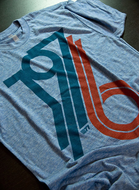
It’s hot as hell but luckily the summer-friendly tri-blend edition 1976 Heather Blue shirt by ISO50 is back in stock! Get them while they last this time, it’s going to be a long summer… Link