Archive for July, 2009

EMRG+N+SEE 2009

iso50-emrgnsee09
I’m flying into Portland tomorrow for the Emrg+N+See Festival in Macleay, OR (outside of Salem). The event goes from Friday-Sunday and I’ll be playing a Tycho/ISO50 set with visuals Sunday night. From the looks of the lineup it’s going to be a great show (see below). The full schedule with set times can be found here.

Performances by:
# Flying Lotus
# Daedelus
# Plastician
# Blockhead
# Sean Hayes
# Gift of Gab (of Blackalicious)
# Lazer Sword
# Random Rab
# Tycho
# Sub Swara
# Mochipet
+ More

See you out there…

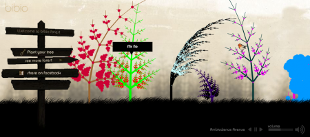
Plant a Tree in Bibio’s Forest

Bibio forest
Bibio / ISO50
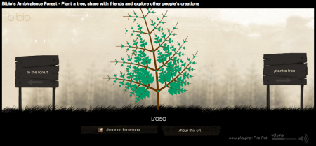
Warp and Bibio made a pretty interesting flash interactive site for the new Bibio album which allows you to listen to songs while creating a tree in Bibio’s digital forest, I made one really quick for ISO50, definitely nice promo and worth checking out. Bibio’s Forest

Sebastian Gram / Hello Monday

Picture 2
Picture 3
Picture 1
892641233871995
892641233932952
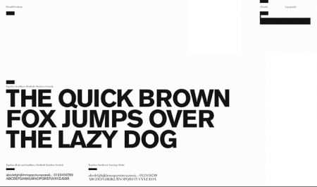
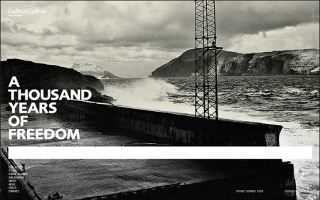
Seriously impressed by the diverse portfolio of Danish designer Sebastian Gram (currently art director of Hello Monday). The first image (interactive design for fashion brand Revolution) made the FFFFound rounds a while back, but it wasn’t until recently that I explored his portfolio further and found the rest of his exceptional work. Each project, whether it’s a logo or full blown identity system, is considered down to the smallest detail. It’s also cool to see process shots along side the finished product; gives you a sense how much time and refinement went into it.

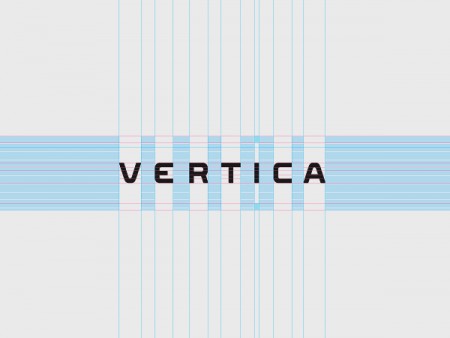
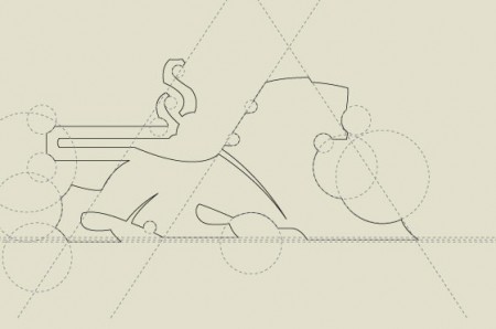
I was especially intrigued by the typeface for Vertica, developed by Gram and Creative United. My guess, based on progress images like the one above, is that it was designed as a custom face for Vertica and is not commercially available. Too bad, those are some sexy letterforms. Like much of Gram’s work, it manages to rock out with a rigid, corporate aesthetic, without being boring or common. I would love to see my name written in that font.

Synth Pioneers Pt. 3: Synth Funk

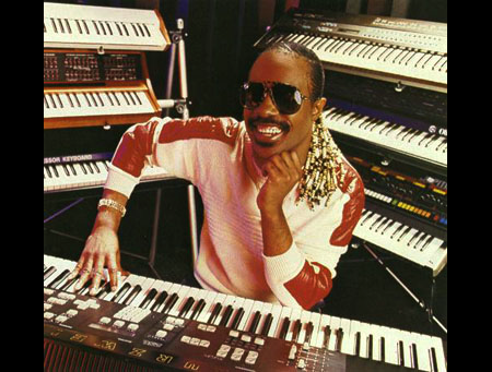
Stevie Wonder

An good intro can really make the song. It can set the mood, erasing whatever else is around you and make you feel safe from the world.  These songs work because they are incredibly funky and use the impossible elasticity of the synth to great measure.

Another reason these songs still feel fresh is because they represent an era where music and technology had reached a new apex. Stevie Wonder’s synth work in the 70’s is considered by many to be the most influential of it’s era, thanks in part to his work with Tonto’s Expanding Headband and their TONTO synth (watch this little documentary), which allowed the funk to show through the machines.

These songs honor that legacy in different ways.

Carly Simon-Why

[audio:why.mp3]

Produced by Nile Rodgers and Bernard Edwards of the all-time best disco band Chic, this was a UK chart hit but never on a US album save for a low-key soundtrack. Not as synthy as the rest, but about as good a pop-disco track as you’re likely to hear, skanking along at an easy clip.

The Brothers Johnson – Strawberry Letter 23

[audio:strawberryletter23.mp3]

A funky version of Shuggie Otis’ deathless original, this cut is synth and bass heaven and helped them reach platinum status. Produced by Quincy Jones no less.

Dexter Wansel – Life On Mars

[audio:lifeonmars.mp3]

Dexter Wansel was on Gamble And Huff’s famous Philly International label. Ann Arbor/Detroit legend DJ Carlos Souffront sold me this re-issue at Osborne’s record store in Ann Arbor years ago and it never sees the shelf. The cut breaks into some super funky disco heat, but that cosmic intro makes this one truly staggering.

Yarbrough and Peoples – Don’t Stop The Music

[audio:dontstopthemusic.mp3]

Greatest bassline awards #1 and sits between genres pretty niftily. 1980 was a MONSTER YEAR for synthy funk, the R+B charts were producing some great tracks, fast and slow. Boogie music is getting some love thanks to revivalists like Dam Funk, and with good reason. Feel this video.
GoWithTheFlowEnzo

time_stood_still_by_GoWithTheFlowEnzo
amsterdam_again_by_GoWithTheFlowEnzo
follow_these_directions_by_GoWithTheFlowEnzo
together_by_GoWithTheFlowEnzo
we_fly_balloons_2_by_GoWithTheFlowEnzo
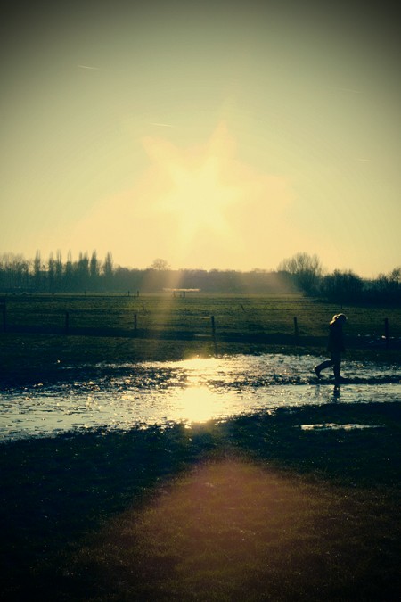
I came across Dutch photographer GoWithTheFlowEnzo’s work (not sure of his real name, only says “Robin” on the page) the other day and I’m really enjoying the color and style. According to the EXIF data he used a Canon EOS 450D for most of the shots. The crazy part is that he took a couple of them with a little Canon IXUS. See if you can spot which ones without looking at the EXIF.

Mig Reyes: Blog Wars Poster

poster-blog_wars
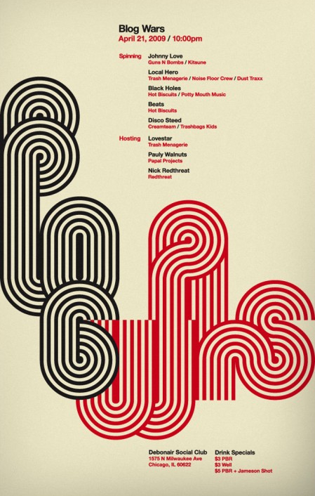
Not sure what Blog Wars is/are, but enjoying this poster by Mig Reyes all the same. Three more colorways at the bottom of the page here. for By the way, don’t look up “Blog Wars” on google if you’re at work.

Canyons+Lusine+Dark Party+Mountains

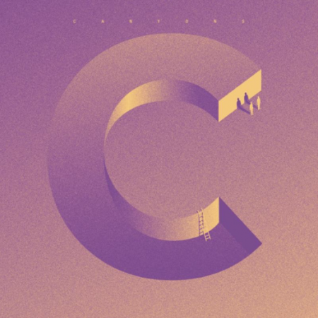
The Canyons - The Lovemore EP
Australian’s like The Canyons have been putting out some great disco as of late, really good rhythm and guitar additions, really gives the songs this authentic non digital feel.

One of my favorite Lusine songs has to be Rushhour, its one of those songs that pays off if you listen to it from start to finish, no patience with the beginning will get you nowhere. Once you get to the 4 min mark you’ll know i’m talking about but the only way to truly enjoy it is listening to the detail in the build up to it, it literally sounds like the a thousand knifes being sharped by your ears while you try to run away from the highest quality low end that monsoons over your precious town.

Eliot Lipp and Leo123 collab again since their original material debut on Ghostly Swim and leak a cutup west coast indie club bomb for their North American tour, real solid work by the two.

Mountains sway the Thrill Jockey catalog up another step on the quality end by unleashing an absolutely phenomenal droned out LP, the real pleasure hear is having the whole LP and playing it start to finish, highly recommend atleast having the song Telescope.

The Canyons – Apples and Pears

[audio:aap.mp3]

Lusine lcl – Rushhour

[audio:rushhour.mp3]

Dark Party – Status

[audio:status.mp3]

Mountains – Telescope

[audio:telescope.mp3]

The Graphic Design Thesis

plan
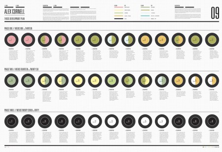
As of this summer I am officially halfway through my graduate design program at the Academy of Art. Unlike a BFA degree, the MFA requires the completion of a thesis, and the second half of the graduate program is dedicated to the development of this. The most recent checkpoint I had to clear was Midpoint; basically a review of your work and skills to date, as well as a clearing ground for your upcoming project. It’s a pretty exciting meeting actually; you place all your work on the table, in front of a faculty committee, and they determine whether you are fit to continue. The main focus of the meeting is your thesis proposition. Before they allow you to embark on a 1-2 year thesis project, they want to make sure your idea is viable and worth pursuing.

I am past the Midpoint stage now and am in a class called Thesis Development this summer. It is a very different class than those that I’ve written about previously. Rather than creating a series of graphic design based projects, we are spending all of our time researching and strategizing how we are going to go about the next few years. I always picture that scene in Apollo 13 when they are trying to get back to Earth and only have one chance to fire their rocket boosters to enter the atmosphere at the correct angle. It is extremely important that they get their aim correct, else they bounce off the atmosphere and careen into space and die. I think of this class as that moment in the space flight; we are aiming where we want to go before firing our boosters over the next year and trying and pull off a successful project.

Above you see a piece created for the class. It is a piece of design, as everything we bring to school must be, but the main purpose of the document is to chart my progress over the next year. It divides the weeks up into sections and outlines what I should be doing when. I expect it to change many times over the course of the coming months (it’s already way off base), but it really helps having a checklist like this to keep tabs on my progress. I have never pursued a project of this magnitude before and the planning involved is unlike any design challenge I have been faced with previously. Most of the time I just open Illustrator and start drawing lines and scribbles until things look cool.

A graphic design thesis is a very interesting concept. The biggest thing I struggled with, as I decided on a topic, was whether my thesis would implement graphic design, and pursue an issue outside the field, or whether it would be about Graphic Design itself, and aim to make waves within the design community. Most projects do the former. We are lucky in this way — because design really can be used to solve just about any problem — but there is the concern that this strategy will be of no relevance to the actual field of study. I still don’t know quite what to make of this dilemma. I have tried to meld the two directions with my project (I’ll discuss details in later process posts), but I am unsure whether it will end up being that much more effective because of this, or if it will fail because I never decided which path to pursue. I guess it’s still too early in the process to know.

Designing Armageddon

574921242075726
574921242076171
574921242075568
574921242076374

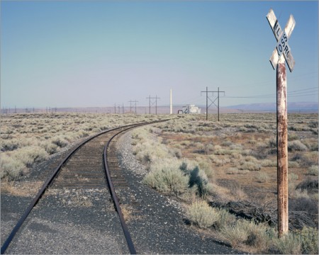
Most have heard of The Manhattan Project — the program lead by J. Robert Oppenheimer to develop the first nuclear weapon — but few have seen what’s left of it. Today I came across Martin Miller’s photo essay — Slouching towards Bethlehem — which gives an inside view of the surprisingly intact facility where the project was based. I was immediately stricken by the aesthetics of this massive nuclear laboratory.

I’ve always wondered how much time and thought is put into the purely aesthetic aspects of military/industrial design. Were the engineers who built this place trying to make it look good? Or am I just appreciating the fruits of design born solely from the pursuit of functionality. At any rate, the photos are excellent and whether intentional or not, the design ethic at work in these facilities is amazing. Link

Mike Cina: Spirit Edit Jazz Mix

mikecinamixcover470
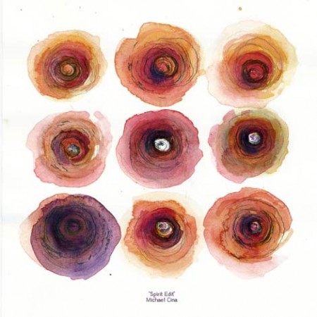
Grain Edit has posted up a very nice Jazz mix by Mike Cina along with a short interview on his thoughts about record collecting and music. It’s always nice to hear what other designers are listening to and being influenced by; it often brings more clarity to my understanding of their work.

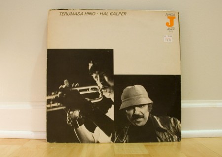
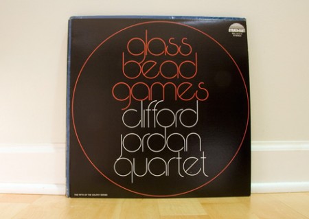
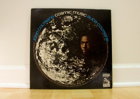
Mike also contributed the custom mix cover you see above and some shots of the album covers for the songs included in the mix (a few are shown below). You can check out the interview and download the mix here.

08
04
02