Archive for July, 2009

Studio Update: July 2009

iso50-studio-7-13-09
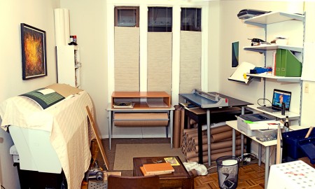
This past month has sort of flown by, I’ve had my head down working on some new posters (one of which you saw a preview of recently) and trying to sort things out around the house. If you’ve been following along you’ll know that I recently got the Epson 9900 large format printer and have since spent a lot of my spare time trying to make a home for it upstairs. I’ve also spent a fair amount of time (as has Alex) bringing together the various supporting elements needed to produce, cut, package, and ship the prints. You’d be surprised how much space all that stuff takes up, the result is that I lost my dining room and now eat at the coffee table in front of the TV. I’ve been kidding myself that I’d eventually move the whole printing operation downstairs into the main studio but today I finally put that delusion to rest and went to Ikea to get some shelves and make it official. Unfortunately I got started a little late so the mess you see above will have to wait until tomorrow. If you look carefully you can catch a couple unreleased prints that will be showing up here very soon.

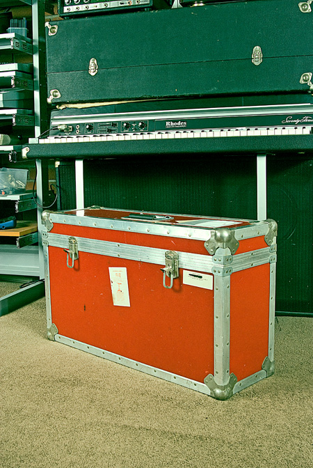
On the music front I’ve been trying to make some headway with the album, which has been slowed a bit by the printer project. As for shows, I’m heading up to Salem later this week for the Emerge-N-See Festival. I’ll be doing a live Tycho set out in the woods (along with Flying Lotus, Daedalus, Plastician and many others: info) where I hope to make good use of this fiberglass ATA flight case (below) I scored at a garage sale this weekend for $30! I was just walking to get coffee and my neighbor had this thing just sitting on the sidewalk; she also threw in a poster case for $10. On the way back I bought a kitchen scale that looks like a prop from a 70’s episode of Price Is Right for $1. The guy I bought it from tried to trade it for the case which he said would “fit his Moog perfect”. Unfortunately for him it will fit mine better.
iso50-ata

Images From Where? and By Who? Part. IV

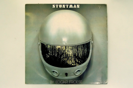
Stuntman
Nasa
squares on waterfall
Here is the 4th installment of “Images From Where? and By Who?” So we all download and save images of items, graphics and photos from the internet daily and some of the time you have no idea where to give credit besides maybe the guy that posted it first or second randomly on a blog. I ‘d like to get some answers on a few of these but also just post some interesting pieces that we come across that might have been sitting on our drives for awhile that are go to for inspiration or just found randomly on a forum with no info attached and just look great. Either way hopefully the point that gets across here is that they are inspiring in some sort of way to you as well.

The first one has to be my favorite album cover of all time but only when someone takes a photo of the vinyl sleeve and it catches this pearly yet worn look and then a slight hue of yellow over the whole thing. Who ever thought of the idea of simply just photographing this white helmet but having that mirrored visor wins an award in my book.

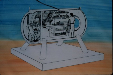
I remember finding this NASA illustration and it inspiring me a lot for awhile for Moodgadget material, I could of gone without the blue and orange crayon background.

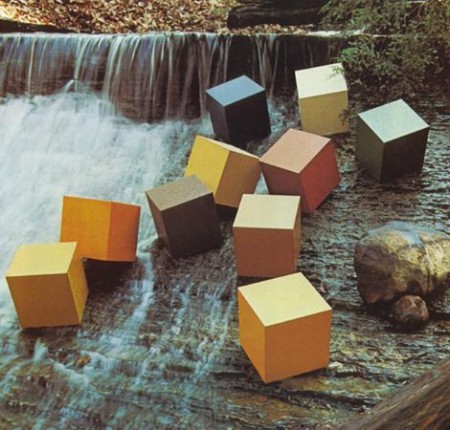
I am pretty sure this “cubes on a waterfall” was an advertisement and if it was i’ll buy whatever they’re selling…especially the cubes.

Dubstep Essential Mix by Guardian

Guardian
Dubstep has been manhandling the electronic scene lately in the States and i’m sure in the UK its even more intense than that and has been for quite sometime now. I think its finally spreading into the “normal” listeners ears, I say it that way so I don’t get too much crap from the true dubstep heads that have been following dubstep since the 90’s or whatnot. Guardian also known as A Setting Sun did a nice job of with this mix by showing the range of how dark to poppy the sound gets plus really capturing a few of my personal favorites.

TRACKLIST
RamadanmanBidding War
SkreamBabylon
TRGMove Dis
HijakNightmares
RSDForward Youth
UntoldDante
2562Kontrol
BengaCrunked Up
Dizzee RascalRound We Go
Kode9Ping
LoefahBombay Squad
The Bug ft Killa P & FlowdanSkeng
BengaE Trips
Magnetic ManThe Cyberman
La RouxIn for the Kill (Skream Remix)
PinchPunisher (Loefah’s SE25 Remix)
SkreamTrapped in a Dark Bubble
Bar 9Midnight
BengaEvolution
Plastician ft SkeptaIntensive Snare
BoxcutterA Familiar Sound
D1Cocaine
Kode9Magnetic City
Flying LotusRobertaFlack (Martyn Remix)
MartynRight? Star!
LDWoodblock
ZombyTest Me for a Reason

DOWNLOAD IT HERE

Guardian – Guardian Battles the Space Invadaz

[audio:guardianmix.mp3]

H34dup: Droit

droit2-600x999i5
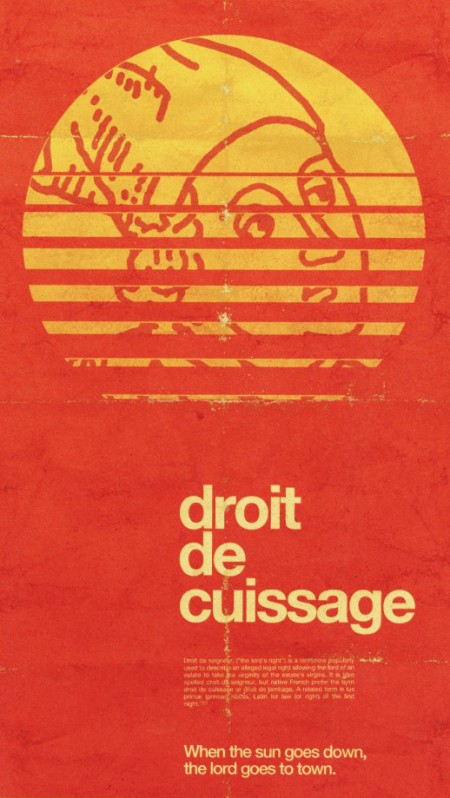
You may recognize Alex Koplin (not to be confused with the Alex who writes for this blog), aka H34dup, as a frequent commenter here. I was checking out his blog today and came across this wonderful image which I just mistook for a vintage piece that Alex had simply blogged about. But after reading on I realized that this was actually created by Alex for Typcut. I see people use textures and aging techniques all the time, but they’re usually pretty transparent and obvious. This, on the other hand, is spot on authentic. Loving the color, type, and composition. This would feel right at home on my kitchen wall or a wine store in the Rhône.

I’ve spent a good portion of my career working on distressing and aging techniques. It’s one of those things that you just shouldn’t even be doing unless you can totally nail it (and that’s not to say I’ve always gotten it right; I cringe at the sight of some of my older stuff). I see people try to use Photoshop brushes to achieve this sort of style but I think if you’re using brushes to distress, you need to turn back because that path leads nowhere. Who knows, maybe it’s possible to get decent results with brushes, I’ve just never never seen it done. That is to say, whenever I see work done with brushes, it always screams “hey, look at these brushes”. Anyways, Alex’s piece is a great example of how to do it right. Now here’s the part where Alex comments and says he did use brushes and I look like an idiot.

Dam Funk+Runaway+Michna+Stranglers

Dam Funk on Stones Throw
We have more from Dam Funk, I just find it perfect for the summer sun. Look for his Toeachizown album on Stones Throw Records, it’ll be hard to miss since its 5xLP’s!

Posted the original of this Runaway single awhile back, definitely feeling this Brennan Green remix though, if you’re ever in Manhattan you should check out his night in Chinatown.

Michna is back from months of touring and turned out new digital EP which includes remixes from Star Eyes, Osborne, and Eliot Lipp. The Osborne grabbed me, also kind of loving the art on the egg.

I’m sure most of you have heard this Stranglers song when you watched Snatch with Brad Pitt, it came up randomly on iTunes shuffle and put me in a great mood especially the last 30 seconds of vocals.

Dam Funk – Toeachizown

[audio:toeachizown.mp3]

Runaway – Brooklyn Club Jam (Brennan Green’s Version)

[audio:clubgreen.mp3]

Michna – Triple Chrome Dipped (Osborne Remix)

[audio:tripleos.mp3]

The Stranglers – Golden Brown

[audio:goldenbrown.mp3]

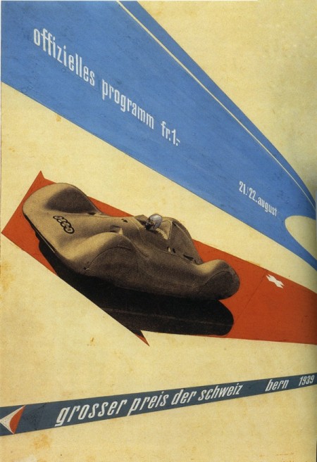
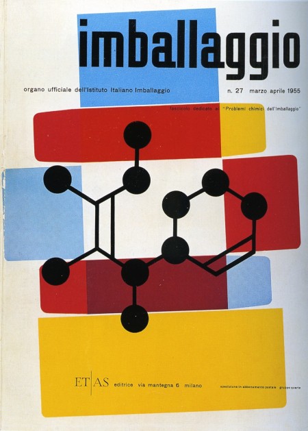
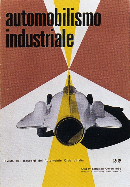
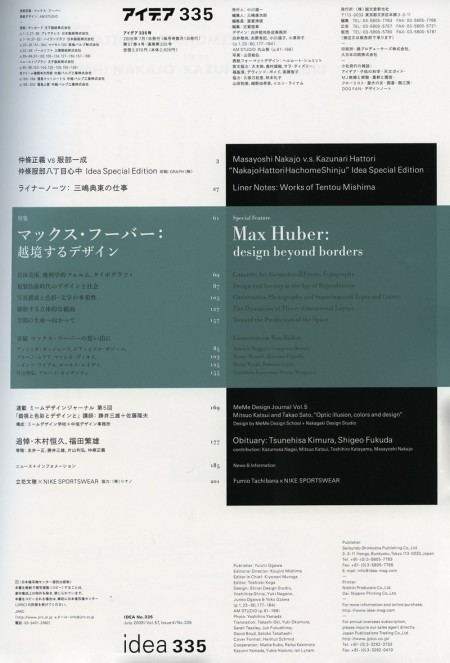
Max Huber Round Two: Idea Magazine

idea1
idea2
idea3
idea4
Immediately after I posted a few Max Huber posters earlier this week, I walked into Kinokuniya and saw that the latest issue of Idea was devoted to the man himself. A fantastic coincidence and even more fuel for my Max Huber inspired creative fire. The issue is huge (about 200 pages) and is filled with some pretty incredible stuff. A lot of work I had never seen before; I put a few of my favorites above (the Table of Contents as well). The issue costs quite a bit for a magazine ($50 eek!) but Idea is certainly of much greater quality than most magazines. Well worth a perusal if you find yourself in a Japanese bookstore any time soon.

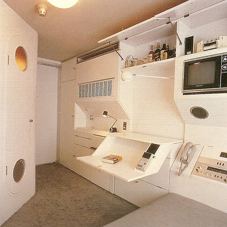
1970’s Apartment

1970's Apartment
Follow up on Jakub’s 1970’s Shopping Malls – check out this apartment! Love the built-in calculator.

Further reading: Nakagin Capsule Tower on Wikipedia (Thanks keoshi)

Datasette vs. Jason Cawood

1095283097_1e27c35a37_o
1084698290_dba5873798_o
1084693828_9721f2be4d_o
2263661853_9c5bf19592_o
2199008738_15082cabd2_o
1767802686_71f2972f3a_o
1423362601_8d1fe72d26_o
449080925_9e331b85d8_o

Dusty was over tonight and we were listening to some Datasette. That along with Jakub’s mention of Jason Cawood’s excellent “Salvaged” set on Flickr got me thinking I need to do a post on both. So it is; most of the songs were cut from Datasette mixtapes by Dusty so they don’t really have official names that I know of.

Datasette – Business Funk 1

[audio:datasettte-dsht1.mp3]

Datasette – Business Funk 2

[audio:datasette-dsht2.mp3]

Datasette – Business Funk 3

[audio:datasette-dsht3.mp3]

Datasette – Minus Fourteen

[audio:datasette-14.mp3]

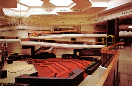
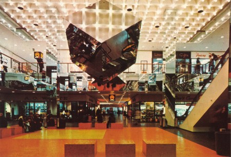
1970’s Shopping Malls

Fairlane Shopping Center Dearborn, MI
bay state west springfield, MA
Some people that you randomly come across like Jason Cawood just go around and collect, take, and share great vintage images that i’ve probably had on my computer for awhile now and I don’t know which images are his or if they’re from someone else, either way these 2 from shopping malls always caught my eye. I feel silly tagging this post “1970s malls” hah! if someone actually searched for that i’d be pretty amazed, now the ISO50 blog has that covered. On a side note, I never remember Fairlane looking soo impressive.

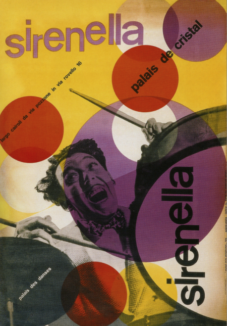
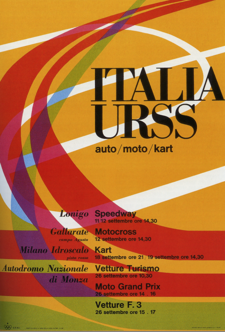
Max Huber

Picture 3
Picture 4
I’ve got a few projects coming up so I’ve been browsing through some of my old design books for inspiration. These two posters by Max Huber kick-started my mind into creative gear. I really like the color palette at work in both; really unusual and effective. The second one is all about the type for me. Didot Bold in all caps always does a good job. I was recently in Switzerland and am really bummed I missed out on the Max Huber Museum. Next time I guess.