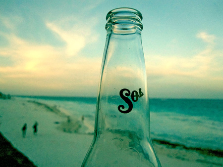
So I’m back home after my nice little break, it feels good. Luckily the weather here in San Francisco today is sunny so it’s not such a huge change from Tulum (although it’s about 20°F cooler). I had a great time and got some good shots with the little Canon Elf but I did miss having my D80 along. It was nice to not have to lug around a big DSLR, but the handheld just didn’t cut it for a lot of the shots. I’ll try posting up some of the better ones this week. Now it’s time to start sifting through the email and get back into work mode…
Archive for August, 2009
Back Home
Emil Ruder
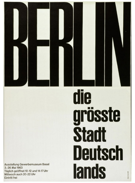
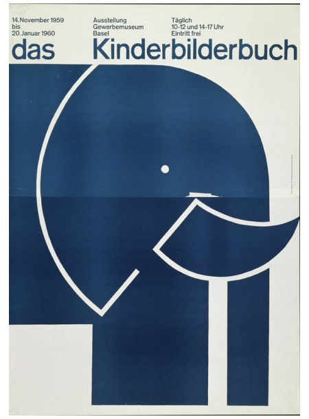
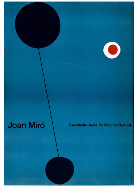
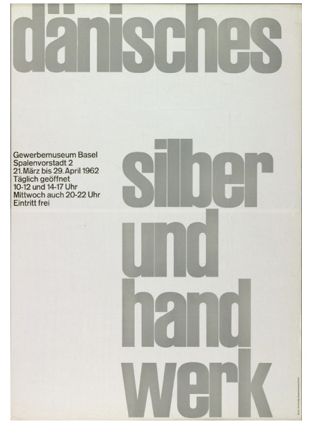
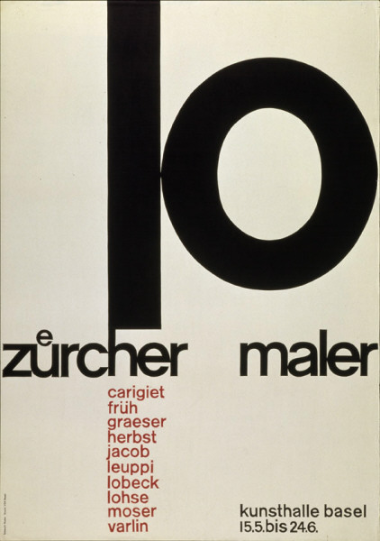
Five incredible posters by Emil Ruder.
via 80magazine.
Continuous Lighting Part I
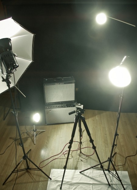
We’ve written before about photographic lighting. Another lighting arena that I’ve recently explored is continuous lighting for video. As I had absolutely no idea what I was doing when I jumped into this, I decided to start with a basic kit set up, and then go from there. I had researched enough to know that I would need at least three lights, but I was fuzzy on just about every other detail. I ended up going with the Smith Victor K84 Photoflood Kit. (Four lights: two A80 flood lights and two, smaller A5s.)
Now to this point, the kit has satisfied my requirements. I haven’t felt like I needed any additional lights on my projects and everything is lit well and looks (more) professional. That said, I have learned a lot in the process about what not to do.
First, these lights get unimaginably hot when they’re on for an extended period of time (more than 5 minutes). I use them in an enclosed room without a lot of ventilation and it can become unbearable really quickly. If you are interviewing someone, or performing under these lights, you need to either get things done fast, or have some way of cooling down your room. I broke a sweat just snapping the above picture, and they had only been on for 10 minutes.
Second, despite the benefits of using continuous lighting for photography (no camera syncing necessary, always see where you’re lighting etc), this kit is not powerful enough to really work in this regard. Unless the lights are right up on your subject, you’ll have to adjust the shutter speed significantly to get satisfactory results. It’s also impossible to get good portrait shots, mainly because your iris gets smaller as it gets used to the continuous amount of light; doesn’t look as cool as strobe. It works for some photo things, but I am mainly attempting to use this kit for lighting video. So far the footage has required a significant amount of color correction to make things look natural. The kit is a tungsten set up, which burns yellow/orange, and that is the color of the footage upon capture. Luckily I’ve been working a lot with Color and have been able to work around this.
The biggest positive to the kit is that it’s cheap (relatively). It helps to know some basic lighting strategy (three point etc), but the kit really doesn’t require much know-how to get up and running. It is a great starter kit and I feel like I have a much better idea of what I need, now that I have fumbled my way around with this one. Of course it will be a while before I can afford a real set up, but in the mean time I am having a good time experimenting and making mistakes. This probably wasn’t the kit of me at the end of the day, but it sure beats lighting things with assorted desk lamps and flash lights.
Stereolab+IdjutBoys+WIGHNOMY+Hammer
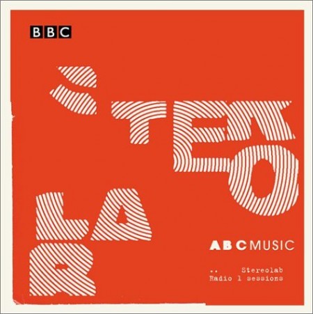
You can never go wrong with Stereolab when you have a small gathering at your place before you head out for the night, its like no one is going to say “hey, come on man, turn off that crap” because that person can just go home.
I’m not sure if Tom Croose ever put this song in his mix since he turned me onto it but this is a better Phil Collins edit than the one with Bone Thugs n Harmony on many levels.
I have not met a dance floor that didn’t like this Wighnomy Brothers song, its about as potent as Metro Area – Miura.
Jan Hammer knew something that a lot of producers didn’t back in the late 80s, its like he almost nailed this comfy Miami sound but then just got off the beat and path with the ok guitar solo and new age chimes but the melody and groove in there in the background probably influenced a lot of the late 20 year old producers today that make slow disco.
[audio:doubt.mp3] [audio:phil.mp3] [audio:1974.mp3] [audio:theme.mp3]The iPods of the 70s
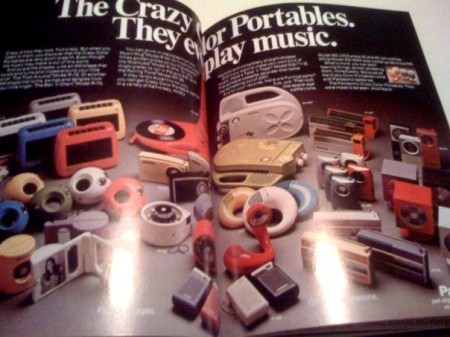
As a collector of 70’s-80’s knick-knacks this selection of portable music players is a dream come true, the thing that makes it for me for the non 70’s fans that might not understand is the color selection and that plastic. It’s almost unbeatable sometimes when in today’s market i’m choosing from gross colors like Beetle shell neon lime green and Bratz doll shiny purple.
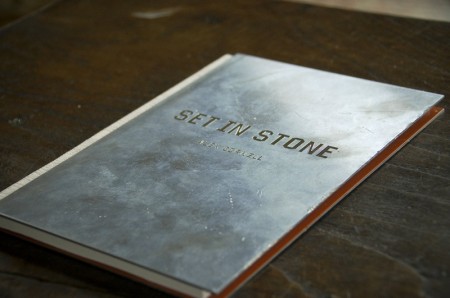
Student Project: Set In Stone
Note: I wrote this process post a while ago about a project I completed last November. There has been so much going on these days that I forgot about it in the depths of my terribly cluttered hard drive. As I have transitioned to thesis mode now, there are less of these sorts of projects in the pipeline. This is one of my favorites I have completed at the Academy thus far and it was interesting to revisit. This is the article in its original form, as I wrote it last December.
Assignment
This semester we were asked to immerse ourselves in one topic and research it through a series of week long projects. The content of each project would be the result of our extensive research, and we were expected to pick a topic robust enough to be worthy of 15 weeks of study. Each project encouraged us to explore different design solutions and helped us hone in on a visual style that we could use for the final project, which would synthesize all of our work into one deliverable.
For the last month of the semester, we were tasked with compiling all of our research into a book that we would write, design, and bind ourselves. It was to have a minimum of 48 pages (6″ x 9″), a hardcover, and provide some meaningful insights about our topic which we uncovered during our semester of research. In addition to providing a worthy and refreshing commentary, it was to be a covetable piece of graphic design that felt visually appropriate for our topic.
The topic I chose for the semester was Mega Cities (urban areas with a population over 10 million people). The original focus of the project was an examination of what makes a city successful — what it is about a massive city that makes it unique. It eventually dovetailed into an exploration of the ways these cities are confronting the problems they face and how increasing populations make solving these problems more complicated and time sensitive. These problems are becoming increasingly relevant as the world’s urban population continues to grow at an unprecedented rate. I flirted with numerous other topics, some of which I thought were quite interesting, but I found that Mega Cities would provide me with the most interesting and engaging material.
