Archive for November, 2009

Synth Pioneers Pt.4: Synth-Pop

Screen shot 2009-11-18 at 2.59.25 AM
httpv://www.youtube.com/watch?v=WeVRYPjcVXg

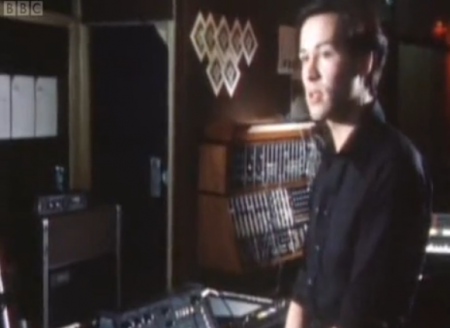
My friend Eli (who needs to do an Italo Disco installment of Synth Pioneers) put me onto this documentary, which is likely the best exploration of the English synth-pop moment. With great interviews from heroes like Daniel Miller, Vince Clark and Martin Gore, it really got my blood pumping so I wanted to write about a few other acts who were originators of the international electronic pop sound.

Kraftwerk – Computer Love

[audio:computerlove.mp3]

Talking about the greatness of Kraftwerk is like talking about the necessity of air, so I’ll keep it short. They just released all of their most well-known albums, remastered and with original artwork. “Computer Love” is one of my al time favorite songs. The way the lead seems to phase shift at the end always takes my breath away. Let’s get this straight: A song about loneliness and computers, made before the internet was invented which glides like classical music? Sounds like a plan.

Yellow Magic Orchestra – Technopolis

[audio:technopolis.mp3]

Yellow Magic Orchestra have been called the Japanese Kraftwerk, in that they were both pop innovators and an awesomely stoic synth band. Ryuichi Sakamoto has since gone on to collaborate with Fennesz and Christopher Willits amongst others. Their work may pre-date synth-pop but it’s surely in the canon of influential works. I often play their hit “Computer Games” if transitioning between sounds in a DJ set. When the beat drops at 1:50, it always lights up the room.

Japan – Gentlemen Take Polaroids

[audio:gentlementakepolaroids.mp3]

A band that is sorely overlooked is David Sylvian’s Japan project, which married glam and (some would say, invented) new romantic aesthetics to synth austerity and elegant arrangements. Their full sound was more complex than their peers and more sinister by a long shot. Recently, Sylvian has also collaborated with aritsts like Fennesz and covered acts like Blonde Redhead with stunning vocal clarity.

Simple Minds – Glittering Prize

[audio:glitteringprize.mp3]

Scotland’s Simple Minds were another band not included in this documentary, probably because they are more associated with the New Wave movement, but like labelmates the Human League, they’re example of a band moving from experimental work to pop success. Their work became increasing U2-like and less electronic, but this track captures them at the peak of a rewardingly sweeping sound, with pitch-perfect production to boot.

Parts 1, 2, and 3 of the Synth Pioneers series can be found here.
JOYN:VISCOM Workshop: Natural World

2009.4.30_16.48.20_7617
2009.4.30_17.17.16_1182
2009.4.30_17.14.20_9698
2009.4.30_17.15.53_4306
2009.4.29_17.55.44_8905

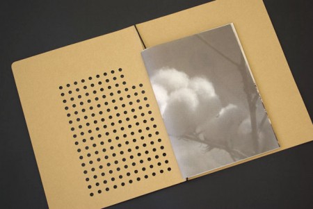
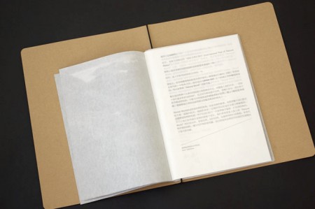
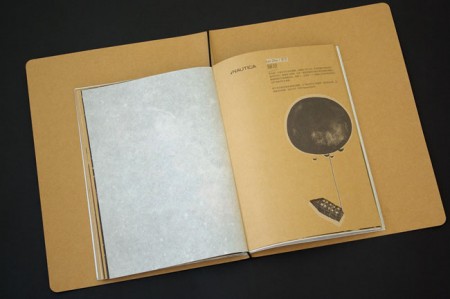
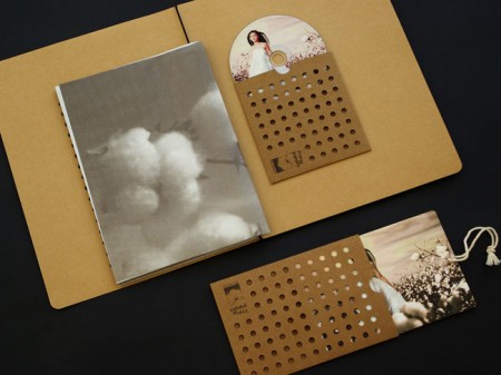
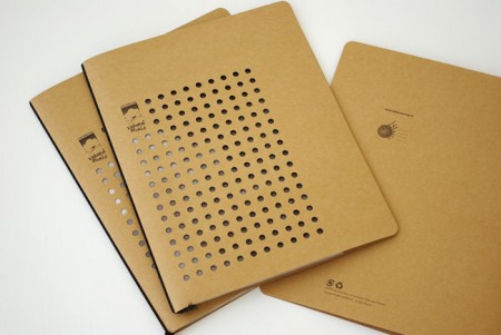
Absolutely beautiful work from Beijing-based JOYN:VISCOM Workshop. Loving the die-cuts and texture, would love a notebook that looked like this.

Via the excellent Graphic Exchange

Helios+CaleParks+D.Wilderness+Yeasayer

Helios
I’ve been sick in bed but that hasn’t stopped me from digging deep for music in between long naps, I found soo many nice tracks I even want to post the 4 songs for tomorrow now.

Helios is one of those bands i’ll always check out because I know they’ll have a stand out track on there album every time and this album is no exception. The song Cross The Ocean is the closest i’ve heard to something like Boards of Canada in a while but without the PBS feel, tell me if i’m wrong.

I’m loving this intro of this Cale Parks song, the whole song is really unique and forward thinking, definitely the definition of Avant Pop.

I just found Desolation Wilderness, a really low key post rock/surf-ish group and an enjoyable listen.

Yeasayer have the sound to take experimental indie pop to TOP 40, if you listen close to their instrumental its mind scrambling, how do you sit down and put that together with other band members?! they care and are super talented.

Helios – Cross The Ocean

[audio:helio.mp3]

Cale Parks – Eyes Won’t Shut

[audio:cale.mp3]

Desolation Wilderness – Boardwalk Theme

[audio:wildboard.mp3]

Yeasayer – Ambling Alp

[audio:yeaalp.mp3]

New Midlake Cover Art

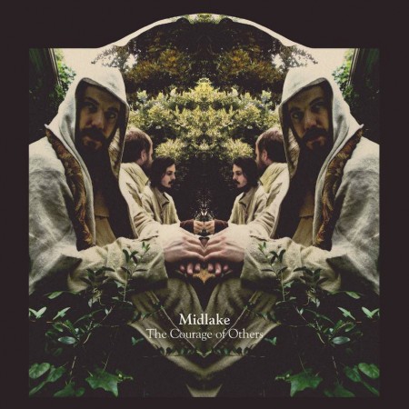
midlake-coo
I’ve really been digging back into Midlake’s work since Sam posted the Beyond The Wizard’s Sleeve remix of Roscoe in Playlist 6 (Jakub actually posted it quite a while back but I somehow missed it). This is one of the few rock remixes I actually like more than the original. In this case much more.

It’s been a while since Vanoccupanter, but apparently Midlake have apparently been busy in the years since working on a new album entitled The Courage of Others due out in February of 2010. I was completely bowled over by the new album art, it’s absolutely stunning. After a quick search I turned up a relatively large version at Tuba Records. Might have to fire up the 9900 and run off a copy of that one. Anybody know who designed / shot it?

And here’s one of my favorite Midlake songs, Young Bride from their last album, The Trials of Vanoccupanther. The bass is incredible on this one; I love that driving style. I keep wanting it to go to this place but it never does and I think that’s what makes it perfect.

Midlake – Young Bride

[audio:https://blog.iso50.com/wp-content/uploads/2009/11/midlake-youngbride.mp3]

Analog Visions

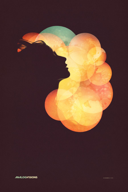
iso50-analog_visions-blogd
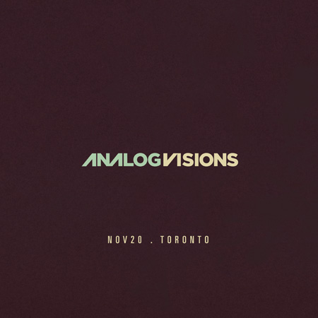
As promised, here’s the final poster for the Analog Visions show on Friday in Toronto. In case you missed it, I’ll be doing a solo show at Function 13 Gallery this Friday, November 20th. I’ve been working out concepts for how to hang the posters throughout the past week, I’ve decided against frames and want to go with something a little more raw feeling for this one. The work that I’ll be showing are all printed on Hahnemühle German Etching paper which has this incredible texture. I don’t want anything to get between the viewer and the piece. I have been working with Bulldog clips and nails, spray painting the clips matte white and using longer nails to let the piece stand off the wall a little. I think it’s going to look nice, but I’m still open to any suggestions, if you have any ideas for alternative poster hanging methods, let me know in the comments.

As for the poster design itself, I spent way longer than expected on this one. It was meant to be a quick promo poster for the gallery but the deeper I got into it the more I realized I had to finish it off properly. Once you hit on a concept you kind of have to decide whether to go all the way with it or save it for when there’s time to do it right. It was a stretch, but I was able to get it done in time (deadline was this morning) so it’s pretty nice to finally see it in it’s completed form. As you can see, this is another take on the Nocturne poster, featuring the same model. Seeing as how these events are the same night I wanted them to be related, but not exactly the same. I wanted the Nocturne design to be a little more divergent from my earlier work while this one was meant to sort of bridge the gap between new and old given the nature of the gallery show. You can see a larger version of the image over at the studio site.

The version above is probably the fifth or sixth, not counting the various in between states. The final file ended up around 4GB, 24×36″ at 300dpi but I did most of the heavy lifting with low resolution smart object stand-ins so it wasn’t too slow. In case anyone was wondering, this is the project I was referring to in the Photoshop Question / Problem post. All of the circles were smart objects based on the same photograph. As stated above, I worked with a model I shot here in the studio for the silhouettes, but I worked with another photographer for some elements of the background. I used some shots from Jacob Sargeant’s beautiful Experimental Set on Flickr for the detailing and color shifts. Thanks to Disign Police for turning me on to Jacob’s work.

Time for a day off and some much needed rest, hope to see you out in Toronto.

» Scott Hansen / ISO50 Solo Show @ Function 13 Gallery
» Tycho Live – ISO50 Gallery Afterparty @ Nocturne

Darren Firth

21
geposter1a
geposter2a2
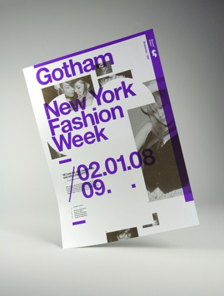
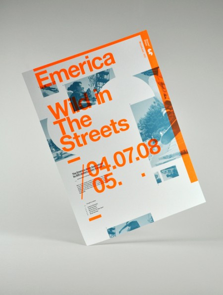
Older poster series by Darren Firth. I’ve always been a fan of Darren’s web work and recently came upon the project above while searching around for innovative ways to shoot pictures of printed work. I thought this was a cool idea; playful and interesting without being distracting. Of course the poster design is what I really like. I’ve never been able to pull off this kind of mega overlapping layout, and I always appreciate it when it’s done well like this. Hopefully going to see some new projects soon! Keep an eye out at Darren’s portfolio.

Follow up reading: AisleOne interview with Darren.

ISO50 Gallery Exhibition: Toronto 11/20

iso50-f13-gallery
I’m doing a solo exhibition at Function 13 Gallery in Toronto next Friday where I’ll be showing some new work and large format stuff. I’m still working on the main poster for the event so I’ll be posting that on Monday probably. For now, here’s all the details:

Gallery Opening: Fri Nov 20th, 2009
6pm-9pm
FREE

Function 13 Gallery
156 Augusta Ave Toronto, ON M5T 2L5 [Google Map]

I’ll also be doing the live Tycho set afterward at Nocturne.

Lone – Ecstasy & Friends

Lone - Ecstasy & Friends
One label that did it perfect this year was Werkdiscs, just solid A+R with a vision and exposed new sounds to the whole industry by unveiling high caliber talent like Lukid, Actress, and their new addition Lone. It really made a hobbyist/music lover like myself get excited about the hunt of music again. What Actress brought to the table this year was eye opening and Lukid’s twist on Dub gave me another record that I could put on and not worry about skipping around.

Lone’s new LP has the charm and playful nostalgia feel like his last LP Lemurian but hits a bit harder on the kicks and just comes off brighter like the sun beams glaring off snow. If you’re a Tycho, Boards of Canada, Flying Lotus, Christ., Washed Out, Neon Indian, etc. fan there is something in this album for you.

On a side note: I kind of want to rock doubles of Karen Loves Kate, just a second there I had this player and itunes playing the song at the same time and it just sounded soo warm and thick, pure goodness.

Lone – Karen Loves Kate

[audio:klk.mp3]

Lone – Go Greenhills Racer

[audio:ggr.mp3]

TCHO Chocolate

tcho17_540x367
tcho14_540x360
ed04
tcho_1-1

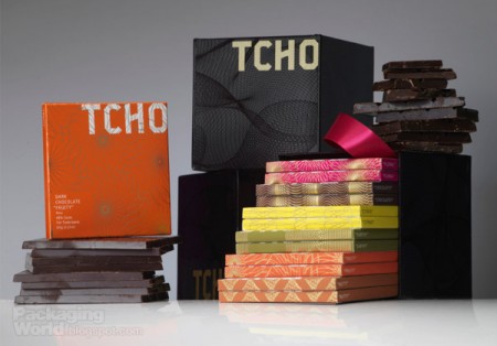
I’ve noticed these high end chocolate companies springing up left and right over the past few years. The paper-made thing seems to be the prevailing aesthetic of retail chocolate branding; employing one-color screened ink on kraft paper along with things like wax seals and cardboard hang-tags to give off that organic, handmade vibe I guess. It’s usually done to good effect but it’s nice to see a fresh take every once in a while.

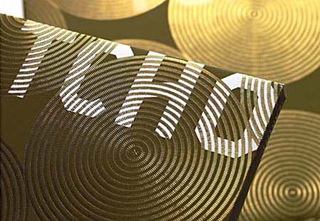
When I first saw San Francisco-based Tcho Chocolate I was struck by the name (no, I didn’t trade my studio for a chocolate factory down by the pier) and then by the design. I regrettably couldn’t find many decent pictures of the actual packaging, but suffice it to say you need to hold it in your hand to really appreciate the finer points. The letterpress and gold leaf inlay are a very nice touch that I don’t think is really captured properly in the above shots.

The video above goes over the concepts that informed the TCHO branding. I particularly like the central idea of chocolate as currency; design firm Edenspiekerman’s implementation of that concept is well executed. The result is a striking design which vaguely conjures the notion of European currency whithout making you forget you’re supposed to eat it. I don’t really enjoy chocolate on it’s own but they still had me wanting some just from the packaging.

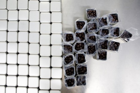
First two images from CNET’s tour of the Tcho factory at Pier 17.

» Tcho Chocolate – San Francisco, CA

GDI 09

Kirstyhole1
ricahardcarey1
EddHarrington_2
kylebean1
The University of Brighton has a nifty website up displaying the work of their Spring 2009 design and illustration graduates. I’ve placed some of my favorite pieces above, but there is a lot of impressive work to be seen. I think it’s great that the school puts this together for the graduates. While each student seems to be very web-capable (at least in terms establishing an online presence), this kind of collective resource allows each student to benefit from the aggregate buzz of the project. This institution-sponsored online portfolio presentation is something I think we will be seeing more and more of (in conjunction with, or probably as a replacement for, the onsite end-of-semester shows).

The work above is by the following designers, in this order: Kirsty Hole, Richard Carey, Edd Harrington, Kyle Bean. Those old school phones remind me of some of the work by Dan Mcpharlin.

via The Strange Attractor