CHOP CUP from :weareom: on Vimeo.
I thought I should share this since the video treatment and unpredictable ending made watching it over and over a good time waster.
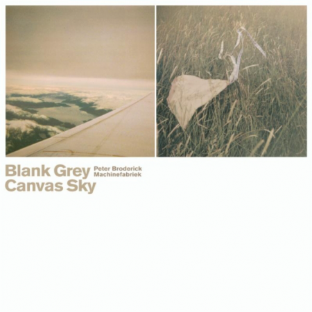
On top of wanting to travel the world this upcoming year I think one thing that I want to do along with seeing the new city is to hear Peter Broderick play live there so I hope the man tours this year so I can have some options. This beautiful collaboration called Blank Grey Canvas Sky by Peter Broderick & Machinefabriek has calmed me at airports and let my imagination walk slow and happily before I go off and sleep, highly recommended.
I wasn’t too impressed by the new Joe Goddard LP, his work with Hot Chip always excited me, and this song Lemon and Lime (Home Time) is more of what I wanted but instead a good portion of the LP has a ton of preset sounding synth work which was rough at times to sit thru. This track was well worth the purchase of the LP but man only if I got more of this sound i’d have it on repeat.
ATTENTION: this DJ Sprinkles Midtown 120 Blues album is my jam, soft 4/4 IDM meets deep minimalistic house, let it ride out don’t just judge it by the intro, it will reward you after the breakdown.
Horror fascinations for a music video and odd dark pop sometimes can be done well and Salem pulls it off but I think i’ll just stick to listening to the music and not getting too close to reading into the bands interests.
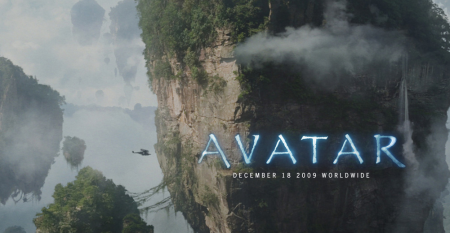
I saw Avatar last night (in full 3D IMAX glory) and really enjoyed it. It reminded me of how I used to feel when I would play video games as a kid — not so much because of the graphics or anything like that, more because of how in it I felt. I remember when I used to play Zelda for example, my imagination would just take over and for those couple hours I lived in that universe (I was a nerdy kid). Avatar is like this; it is very easy to forget you are watching a film and think you are actually physically along for the ride, as there are no visual limitations to give you any indication otherwise. There were moments when you could hear the whole theater let out audible gasps as something incredible came on the screen. The first time you see one of the giant mining machines is pretty amazing. Of course the plot follows an extremely predictable trajectory, but seriously who cares. When things look this cool I am willing to make concessions on freshness of plot.
I saw the film with a few friends, one of whom is an interaction designer. He was mesmerized by all the crazy user interfaces the characters were manipulating. The spherical and detachable computer screens were a favorite. Meanwhile I couldn’t get over the choice of typeface for the subtitles; Papyrus (or some variant, essentially the same thing). The rest of my friends thought I was a huge nerd when the first thing I said out of the theater was “What was with that subtitle font!?” It is crazy to think (in my opinion) that $280 million went into this movie and they chose the one font that is at the end of most typography jokes (save maybe for Comic Sans). I know it probably fit better than a super clean sans serif (and I can’t imagine there weren’t hours of discussion over this point), but seriously, Papyrus?
Further: Kottke describes another interesting issue, regarding the realism of the Na’vi’s technological development. I don’t necessarily agree with his point (I think they were as advanced as they wanted/needed to be given the physical and spiritual qualities of their world), but he makes an intriguing argument.


The Museum of Flight displays an impressive collection of vintage airline logos. As I’ve just spent most of my young life traveling between DC and SF over the holiday, airline logos aren’t exactly what I want to be looking at right now — regardless, some of these are too good for me to mind. Lufthansa is still my absolute favorite (I gravitate towards anything with a stylized bird). The images are relatively high quality and they have a ton more over on their site.
The wondrous Gestalten has a terrific selection of videos up on their site Gestalten tv. Anyone familiar with their publications knows that Gestalten is synonymous with extremely high quality production. I wasn’t familiar with many of the subjects listed, but found each one engaging and very well done. The one on Postlerferguson above was especially entertaining. Definitely going to order a paper MP5.
Of course I had to include the recent video on Dieter Rams above. I find interviews with him to be mesmerizing and am nowhere close to tired of seeing new ones pop up (as his exhibition makes waves in London). The book Less and More is available for purchase from Gestalten (in Europe), Vitsoe, and Amazon (though looks like not until January).
Gestalten.tv creates a broad range of documentaries, interviews and features that introduce Gestalten related subjects alongside individuals, projects and companies that are vanguards of visual culture.
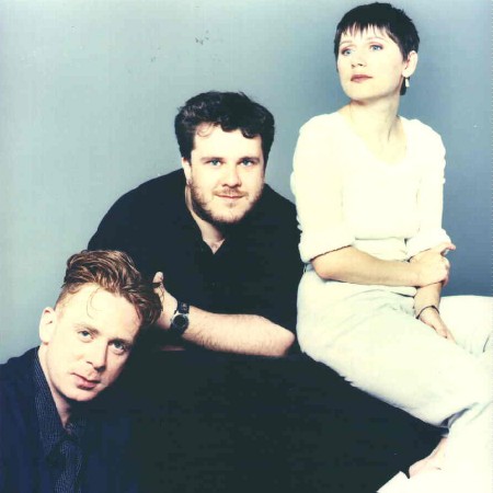
The holiday break has been great and I hope you all have been finding some time to rest and listen to new music. With this new playlist option I wanted to maybe drop in and make a few select artist playlist and why not start with a favorite like Cocteau Twins, let me know how you like these and if they flow well and if you want a few more.
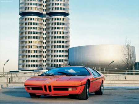
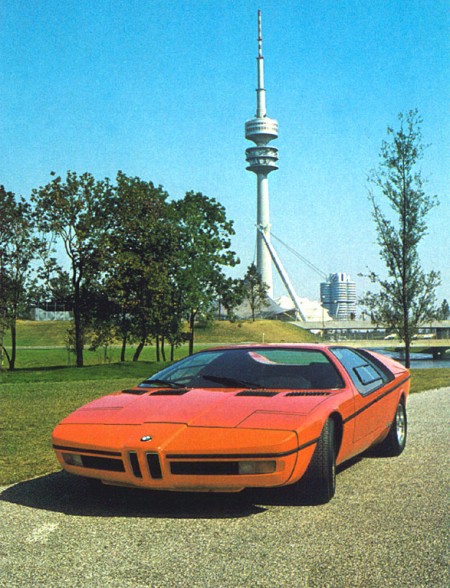
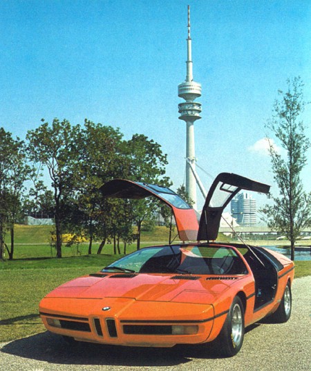
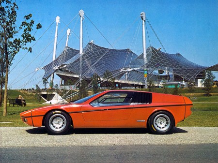
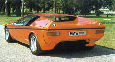
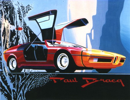
I’ve been geeking out on ’70s supercars lately and came across these gems depicting a BMW concept from 1972. The “E25 BMW Turbo” was commissioned to celebrate the 1972 Munich Olympics. BMW tasked famed automotive designer Paul Bracq to create the concept of which only two were ever built. Honestly, I love the front angles, but not really feeling that rear end. It feels very hatchback/kit-car-ish and the doulbe logos are killing me. Thankfully some of the finer points made it into production in the form of the M1 and some others.
That first shot is just off the charts; in the background you can see BMW’s Munich headquarters which was designed by architect Prof. Karl Schwanzer shortly before his death in 1975. In the other shots you can catch the games tent and the communications tower providing apt backdrops for the Turbo.

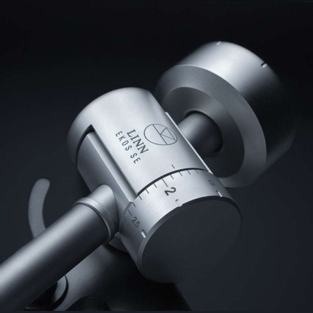
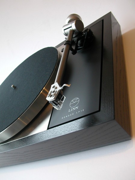
Every year around this time I like to pretend I have a rich uncle or something and then think about what they would get me for Christmas. This year rich uncle would get me a Linn Sondek Limited Edition Retro LP12 with the walnut finish. I’ve been thinking a lot about home stereos lately, I really want to build a solid system for listening. For a long time I’ve lived by a rule that I’d only spend money on things related to making music or graphic design. This means I have a great set of monitors in the studio, but in my living room I listen to music on a $200 set of Logitech speakers. For some reason I never really thought about how ridiculous this was, especially considering how much enjoyment I get out of listening to music.
So I was walking down Market street the other day and stumbled in to San Francisco Stereo & Theater Systems where they had a pair of B&W 683’s on the floor. I plugged in my iPhone (I know, MP3 is not worthy of a hi-fi system, but it’s all I had), cued up Beyond the Wizard’s Sleeve’s rendition of Midlake’s Roscoe and proceeded to melt into the seat. I’ve never heard sound like this. Yes, I have Adam’s in the studio, but that’s a near-field system designed for professional use. They’re meant to sound very flat and honest, they’re not necessarily supposed to sound pretty and warm and they’re certainly not designed to fill up a large room.
So this all got me thinking, I need to build a proper hi-fi. I have an old (but powerful) Denon hand-me-down amp in storage that I could dust off, just add some B&W’s and I’m set. But then I started thinking that I couldn’t bring myself to play MP3’s through a system like that so I would have to start rebuilding my music collection based on FLAC and WAV, which could take some time. Finally I realized this would still involve D/A conversion at some stage (which I was thinking could be handled by a spare MOTU 828MKII) so it still wouldn’t be ideal. This is when it finally occurred to me that I need to get a proper turntable and expand my vinyl collection.
Enter the Linn Sondek LP12, which apparently sounds incredible and — as you can see from the photos above — is absolutely gorgeous. Unfortunately it’s about $2500 so it’s never going to happen. There’s got to be some less expensive alternatives out there, guess I’ll have to dig around a little. At any rate, if my long-lost, wealthy second cousin is reading this, you can ship it all direct or I’ll take a personal check.

City Center ISO50 posts: 1 / 2 / 3

Neon Indian ISO50 posts: 1 / 2 / 3
Pop Ambient 2009 ISO50 posts: 1
Junior Boys ISO50 posts: 1 / 2
Atlas Sound ISO50 posts: 1 / 2
Kings Of Convenience ISO50 posts: 1 / 2 / 3
Fever Ray ISO50 posts: 1 / 2 / 3 / 4 / 5 / 6
The Horrors ISO50 posts: 1 / 2 / 3
Washed Out ISO50 Posts: 1 / 2 / 3
2009 was a creative year for musicians like City Center who has the perfect voice and a natural sense for lo-fi singer songwriter material, if you’ve worn the groove out of your Panda Bear record then look no further and pick up his self titled LP. We saw Dubstep take over in the US and UK clubs with unique takes on albums from Martyn, 2562, and many others. Animal Collective and Grizzly Bear showed the top 40 charts that indie rock has a big say in what people want to own and even Jay-Z thought so. Lo-fi is back on all different levels like surf, folk, and a fusion of a ton of different genres which really had a big impact on my daily listening.
I’m not going to ignore that some people didn’t like my #1 song and #1 album of the year and I kind of want to share why I liked it so much. At first they were a band that i wanted to sign but after seeing a few shows of them playing live I was hooked, soo much energy, passion and catchy parts plus the band is just fun to watch, the tambourine player even was more hyper than any musician I saw all year. The songs all have this mash of a lot of music that I grew up on and still to this day listen to frequently. I see them as a band that can jump into the top 40 and get a budget to be a great band to see live and I guess the live show did it for me this year and I loved sharing the bands songs with friends, so I guess those are some of the reasons why I loved The Drums release.
HONORABLE MENTION:
Telefon Tel Aviv – Immolate Yourself
*Please note I did not include any releases by Ghostly International, Moodgadget, remixes, Tycho songs and ISO50 exclusives just to make this a fair collection. If you like this list then take a second and check out ISO50’s 2008 list.
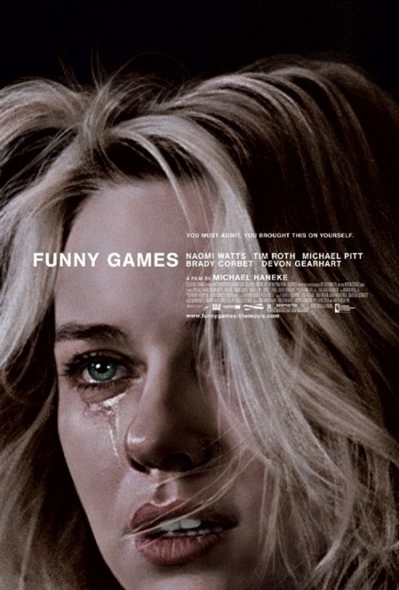
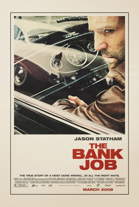
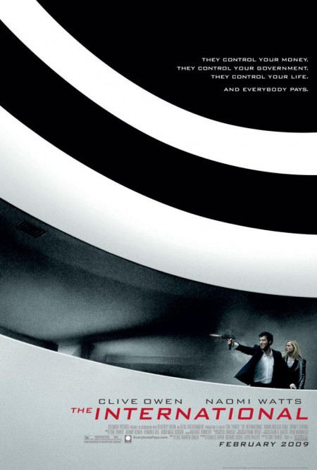
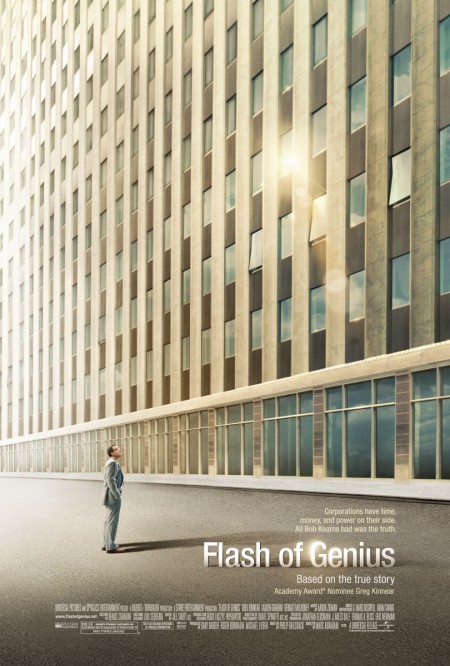
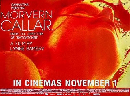
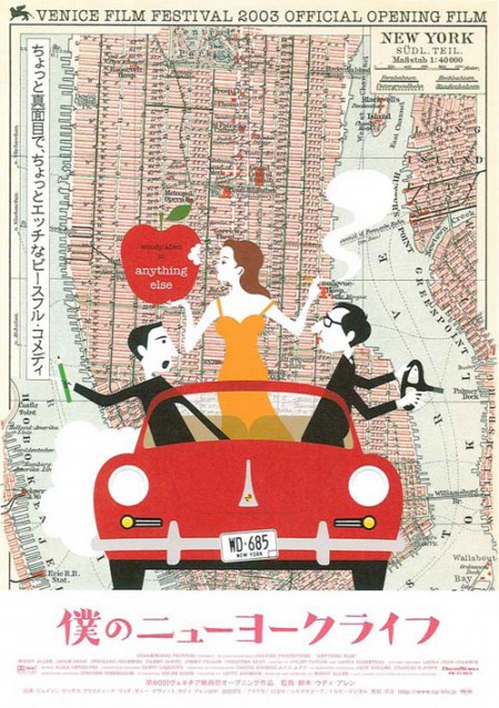
The Auteurs has a post on their picks for the top movie posters of the decade. Considering that the vast majority of modern movie posters fall short of the standards set in heyday of film, this must have been a difficult list to assemble and a boring task to complete. Nevertheless, they have managed to dig up a few gems. Good to see The Bank Job in there — always a favorite — but I was pleasantly surprised by Funny Games, hadn’t seen that one.
Can you think of any obvious omissions from this list? Let us know in the comments
For some background, more good movie posters from years past can be found in these older posts: 50 Beautiful Movie Posters, 100 Greatest Movie Posters, and, of course, SOLARIS!.
Via The Auteurs