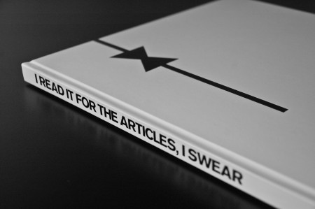
My rebranding Playboy project came to a close last week with the end of our fall semester. If you read the last article, you are familiar with the first part of this project, which was the new logo for Playboy. While it is absolutely the flag bearer of the entire project, the logo development represented a small amount of the work we were required to do for the overall project. The final deliverable for the class was a book in which we the explain history of the brand, walk through our rationale for the new identity, explore the process of the logo development, present brand standards and guidelines, and show example brand implementations and extensions. Other than this required content, there was no specific criteria for the book. Each student also gave a short final presentation explaining their rebranding and the choices they made along the way. Everything was created for the Nature of Identity class at the Academy of Art, as part of the graduate graphic design program.
I really enjoyed the conversation the first post on this project generated. I was excited to see that the new logo was as polarizing as it was — I feel like these types of solutions are the most exciting and rewarding for me. I noticed that many people were up in arms about the idea of Playboy removing nudity and becoming an all article magazine. While I would like to note that the new strategy was purely a conceptual exploration constructed in an educational environment, I actually do think they might be well served to switch things up this drastically. Playboy was once irreverent and boundary shattering. They are no longer. I can think of no better way to recapture this audacious spirit than by doing something this extreme…
