

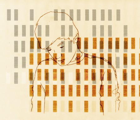
Absolutely loving Jelle Martens’ work. Raw and inspired, I want a print. More work can be found at his flickr.
Via Matthew Lyons’ incredibly excellent Inspiration Tumblr


Absolutely loving Jelle Martens’ work. Raw and inspired, I want a print. More work can be found at his flickr.
Via Matthew Lyons’ incredibly excellent Inspiration Tumblr
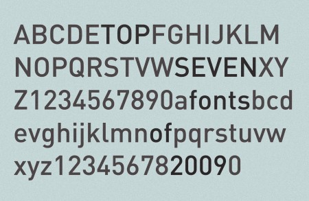
I was inspired to investigate my favorite typefaces of last year by all the “Top Ten Fonts of 2009” lists I’ve seen going around. I tried desperately to make my list longer than seven, but honestly I don’t know if I used more than that. (I only have 50 anyway) Keep in mind, when I say “favorite fonts of the year”, I am referring to the ones I used most, not necessarily ones that were released in 2009. New font releases rarely get me very excited anyway. This list pretty much sums up the only fonts I ever implemented in all of 2009. There is an outlier here or there, but I keep everything pretty regimented.
So here we are, my favorite fonts of 2009:
Knockout – Probably my favorite of last year. I used it everywhere. It’s so versatile, and has so many weights, that I found it really helpful for many projects.
United – You know I love this.
Din – One of my favorites of all time. I found myself using this in just about every infographic I had to create.
Miso – It’s free and comes in handy every once in a while. Found this one popping up in my freelance work a bunch.
Plantin – One of the sole serif representatives. I used this for just about every single time I had body copy. Thanks Monocle!
Futura – Had to include this after my Wes Anderson project. Didn’t use it a whole lot elsewhere, but I always check out how things look in Futura just in case. Especially for logos — Futura comes through in a pinch often.
Trade Gothic – Especially Bold No. 2. If I hear a cool word I don’t know, I will write it down so I can type it out in Trade later just to see how bad ass it looks.
Anyway, nothing too surprising up there I don’t think, but interesting to see it all in one place. List yours if you have them!
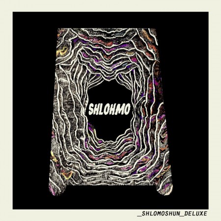
I first heard Shlohmo from that remix he did that I posted earlier this week and I needed more. I really love his breaks in between the massive low end, shows that he has potential. I read somewhere that someone said it sounded too much like Flying Lotus, well if I was 19 years old and dude said that I sounded too much like Flying Lotus I would probably shake that man’s hand. I see a bright future for this guy if he steers clear of Dubstep only work and keeps pushing forward with tracks like Hot Boxing The Cockpit and Spoons and the wonderful details he includes all the way thru those tracks.

I’ve posted on this subject before and its implications are certainly debatable, but last week’s announcement that researchers had discovered the presence of the Golden Ratio in the quantum world had me thinking there might be more to it than anyone has yet realized.
“Researchers from the Helmholtz-Zentrum Berlin für Materialien und Energie (HZB), in cooperation with colleagues from Oxford and Bristol Universities, as well as the Rutherford Appleton Laboratory, UK, have for the first time observed a nanoscale symmetry hidden in solid state matter. They have measured the signatures of a symmetry showing the same attributes as the golden ratio famous from art and architecture.”
Dr. Radu Coldea — the principal author of the paper — describes how the ratio was observed in magnetically linked chains of atoms: “Here the tension comes from the interaction between spins causing them to magnetically resonate. For these interactions we found a series (scale) of resonant notes: The first two notes show a perfect relationship with each other. Their frequencies (pitch) are in the ratio of 1.618…, which is the golden ratio famous from art and architecture.”
Pretty amazing to think that something we seem to have an innate appreciation for and which occurs on such a comparatively massive scale can also be observed in the smallest components of our world.
Image via Minarai
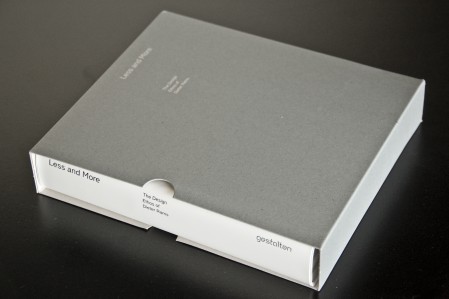
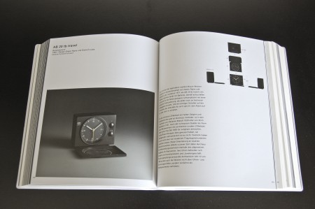
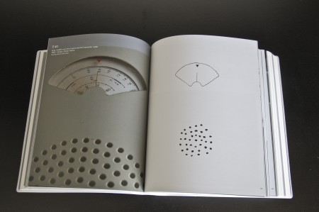
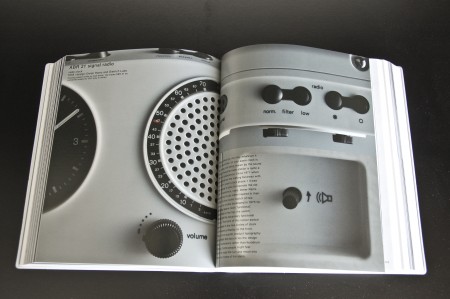
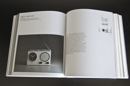
Less and More is the new book about the work of Dieter Rams. The book itself is massive — 808 pages of images and descriptions of Ram’s ground breaking designs. It’s bound beautifully and comes in a really nice display box. Publisher Gestalten wins again. I just received mine from Vitsoe, but you can preorder it from Amazon if you prefer. If you go the Vitsoe route, I would also suggest this poster displaying Ram’s 10 Principles of Good Design.
Less and More elucidates the design philosophy of Dieter Rams. The book is the ultimate collection of images of all of Rams’s products as well as selected sketches and models – from Braun stereo systems and electric shavers to the chairs and shelving systems that he created for Vitsœ and sdr+. In addition to the complete visual presentation of his designs, the book contains new texts by international design experts that explain how the work was created, describe its timeless quality, and put it into current context.
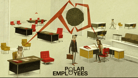
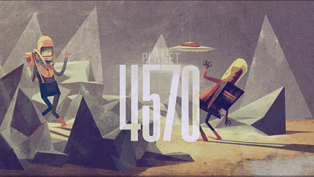
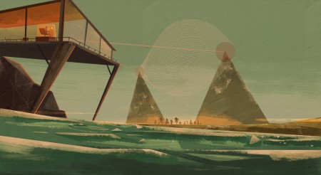
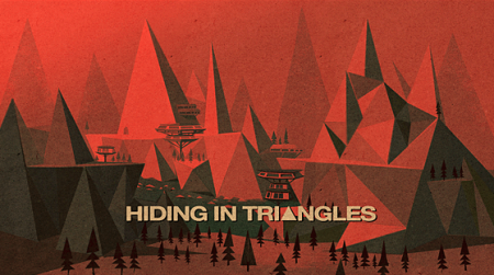
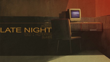
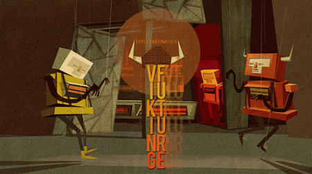
Absolutely killer illustrations by Matthew Lyons. My first assumption was that these pieces were very old, and the work of a grizzled old artist, who had developed exceptional skill and craft over years and years of animation grunt work. I was incorrect. Matthew is actually a 21 year old student at his final year at the Loughborough University in England. He’s clearly a natural. Not only is his eye for color and composition spot on, he also clearly has a vast imagination. I want to get in my spaceship and explore each of the scenes he has presented.
Pitchfork Media and XLR8R have teamed up and curated a free compilation together which features a ton fresh talent. I picked a few songs from it, the real stand out is the energetic work by Nice Nice, has this feeling of Battles meets Konono N°1, its strong on the tribal tip and the combination of dynamics and uptempo really work well for this sound. Others artists include Willits and Sakamoto, Hudson Mohawke, Lusine, Atlas Sound, and a many more.
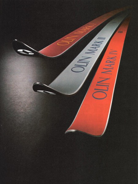
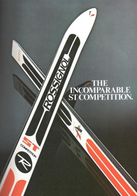
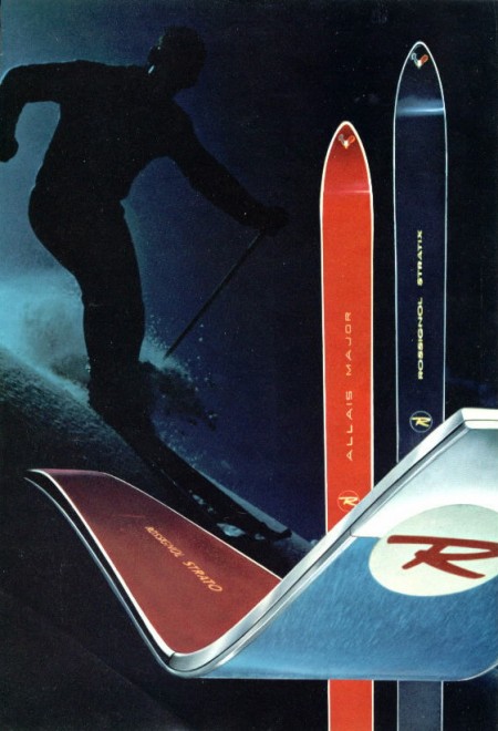
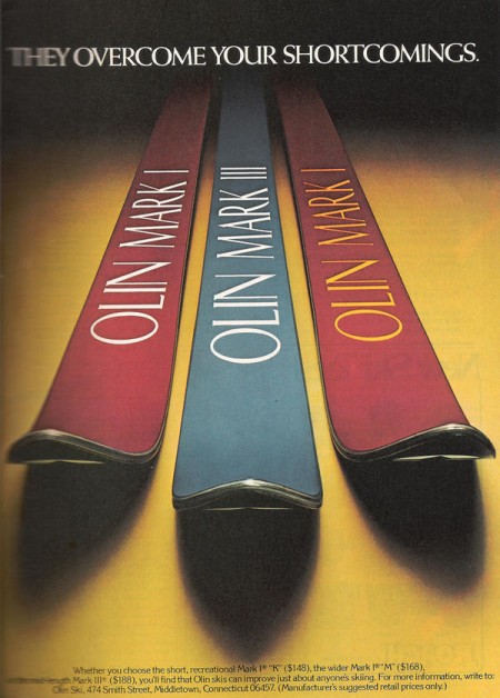
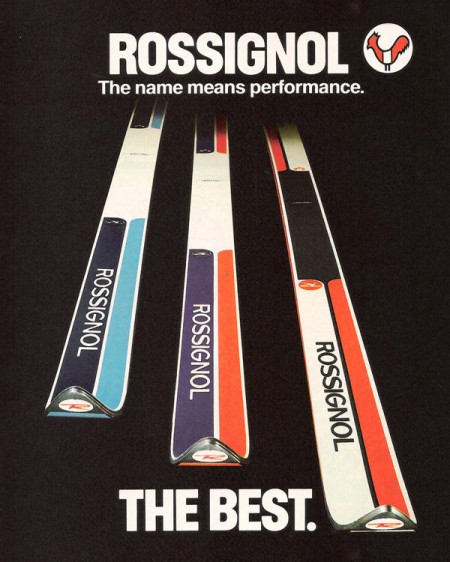
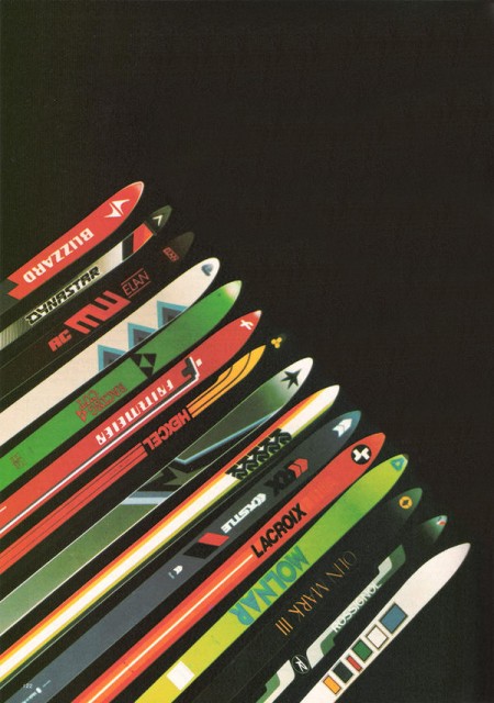
In part 2 of the Vintage Ski Ads Series I chose some that focused in on the skis themselves. When I see skis these days they either look like pop culture threw up all over them or they were designed by the same guy who makes the info graphics at the bottom of the ESPN screen. Looking at the examples above it’s plain to see they had a little more appreciation for subtlety and a sense for classic design back in the day. Either that or the printing methods were such that they were limited to simple shapes and colors and the designer in me is just picking up on that.
When I think about it, this could be the case with a lot of older stuff. I think we as designers often appreciate unintended aesthetic elements; things that were a function of necessity or limitation rather than deliberate design decisions. A good example would be vintage audio equipment. I think the Neve Sidecar is one of the most beautiful inanimate objects ever created. But when you really look at it you realize it was designed by engineers; pretty much every design decision was dictated by necessity and function. So I must be reinterpreting that as physical beauty creating a connection between the idea of an object’s functionality and it’s aesthetic beauty. In other words, maybe I only like how it looks because I appreciate how it works (or in this case, sounds). Then again, I have some gear around the studio that I love the sound and functionality of but is just downright ugly to look at.
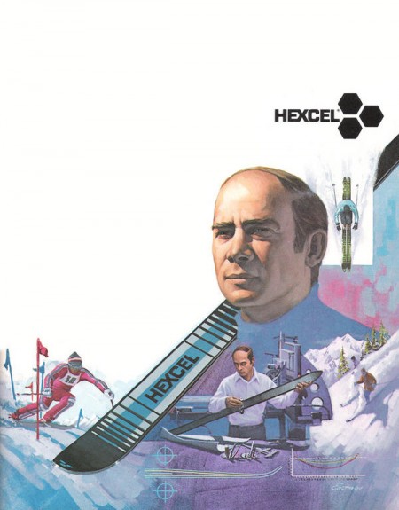
Anyways, all those Rossi’s are incredible. This whole style needs to make a comeback, but it seems these days people need to be beaten over the head with design instead of left to appreciate its finer points on their own. I’m not saying there’s not a place for busy, crazy graphics on skis — I myself have designed several busy, crazy skis — I just wish there were more like these to choose from. I guess it’s a different industry, no longer do guys in mock turtlenecks with comb-overs get all scientific and wear collared dress shirts while developing new skis in the lab, now it’s just this guy and a Nintendo DS in a dark room.

Jay Bodley aka A Setting Sun has been on the blog before with his cover of Air’s Le Soleil Est Pres de Moi but that sound is far different from what he’s brewing which is more of a textured doom metal that you’d find from an artist like Ulver with hints of what a non-metal fan would call beautiful. Raspberry is a song that could be split up into multiple sections where you start off with the unforgiving coldness of the intro and lets you enjoy a bit of familiar acoustic guitar and then fades into an almost ceremonial muted brother of the intro, its grey yet ends on a restful feeling that everything has calmed down.
The mysterious grace that Johann Johannsson shares with us reminds me of what a mad man would hide from anyone that feared him to not show that he has such a passionate side. Think if Tangerine Dream had to make a dark classical piece with Jan Jelinek without beats or glitches.
The label Kranky can never do me wrong, you dig in their back catalog and just find treasures and one song that I found from this Christopher Bissonnette LP made me happy that there were such things as good A+R.
Tim Hecker is a hero in my mind to lo-fi ambient, if I ever drowned this better be playing so its as bittersweet as I could ever imagine it being.
Take your time with these songs if you really want to enjoy them, if this sound isn’t something you usually listen to then I suggest listening to it alone, yet close to you but not overwhelming yourself. Try listening to it as background sound quietly then try listening to it noticing every detail, you might realize how much goes into making this sound appealing.
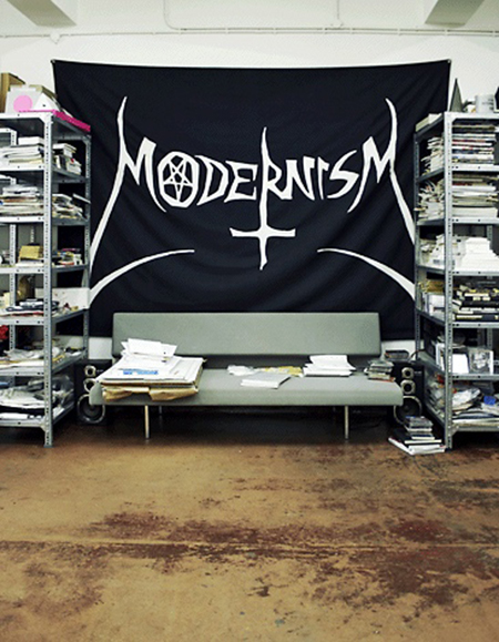
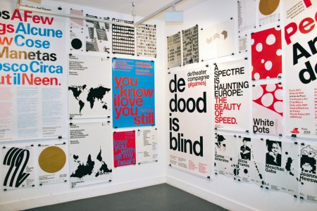
Late last year I had to pleasure of interviewing Danny, Marieke and Erwin of Experimental Jetset. Founded in 1997 and based in Amsterdam, Experimental Jetset is one of the most exciting and highly regarded studios working today. They create exceptionally beautiful work; immediately recognizable for its top notch quality and unique remixing of modernist principles and stylings. Their global renown continues to soar– most recently thanks to their part in Helvetica and the extreme popularity of their (now re-released) John&Paul&Ringo&George shirts.
A quick perusal of their website can easily turn into hours as you browse through their catalog of work and read their comprehensive descriptions of each project. In these descriptions, and especially in interviews, the depth of their reflection is astounding. They take great care to consider every perspective — whether it be a report of one of their own projects, or an answer to a seemingly basic interview prompt — their ability to discuss Design and work is as remarkable as it is fascinating. What follows is our discussion from November 2009. Enjoy!