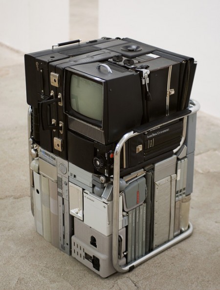
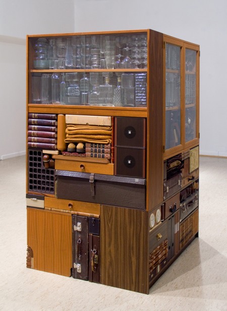
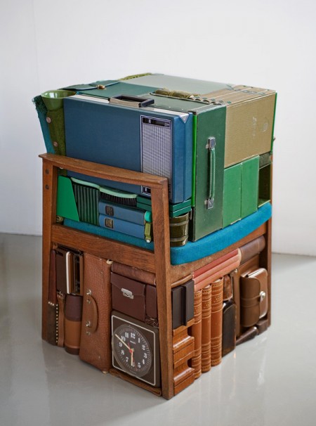

This is what might happen if a trash compactor had impeccable taste and color sensitivity. The work of Michael Johansson is unique and impossible to categorize. You really have to look closely to see how random and unrelated the objects that make up these blocks actually are; yet they still match up perfectly. I can’t imagine how long it must take to source materials and eventually place and align them so precisely. Would be like building a puzzle where each piece was made by a different company and then scattered throughout the world.
Archive for February, 2010
Michael Johansson
Why i’m addicted to Electronic Music PT. 2
With that wave of mom and pop record stores closing monthly winding down and completely gutting the support for physical music for people to discover, iPods building closed personal shells running mostly ringtone quality sound thru tiny white earbuds instead of record players playing aloud, and faceless torrents and file sharing sites handing out music like its those frickin’ free Auto Mart gazettes sitting in those bright yellow stands in front of your local closed down Blockbuster’s, i’d like to spend some of the young readers time by sharing how I got into electronic music. For what its worth I want to keep sharing what musicians first turned me from a casual listener to something that involves more time than people are willing to sometimes spend to keep up with something.
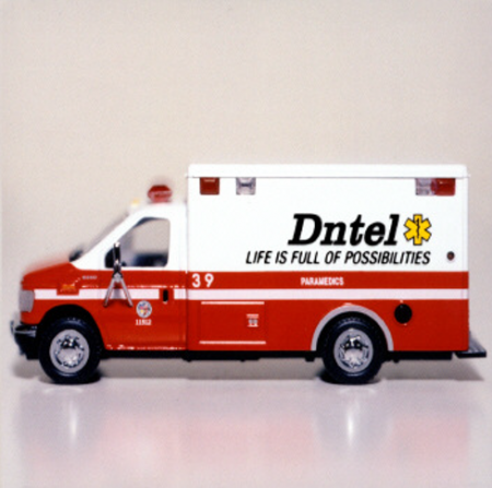
This music by Dntel was more emotional than any other electronic music I heard at the time, I feel like it almost paved the way for a ton of new genres to start. I really only listened to it when I worked or was falling asleep but then started sharing it on mixtapes and became a favorite of mine. I needed more and at that time in Detroit there was a flurry of solid record stores filled with enough employees to answer any of your questions happily with great suggestions, can you imagine that? well it was true especially one called Neptune Records which I was happy to drive the 45+ minute drive weekly to see what was new. I’ll prepare a 3rd playlist and share more, hope some of you can relate.
PART: ONE: Caribou
Vans And The Places They Were


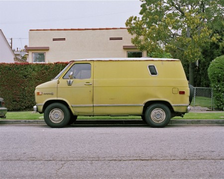


At first glance you might expect Joe Stevens’ collection of van photos — Vans and the places they were — to be another nostalgic overdose of 70’s camp, but on closer inspection you’ll find some beautiful photos that transcend the limited scope of the series. I love the color composition and processing; I almost feel like I’m looking at some hyperrealist version of a Kevin Cyr painting. This is probably also the only other time you could get away with hanging a picture of a van conversion on your wall and convincing all your friends that it’s art. The best part of it all is that they don’t seem to be staged at all; they all seem to be random finds which makes the quality of the shots all the more incredible.
Sidenote: Looks like Joe’s site was built on Arlo Sites, a portfolio platform that looks pretty interesting. Not sure how it stacks up to Cargo or Squarespace though, this is the first I’ve seen of it.
Parisian Love
This was easily the best ad of the Super Bowl hands down. It was exciting to see Google’s first Super Bowl advertisement ever (and first TV ad period I think…though there may have been the odd commercial early on). Apparently “Parisian Love” as it’s called was available for viewing well before tonight as part of Google’s Search Stories. Anyway I found it refreshing and clever; a nice change from the rest of the nonsense.
On average I was very disappointed with the quality and originality of the ads. I was surprised how many concepts seemed to double up (not only that, but also play consecutively). Tackling was a surprisingly frequent punch line. Yawn. I think Super Bowl ads peaked sometime back in the late 90’s early 00’s. Cheers to Google for putting out something worthwhile.
The Lovestep poster boys: Sepalcure
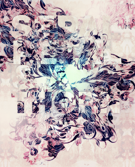
With Dubstep branching out to see how far the genre can be pushed a ton of new ideas start to surface and a fusion of appealing sounds start melting together. One group i’m really excited about is Sepalcure which is a collaboration of Brooklyn’s Praveen and Machinedrum. the duo is doing a fine job of taking hints of soulful house and dubstep to create what they call Lovestep. One thing that Sepalcure has that other dubsteppers don’t usually have and ISO50 fans might also really enjoy is fine art direction by the multi talented designer Sougwen Chung. As you can see above and below her posters and videos of her work are a perfect fit for this heartfelt music.
Sepalcure’s debut performance alongside Untold, TRG, Pole, 2562 & more is February 13th at Unsound Festival NYC.
Below is a “Lovestep” mix done by Percussion Lab Founder/Sepalcure’s very own Praveen.
TRACKLIST
Pangaea – Memories
Burial – You Hurt Me
TRG – Broken Heart (Martyn Remix)
Untold – Dante
DFRNT – Tripped (Synkro Mix)
Synkro – Inhale
Sines – Memories Are Here
DFRNT – Tripped (Ital Tek Remix)
FaltyDL – Party
Joy Orbison – J. Doe
Sepalcure – Deep City Insects
Floating Points – K&G Beat
DOWNLOAD HERE
Sepalcure – Feeling That I Know So Well from sougwen on Vimeo.
Sepalcure – Every Day of my Life from sougwen on Vimeo.
Delfin & Postigo House Madrid


This stunning Spanish monument to modernism is located in Madrid, Spain. The “Delifin & Postigo House” is the residence of fashion designer David Delfin and photographer Gorka Postigo. Incredible; can’t get enough of high ceilings like this.
Via Emma
Doom+JayElectronica+DarkParty+MuxMool

Thom Yorke remix of Doom? sounds great right? well it is, I do love Doom over some big strings and dusty kicks or movie and TV soundtracks but this remix is a nice get away with a fitting haunted feel.
I haven’t heard anything as exact as Dilla Donuts than this Jay Electronica cut but I also don’t listen to much hip hop besides dipping back in more J Dilla or Stones Throw signings. A really hype track, i’m not putting it down at all, i’ve had it on repeat all week.
You may recognize the name Jogger from Daedelus’ Friends Of Friends label or his random appears on labes like Mush or Ninja Tune but I just found him thru Eliot Lipp and Leo123’s side project Dark Party, i’ve never heard the original but if its anything like this remix then i’m in love.
I downloaded this really funny exclusive 10+ minute interview of Mux Mool on Percussion Lab, he talks about his upcoming album, what he samples, how he spends his downtime, and his drawings that you can find on his Flickr, some of this is pretty NSFW.
And per se And
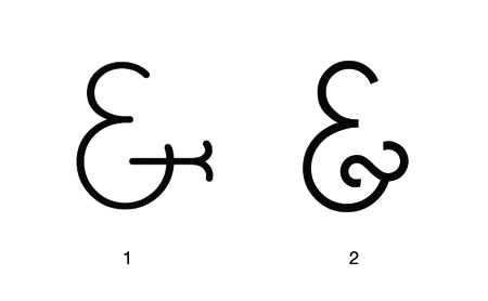
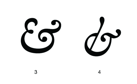
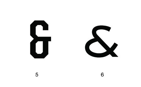
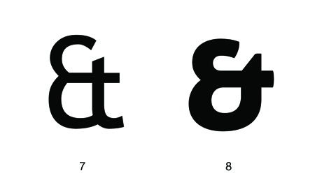
I’m embarrassed to say I cannot draw an ampersand from memory; when I do it always looks like an unfortunate treble clef. Regardless I think the ampersand is easily the coolest symbol in any character set (or ever…). There are many reasons for this assessment.
First, it’s a complex symbol. Often times an ampersand would look more at home amidst a group of kanji characters rather than a cluster of geometric letters. This makes it very interesting to look at and you end up perceiving the overall shape, rather than the distinct path of the lines. Second, it can exist in many different forms and still be understood as an ampersand. I suppose this is the same for most letters, but the ampersand varies the most substantially between typefaces (thus allowing for the most potential random awesomeness). The creativity of the typographer is best (or at least more freely) expressed through the ampersand. Lastly, it stands for the word “and”, which if I were a symbol and I had to stand for something, would be a pretty damn good choice. Very optimistic and inclusive. I suppose the only sad thing about the ampersand is its relative absence from written English. (Though Wikipedia tells me it’s making a comeback via text messaging. I’ll have to get on that…)
I can’t write a post about ampersands and not mention the best blog ever: Ampersand. And another one! 300&65 Ampersands. Above I’ve collected just a few of my favorite ampersands; not a definitive list by any means. Links are below:
1. BernhardFasD
2. Caviar Dreams
3. Caslon Semi Bold Italic
4. Hoefler Text Italic
5. United Sans Condensed Bold
6. Sackers Gothic Medium
7. Trebuchet
8. Aller Display
And yes I know the Mother and Child logo is the coolest thing ever. I know there are more killer ampersands…list your favorite here.
I:Cube + Pogo + Gonjasufi + Blue Daisy
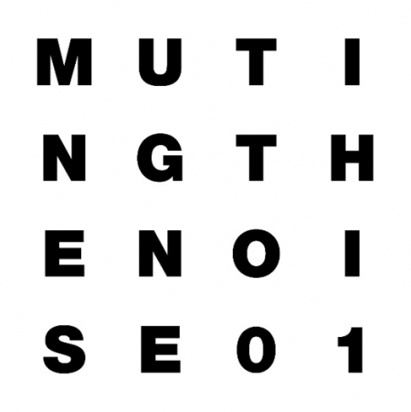
Don’t get French producer I:Cube confused with Ice Cube and write him off, this guy is the real deal when it comes to stunning space disco that pays attention to the details with the proper patience, a great headphone listen.
I’ve been loving Pogo’s edits especially Alice and White Magic that are just oozing out on the nostalgia tip. The tracks are very simple almost like he created them with Garage Band but he makes it work. Watch the video below, I love his use of the older wise fish for a split second.
Warp’s new signing Gonjasufi has a real chance of hitting a wider spectrum of fans than even Flying Lotus[who I hear did the beats], his vocal style for some reason is really appealing to my ears, it feels thought thru and refreshing.
Blue Daisy is a artist I first heard on Percussion Lab radio when Praveen dropped it, it has hints of that more airy minimalistic dub sound, the low end swerves in and out once in a while at the perfect tempo, listening to it now I just wish the song was 10+ minutes long.
February Newsletter
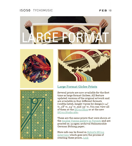
The February 2010 edition of the ISO50 Newsletter is out! View it here or subscribe here.
