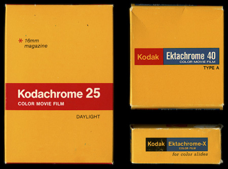
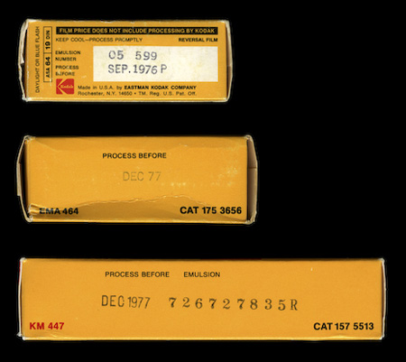
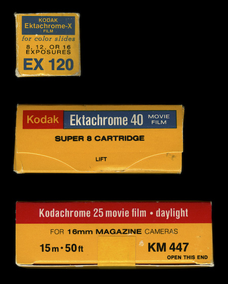
The always excellent Watsonian — who also brought you the Super 8 packaging — have posted these beautiful examples of vintage Kodak film packaging. Every time I see something like this the first thing that pops into my head is “Why doesn’t more commercial packaging look like this anymore?”. I then tell myself “If more commercial packaging looked like this you wouldn’t find it as interesting.” I think that point could be argued but you can’t argue that strictly from a design standpoint, these are just plain better than this crap.
I guess the next question though is whether some kid in 30 years will think the more recent example is better, but I seriously doubt it. I really feel like more attention was paid to the quality of design before the age of computers, I guess the practitioners were just more skilled given the level of training required. Now it’s “have Photoshop will travel”, which obviously cuts both ways. What do you think?
Via The Watsonian (who is apparently a cat)
