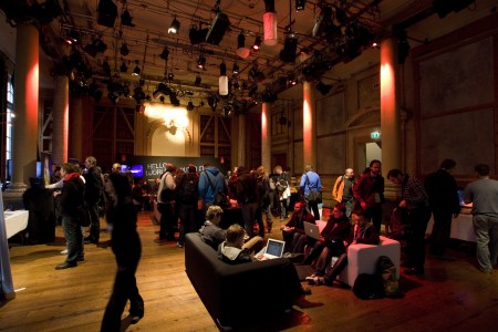
Just a quick reminder I’ll be speaking at FITC Toronto today. The talk starts at 2:30pm in Toronto 1 room at the Hilton. Hope to see some of you out there!
Archive for April, 2010
ISO50 x FITC Toronto: Today
Spirituals + Light Asylum + Ross 154 + Sega

Some of you might have bought the new Caribou record this week and want more or even prefer the old Manitoba sound well a nice new LP from Spirituals can fill this void in your life very quickly. The self titled LP from Spirituals has beautiful melodic swells and full of surprising light drives and builds using everything from woodblocks and warm organs.
The drums may remind you of Phil Collins and her vocals might hint at a tougher Annie Lennox and the synths might have picked up where Q Lazzarus(Goodbye Horses aka the song from Silence Of The Lambs) left off but there is one thing for sure this sound collected is new and fresh.
This is a rough rip from youtube so please excuse the quality but if I could say it does add a little charm to this track. Ross 154 is Newworldaquarium a Danish musical genius in my mind if you followed him on labels like MOS or Delsin. Using classic sequencing of underground raw Chicago House and Aphex Twim SAW like melodies makes me feel like i’m glowing every time I hear it.
Reaching deep into my archives I had to pull this out, maybe the best game ever for the Sega Genesis was Sonic The Hedgehog but soundtrack wise Streets Of Rage 2 was untouchable, here is a intro track that some people say was just be a rip of Enigma‘s Sadeness but the melody added on top of it always made my 12 year old nod.
200 Year Kalendar
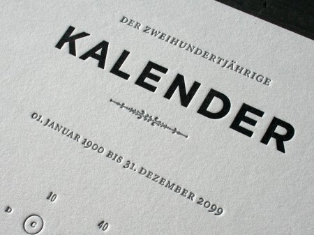
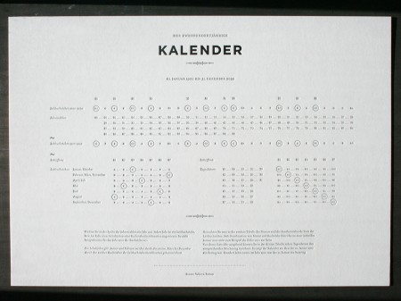
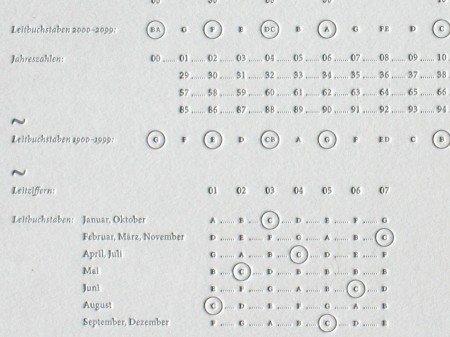
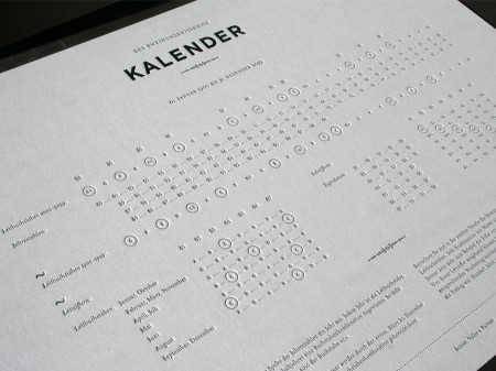
Calendars to me have always been items that I tell myself to use, but rarely do. However, I think that would change if I had this beautifully designed 200 year calendar by Sonner, Vallée u. Partner–a Munich, Germany based design studio.
This calendar was letterpress printed on a thick, 220lb cotton stock and is approximately 16.5 x 11.6 inches in size (click images to see larger).
Images via Beast Pieces.
Qubik
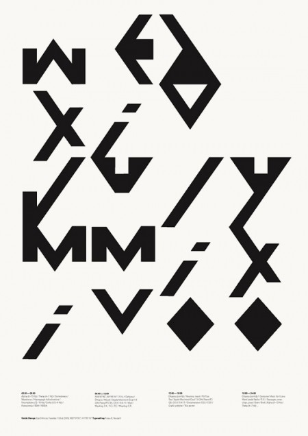
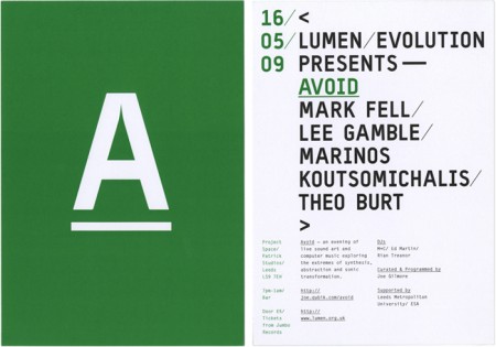
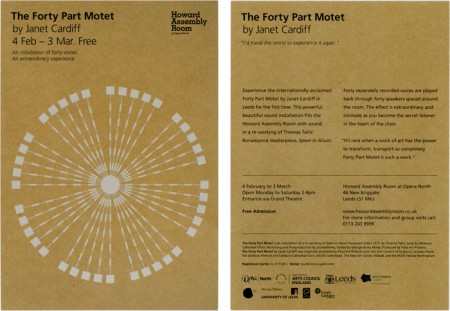
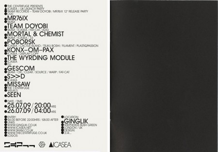
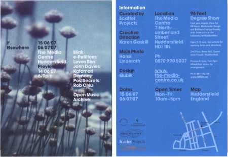
Qubik Design is a graphic studio based in Leeds UK. I like everything about these pieces except the color. The layout and type compositions I find very interesting; personally I just don’t prefer the chosen hues of green, blue or gold. Otherwise I think this work is fantastic. Especially that first one! I also like how clean and organized their site is. I’m starting to appreciate this much more now as a writer; recently I’ve come upon a number of sites that are so poorly laid out I give up researching, even if the work is amazing.
C111 B&W


Found these beautiful B&W images of the 1969 Mercedes C111 that I posted last month. These might just be big enough to make some prints out of (click for high res)
More images here
Newworldaquarium: The Dead Bears [2008]

Jakub why do you post music like Avon Sparkle that sounds like the matchless soundtrack to a late night exploration of Africa’s west coast shoreline you may ask? or expect us to melt and mold with the warm of Kirana’s Lament that might make us feel like were on vacation in a humid jungle that has us surrounded by sugar cane and panthers? how do you expect us to be able to listen to NoworldbutU when the molasses pace might only be perfect when i’ve fallen asleep in a dark room in the afternoon on a sunny day where I lay there listening and stare at the dust floating by in the sunlight that is leaking in? well I just thought you might like something different for this late night post.
Photoshop CS5 64-bit Benchmarks
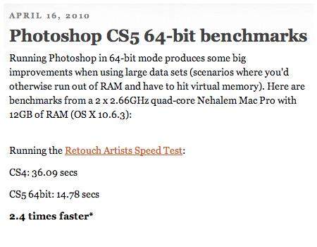
I know I’m always taunting you Mac users about your lack of 64-bit (I develop primarily on Windows 7 but have a few Macs for various purposes, mostly live shows). But now that CS5 is here you are free to bask in the unadulterated glory of full memory allocation that us Windows users have been enjoying since CS4. John Nack has put together some benchmark numbers that should give you a rough idea of the performance gains you can expect. As Nack points out though, these gains will only be seen by people working with larger files, tasks like web design won’t benefit much. You can check out the numbers here: Photoshop CS5 64-bit Benchmarked
On a side note, my overall experience with 64-bit has been favorable in the graphics realm, but for music I use a 32-bit installation. For music production there isn’t much of a benefit from 64-bit unless you’re doing a lot of sampling, it’s mostly about CPU and disk speed for recording and effects. The DAW software I use to record — Cakewalk Sonar 8.5.3 — still isn’t as stable as I’d like it to be when bridging 32-bit VSTs (many of my favorite VSTs have not been ported to 64-bit native yet) so I’m sticking with 32 for the production of this latest album I’m working on.
Anton Stankowski
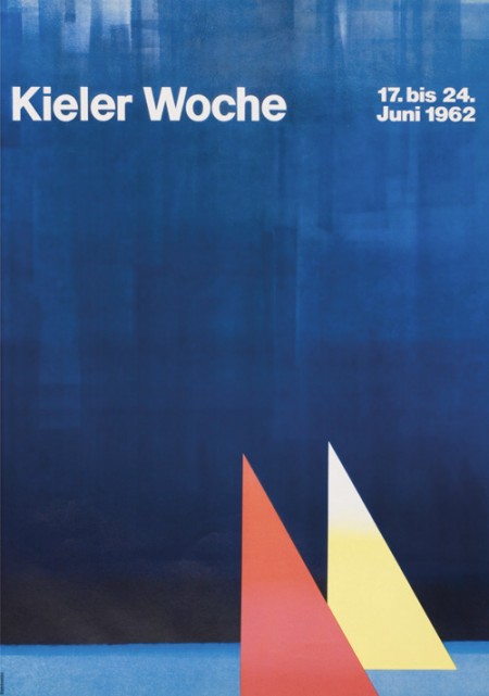
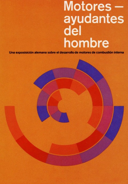

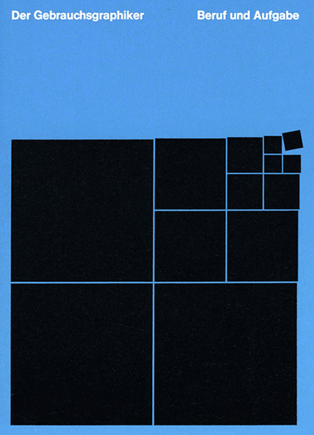
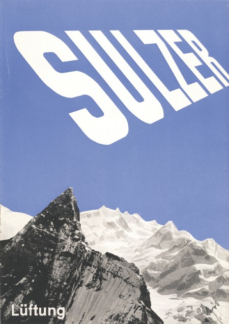
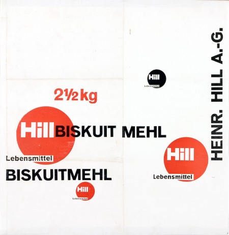
First off let me just say that it’s awesome to have come across this beautiful archive of work by German graphic designer, Anton Stankowski. The images in the archive are fairly large so the detail of the design becomes evident. In the first image of this post it looks to me like the background of the poster was painted with a brush then overlaid by the type. The process of how this was done would be refreshing to see.
The first thing about Stankowski’s work that pulled me in was the amount movement. Nearly every one of these pieces utilizes a visual system that controls your eyes across the graphic elements and to the typography. The system is very effective considering that I keep looking at these pieces every couple of minutes to see how my eyes move around.
The Sulzer poster and the Hill Briskuit Mehl packaging are undoubtedly my favorites. Even though both are very simple they still have a lot of motion in them. Also in the Sulzer piece, the transition of the mountain peak to the type sings composition to me and in the Briskuit packaging I really admire the grid and typography.
Contributor: Shelby White
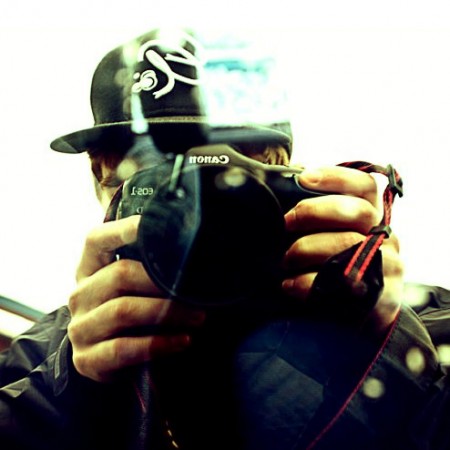
Starting later today, Shelby White will join the ISO50 team as a contributor to the blog. Many of you will recognize Shelby as a frequent commenter here on ISO50. He also runs his own design blog, Wanken, which he has curated for the last couple years. As is evident from his posts, Shelby is extremely passionate about design. He has a remarkably discerning eye for captivating work — especially of the mid-century modern variety — and his aesthetic should fit right in here at the blog. He is currently living in Seattle, Washington, where he is studying at the Art Institute and working for BKWLD (A Sacramento/Seattle-based design agency where Scott spent some time as well).
We are excited to add a new perspective to ISO50 — please give Shelby a warm welcome, his first post should go up later this afternoon.
Trent Mitchell

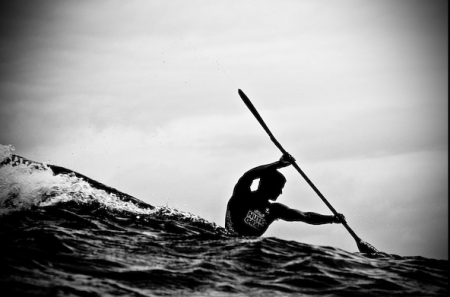
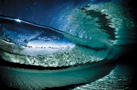
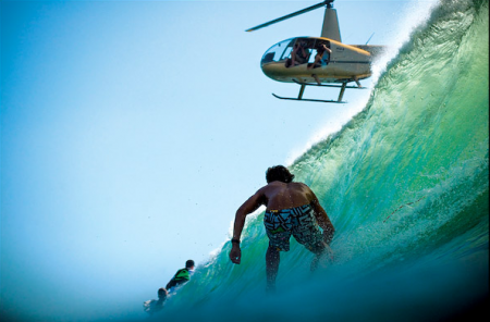
A few photos from Australian photographer Trent Mitchell. That first image is really amazing — looks more like a painting than a photo to me. I am obsessed (and terrified) of the ocean, and I love shots like this that capture the colossal power and beauty of the ocean.
The other day I was convinced I needed to take underwater shots with my new camera. Thinking an underwater housing might cost somewhere around $100, I set out to purchase one and rent a wetsuit. This, I’ve learned, was a naive assumption. An underwater housing for my camera costs approx $3500. The dream died as quickly as it appeared.
The original inspiration for this underwater mission was the work of Asako Narahashi. The idea of floating just off the coast of various beaches, taking the occasional photo, sounded pretty good. Looks like I’ll have to make due with a complicated array of ziplock bags.