Archive for June, 2010

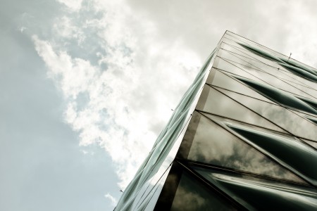
Prada Building // Aoyoma, Tokyo


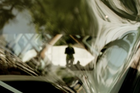
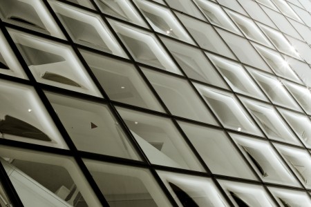
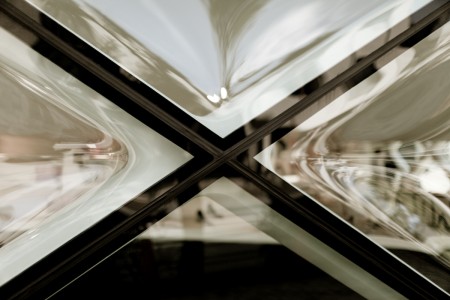
I spent today walking around Aoyoma, a fairly upscale shopping district near Harajuku in Tokyo. One of the more distinctive features of the area is the Prada building, designed by the Swiss duo Herzog & de Meuron. It was really hot walking around it and staring up at the sun, but I couldn’t resist the opportunity to shoot such a cool looking structure. The way the glass warps the interior while simultaneously reflecting the exterior makes for some really interesting compositions. From immediately below, looking up at the sky, the building kind of resembles bubble wrap, or perhaps the bottom of an almost boiling pot. My favorite part is the color contrast of the cross sections, between the black of the edges and the off-white of the supports. The attendants inside kept tossing me suspicious glances, once they figured out I was *not* there to buy anything.

I passed by this evening as well and the building looked awesome in a completely different way. Kind of like a 24 hour bee hive. Unfortunately I didn’t have my camera; I would have really liked to round out the photo group with a few night shots. On an unrelated note, I didn’t have my camera because I was on the way to a Mike Stern concert at the Blue Note. If you are remotely into progressive jazz guitar at all, check out his music. He and the band (especially bassist Richard Bona) really tore the roof off the place tonight.


CFCF+Portishead+Superpitcher+Blondes


CFCF have been my favorite remixers as of late, they always stay at a great pace and grab perfect elements away from both slow disco and house, this one for Jori Hulkkonen has been my fave.

I’m not sure if this is old or new Portishead but I just saw it featured up on iTunes and it caught my ear, i’m a sucker for her voice and that Moroder like driving synth.

More remixes from the master Superpitcher, back in the early and mid 2000’s if you had a Superpitcher remix on your 12″ you were pretty much guaranteed record sales, those were the days.

One band that I haven’t seen live yet but are on the top of my list is Blondes, they play a ton here in Brooklyn but I seem to miss them everytime. This song Spanish Fly might have elements of the whole post Animal Collective sound but way more electronics pushing the song forward.

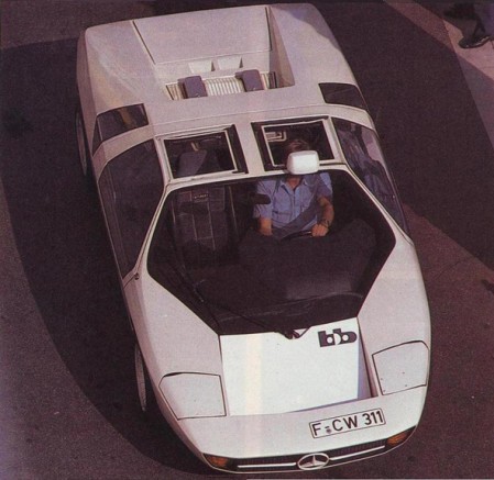
1978 Mercedes-Benz Study CW311


I’ve been on a car kick lately. Not only are they excellent examples of functional design, there’s something about the quality of 60s-70s concept car photography that always gets me. This latest entry is the 1978 Mercedes-Benz Study CW311. Designed solely as a concept by Eberhard Schulz Isdera for Mercedes Benz, it was later put into production as the Isdera Imperator 108i. You may recall the post on the Mercedes Benz C111, a concept which Shulz also developed.

I feel like this was the era right before everything started looking like alien technology or some sort of bird. It seems like in high end conceptual situations like with supercars, the designers are always trying to envision some object from the near future. I guess I prefer the near future imagined in the 1970’s over that of today.

I love the lines, really aggressive but the overall vibe is softened by the sort of roundness of the thing. I’m definitely getting an Italdesign/DeLorean vibe off the windows. Also, picture kicking it with a Lufthansa airliner? Classy. And I’m loving the roof mounted rear-view; something very utilitarian about that. On a side-note, I feel like if a car could be a typeface, the CW311 would be Trade-Gothic Bold Extended.

And to top it off, a very VHS-ish video featuring the CW311 (with poor choice of substitute wheels):

httpvh://www.youtube.com/watch?v=IELHeVXm0cg

Special thanks to AJJB for turning me on to Shulz’s work back in the C111 post. AJJB also pointed out that Shulz is now “selling cheesy oil paintings out of a small town in Germany”. Interesting and sort of sad too…

Images via Carstyling.ru

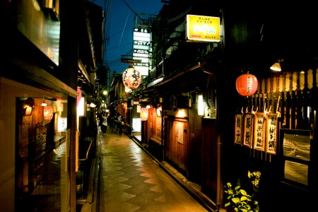
Japan Travel Update


We’ve been in Japan now for about 5 days. Mostly in Tokyo, though the last couple days were spent in Osaka and Kyoto, utilizing our JR Rail Passes. I almost blitzed to Kobe for the afternoon but got caught up on the world’s largest ferris wheel in Osaka. I didn’t know I was afraid of heights until this trip, where I have managed to induce vertigo about 5 times. We’ll be in Tokyo for the rest of the week, staying in a pretty crazy part of Shinjuku.

The trip thus far has been amazing. The weather — especially compared to two years ago — has been really cooperative. We’ve gotten lost many times; usually the result of me half-remembering where something is from last time. I can speak enough Japanese to ask for directions, but not quite enough to fully understand the answer. This usually results in us basically bouncing between locals until we happen upon our destination. I refer to this process as Lost Alex’s Local Japanese Pinball. Travel companions generally do not find this amusing.

(more…)

Tycho: Past Is Prologue iTunes Reissue


Past is Prologue — my first album as Tycho to be released on a label — has been reissued by Ghostly International and is now available on iTunes (and, as always, at the ISO50 Shop). the reissue includes an exclusive remix by Mux Mool of From Home.

I often get asked about the lineage of this album, which has taken on many forms, so I thought I’d lay it out here. The original release was entitled Sunrise Projector and was self-released. Later, Merck records picked it up and released it as Past is Prologue. The Merck version featured new artwork, two new original songs, and two new remixes — but was missing one of the tracks from the Sunrise Projector release. Merck also released a 12″ vinyl sampler featuring 5 tracks from the album. Now, ghostly has released this digital reissue which features the new Mux Mool remix. Hope that clears it up!

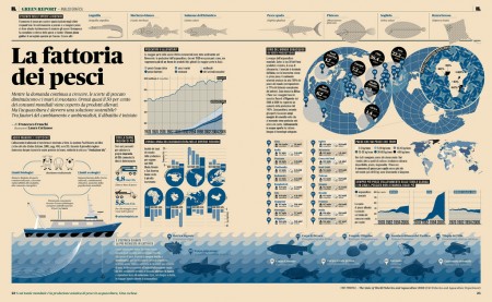
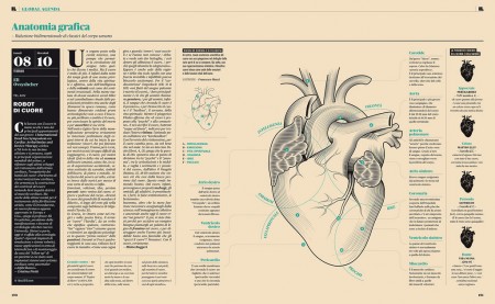
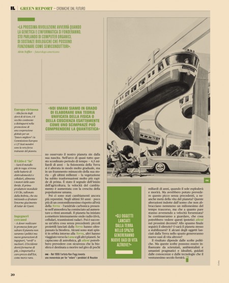
Intelligence in Lifestyle Magazine


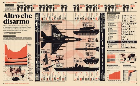
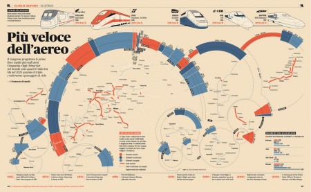
Intelligence in Lifestyle magazine is the new holy grail of infographic greatness. It is a high-end Italian magazine aimed at men. The magazine is equipped with a beautiful design by the art director Francesco Franchi and the creative director Luca Pitoni.

For some of us, getting ahold of the magazine could be difficult. However, several several of the layouts from the interiors spreads and covers are archived on Flickr. Check out the larger sizes, they may compliment your desktop nicely. If in case you’re wondering, the magazine utilizes Publico, a serif face that fits perfectly into the design is much less ubiquitous than say Helvetica or Archer.

On another note prior to being introduced to this magazine via Colorcubic, I was starting to become overwhelmed by the amount of infographics being pumped into the designosphere. Infographics about infographics were being designed for crying out loud. It just seems like it has become trendy very quickly. It’s not to say its a bad thing, but it sure makes me appreciate great design like in this magazine or Nicholas Felton’s works more than ever before.

I’m curious to hear what your thoughts are on this topic.
Do you feel there is an influx of infographics and is it a good or bad thing?

(more…)