
Archive for October, 2010

Encounters at the End of the World


I’ve been wanting to see Werner Herzog’s Encounters at the End of the World for some time and finally got a chance to see it tonight. After seeing Fitzcarraldo and The Bad Lieutenant: Port of Call – New Orleans (which is so incredibly bad that it’s certainly some sort of elaborate joke he’s playing) in rapid succession, I was excited to check out his take on the Documentary format. Based on the trailer I was somewhat looking forward to the imagery in Encounters — I was expecting the majority of the film to be shot underwater like Wild Blue Yonder but was pleasantly surprised to find it was more about what was going on up top. The people, landscapes, buildings, and machines around McMurdo Station make for some beautiful shots. As Herzog narrates in the film “..on this planet, McMurdo comes closest to what a future space settlement would look like.” We even get treated to some vintage celluloid from a 1970’s-era expedition. Definitely a must-see.

More stills after the break. (more…)

BodyLanguage+Mujuice+P. American+Burial


Soon to be Soul-dance pop superstars Body Language has innocence, enjoyable stage presence, and danceability nailed down for a crowd any young crowd, download this free EP they’re offering.

Mujuice is a Russian producer i’m pretty sure, i’m guessing he’s kind of young too. He always hooks me in with catchy repetition, reminds me alot of Farben’s Starbox.

Fans of the label Kranky don’t need an introduction to Pan American, I personally prefer listening to most of their earlier material because of how calm it got me.

In my opinion the most dynamic and emotional Burial track, this song has helped me through long drives on this SVIIB tour.

DSLR + iOS Wireless Photos


httpvh://www.youtube.com/watch?v=vj4WqJGQu1Q

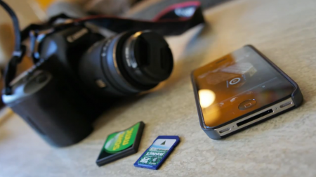
Here’s some serious power on the cheap for your next photography outing. Gizmodo details how to sync your DSLR and iOS device up for wireless shooting and image transfer. I’ve been wanting a system like this but assumed it was insanely expensive, this method will run you about $75 (assuming you already own an iOS device). My only potential issue with it would be transfer speed; notice how there is never a continuous shot of the photo being taken and the image arriving at the iPhone. The remote shutter functionality is enough for me though.

Source Gizmodo

Colors of the Top 100 Web Brands


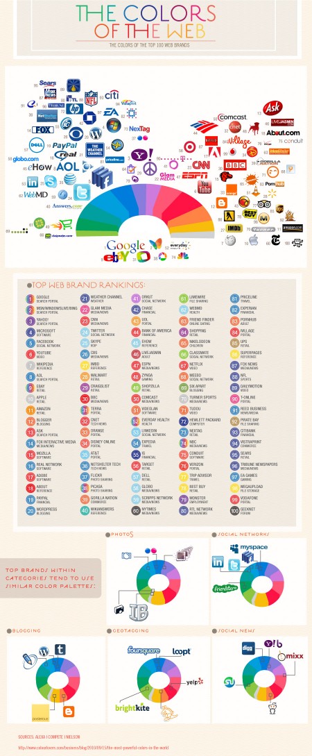
While the initial reasoning for the colors chosen may be trivial, the impact that these dominant players now have in the web world will surely influence the smaller startups that want to share in the positive color associations created by their bigger siblings

The fantastic Colourlovers put together this chart diagraming The Colors of the Top 100 Web Brands. A fascinating chart — the results of which you could probably guess — but it’s cool to see them all laid out and analyzed. Click here for the full size image.

via Josh Spear

B. Baird+LukeAbbott+TwinShadow+Anoraak


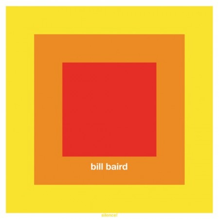
I can’t find too much about Bill Baird but this song is a must hear for an ambient head. From front to back this light horn parts floats over the piece, HIGHLY RECOMMENDED.

Luke Abbott’s new album starts over off with these amazing little flutters, I had to share.

Twin Shadow redeemed itself after I heard their new album, I love the Don Henley style guitar playing here.

I’m on a Anoraak kick because of his synth work but i’m not feeling these vocals, still a pretty solid listen, I can see alot of people enjoy this.

Swissair: Behind the Logos


Swiss Airlines has a rich history that has been hidden in the archives for quite some time. On March 26th, 1931 when Swissair formed, I doubt anyone at the time really considered the history that they were going to be making with the company’s design. Balair and Ad Astra were the two companies that merged to form Swissair. Throughout the years they’ve changed logos many times but there was one that was most memorable (above). Quite possibly it was the best logo that the company has ever used.

Thanks to SR692 for collecting this information so that we’re able to walk through past logos used by Swissair. Some great, some not so great and a few that were very, very experimental. Hit the jump to see how the company logo changed throughout the years.

Via Wanken

(more…)

How Ink is Made


httpvhd://www.youtube.com/watch?v=Fypi6dAJB8E

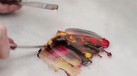
I always see those huge drums of ink sitting around when I’m on press for a print job but it rarely occurs to me to ponder where it comes from. Well thanks to The Printing Ink Company, now we know. It’s amazing the time and the attention to detail they put into each step. Beautifully shot; the whole thing really makes me appreciate printed materials all the more.

Written and produced by Ian Daffern | Directed and Edited by Tate Young

Video Source

Gap Contest Winners

First Place: Roger Schami


Second Place: Steve Juliano


Third Place: Benoit Henken

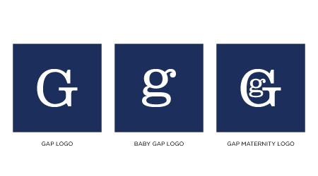
The votes are in and we have our top three Gap Logo redesigns. A varied bunch to be sure. Congratulations to our winners Roger Schami, Steve Juliano, and Benoit Henken! You will be notified by email with information regarding how to collect your prizes.

Honorable mentions to both Jason Caldeira and Chris Reynolds, who scored fourth and fifth place respectively.

Atlas Sound+Arp+Matthew Dear+Eluvium


Rocking with the new Deerhunter record is fun but I hate wearing out a record too early so I started digging thru some Atlas Sound and pulled out this gem of an early EP.

Arp has some light synth work that takes some time to grow but that growing time is where you want spend your time listening, soo relaxing.

For those who bought the Matthew Dear album on CD you didn’t get this digital bonus from Matt. Its a new spectrum of that circular sound he does that grabs me.

I’ve noticed i’ve been looking for more tasteful piano music, Eluvium and Peter Broderick have been my go to’s, any more suggestions? I know its a huge can of worms to bust open, I don’t need any BS like Radiohead piano covers or dumb shite like that.

Access Virus TI2


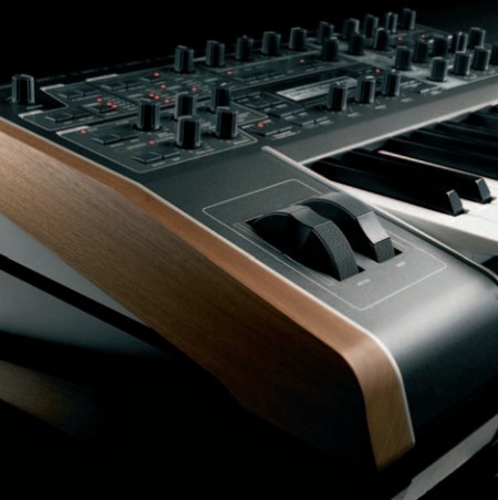
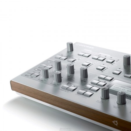
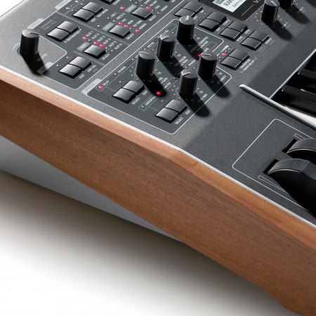
Pictured above are some shots of the various models in Access Music’s Virus TI2 line. Of all the musical equipment manufacturers out there, I’d have to say that the Recklinghausen, Germany based outfit are making some of the most innovative and powerful sound synthesis tools available today. But aside from that, they’re incredibly beautiful and well-crafted machines. I’ve owned several and have to say I’ve always been amazed at the build quality and attention to detail they put into their equipment. I love how they take subtle cues from the past — the perfectly measured application of wood is a perfect example — while still pushing the design forward. As I’ve said before, it doesn’t get any better than stainless steel and wood, and the TI2 KB features a stainless steel/wood sandwich on the endcaps. Sort of like the amazing Jupiter 6 caps, but with wood (I sold a Jupiter 6 once. Worst mistake ever). But none of this comes cheap, these are also some of the most expensive synthesizers out there (probably the most expensive VA’s). I’d have to say they’re well worth the money though, the sound is unmatched and they’re built to last.

What I really admire about what Access is doing is that they’re doing it all from within the festering pit of mediocrity that is the music technology industry, an industry dominated by bad taste and terrible interface design. I don’t know what it is that drives industrial design in music technology, but you’d swear every new keyboard was designed by the backup drummer from Ratt. So I really admire it when a company steps up and chooses quality design over gimmicky superfluousness and nonsensical hyperbole (Tubes? Really? I bet they’re not even in the signal path). Roland is the saddest example of a once great company committing egregious latter day design sins. This is the company that brought us the iconic 808, 909, MSQ-700, SH-5, and Jupiter 8. Music machines with incredibly well thought out interfaces which were also durable and aesthetically pleasing. The best they can muster now are bloated, plastic, messes that look like a cross between a dvd player and a karaoke machine. And they don’t sound any better than they look. Oh yeah, once in a while try to reclaim their former glory with a cheap knockoff of their own product (to be fair, Korg is just as guilty of this as Roland).

But I digress… If you’ve caught some of my posts on the studio or seen the live show you may have noticed that I’m quite fond of my Virus C synthesizers. Of all the VA (virtual analog) synthesizers out there, I’d say the Virus has the most warm and unique sound. When it comes to VA’s, I think it’s all about the converters. The modeling can be dead-on but if you’re running through some space-age, 24-bit converters, the sound is going to be cold and rigid. That’s the thing that (used to) set the Virus line apart from the rest, the converters. They were warm and gritty, you could really feel the sound, it was authentic. First came the Virus A, which many still consider the best sounding of the Virus line (I wouldn’t know, I’ve only used the C line and on). Then came the B, which I heard had a little cleaner converters (read: worse). And right around the time I became aware of the Virus they came out with the C line. I was sold the first time I played one. They come shipped with the bucket full of useless euro-trance trash patches that are apparently legally required to preload on a new synth, but once you get past those and start digging in and programming, you can make them sing.

A couple years later they came out with the TI line and I got a TI Polar. To tell the truth, I was pretty disappointed by the sound. It was just too sterile, too pristine. They had apparently implemented the new 24-bit converters and you could hear it. I ended up selling the Polar and sticking with my C KB and Indigo Redback. Which was unfortunate, because the TI’s are just so beautiful. And also because Access no longer makes the mainboards for the C models. One bad power setup at a show and my Indigo is toast, for good.

Images Source: Access Music