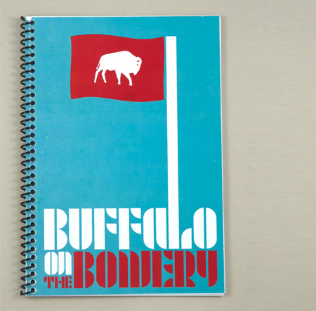
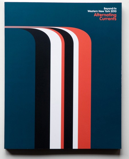

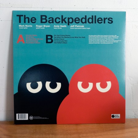
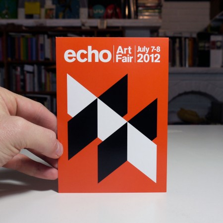

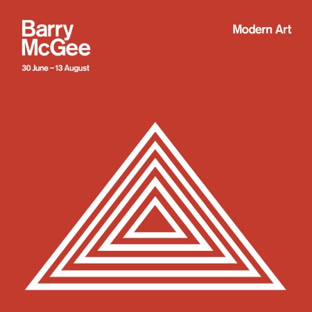
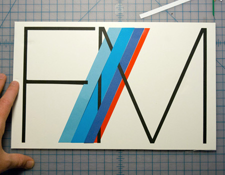
You may recall the post I did a while back on Daily Book Graphics. Well apparently I misidentified several of those images as vintage covers when in fact they were modern works by designer Julian Montague who is part of the Buffalo based design duo Frazer / Montague.
Archive for March, 2012
Frazer Montague Design
Icon 4X4
![]()

![]()
![]()


When I first saw the Icon 4×4 CJ series a while back I was temped to post but never got around to it. Seeing their new 1964 Bronco reproduction tipped the balance though and I had to get these up here. Icon create idealized versions of a few of the great 4×4 of yore (Bronco, CJ, and FJ) with a modern slant and an eye for detail. Don’t ask how much they cost unless you’re reading this on the front deck of a yacht or all your emails end with “Sent from a horse”. Nike was somehow involved. Also, you get a free shoe with one of them apparently.
More pics and some insight into the process of designing the Bronco can be found here
The Violet Crown App At SXSW
With everyone heading to or already at SXSW this week and next, I thought this would be a good time to post about the location aware music apps that Bluebrain has been doing. They’ve already done one for The National Mall and Central Park ( Listen To The Light ), the new one The Violet Crown is based around Austin and SXSW. Basically it’s, as Bluebrain describes it, “a musical composition, available exclusively as a free iPhone app, that uses the phone’s built-in GPS to alter the music as the listener traverses the area – each street and intersection is tagged with various pockets of sound, turning the festival grounds into a musical ‘choose-your-own-adventure’.”
You can download the free app here through iTunes.
It’s a really cool concept and as of yet, I haven’t been able to try out the other versions from The National Mall or Central Park ( Listen To The Light ), The Violet Crown will be the first.
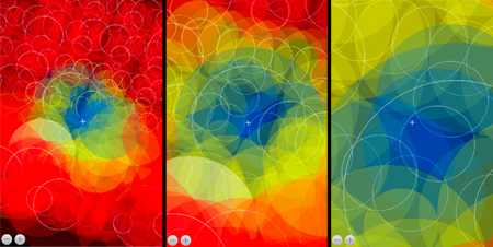
For those that can’t make it out to SXSW this year, I dug a little further to get some more of the background on The Violent Crown app and some process. Ryan Holladay of Bluebrain went over the technical info and he sent me a few screen grabs and a map from the programming end of things. He also did a breakdown of how it works, which I think is really interesting.
“What you are looking at in these shots is the app simulator running running on our desktop — this is a way that we can remotely test the music without having to be in Austin and simulate the experience of, say, walking from one block to another and hearing how the music changes. As you can see, there are many in a single area, often with so many overlapping that it’s difficult to tell visually where each of them are located. The crosshairs in the middle represent the location of the listener, the various circles indicate the size of the audio track and the colors the state the audio is in: Blue, as you probably guessed, is playing, while yellow is cued and red is disengaged.
Because, by design, the app basically has to be ready for whichever direction you move, what we have is a system that prepares the audio to be dropped in at any given point and at the correct interval by preloading audio in every direction within a certain proximity. So, for instance, if you were to begin walking from Frontage Rd towards Congress Ave, halfway up 4th Street it will have prepared the tracks waiting for you when you arrive at Red River Street. But, when you reach an intersection, the audio to your left and right is also waiting for in case you chose that direction. Once it’s realized you’ve moved on, it drops those tracks to save processing power until you turn around and re-approach.”
To see what it’s all about check out the Making Of video below, which gives you a detailed explanation of what it does and how they actually built the one for Central Park ( Listen To The Light ).
Ski Posters 3
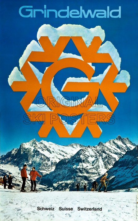
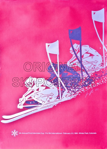
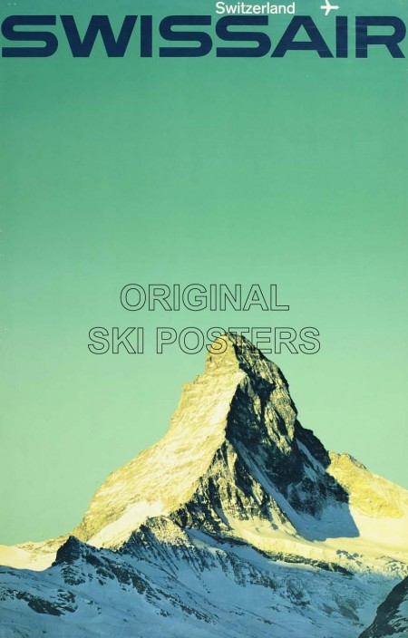
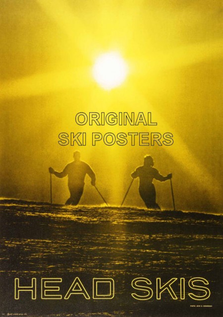
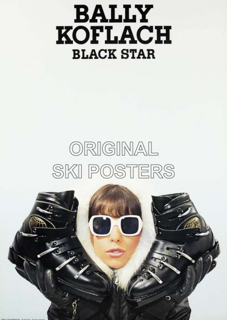
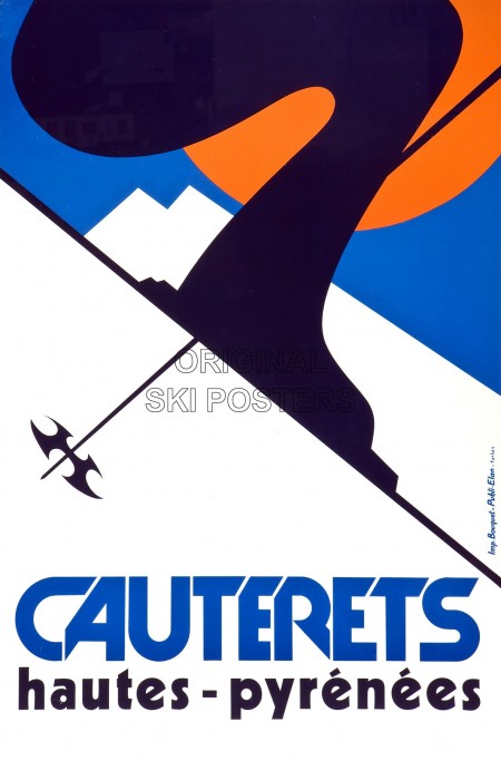
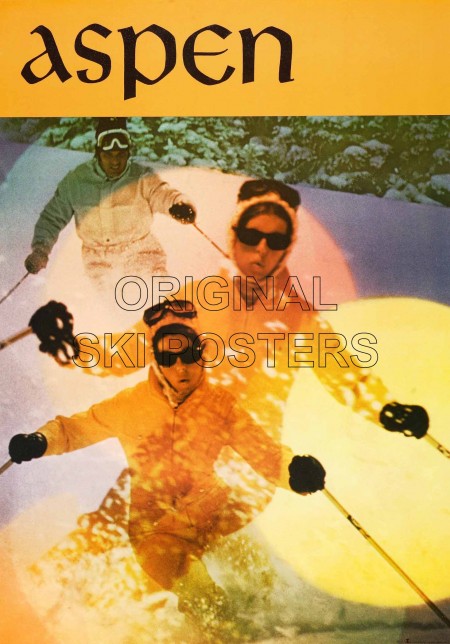
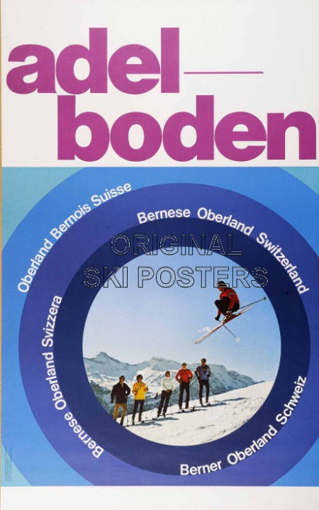
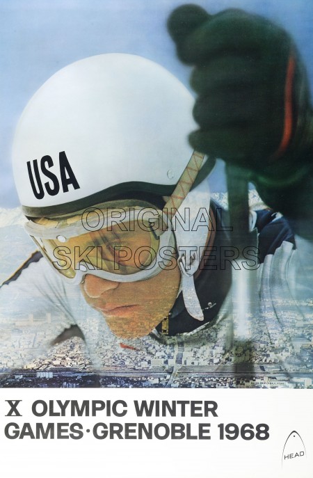
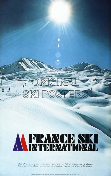
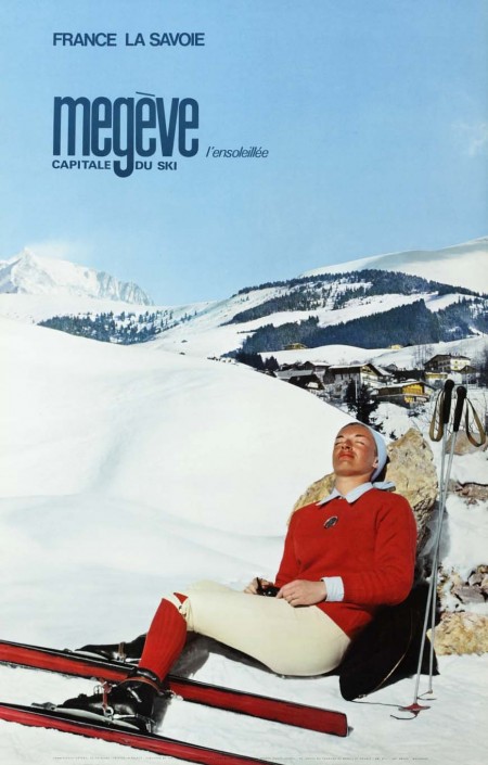
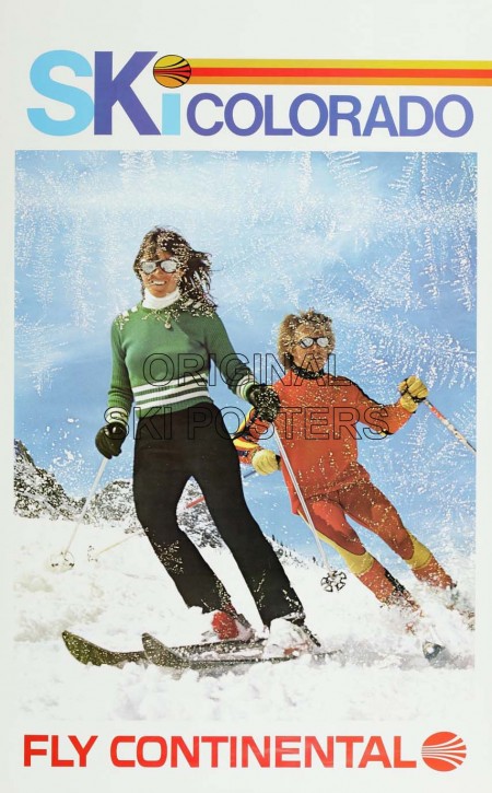
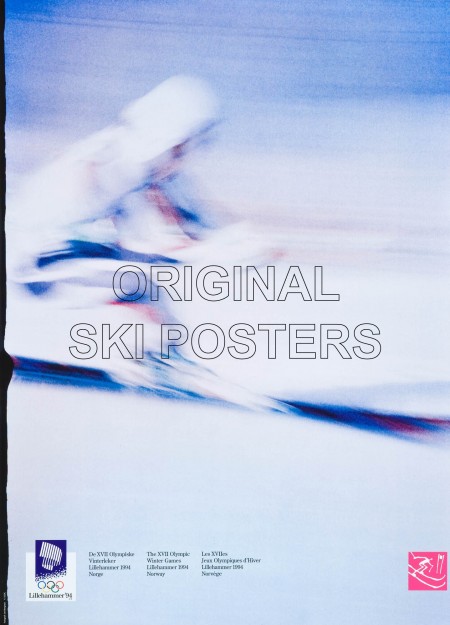
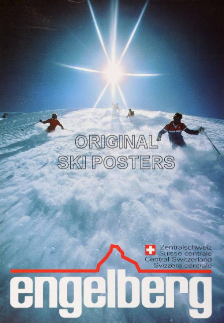
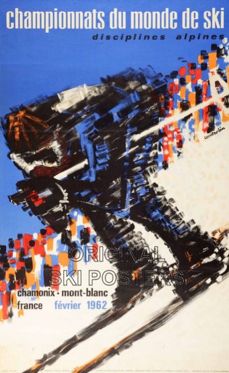
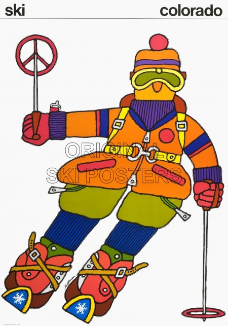
So I came across this great collection of vinatge ski posters a while back, but unfortunately they were all watermarked. I really hate watermarks and try to avoid posting images containing them at all costs; but these were just too good to pass up so you’ll have to try and see past the giant “ORIGINAL SKI POSTERS” and enjoy the underlying greatness. Growing up in Sacramento I always had a thing for 70s ski culture — Tahoe was a short drive up the mountain and a lot of the style and imagery tricked down into the valley. A lot of these perfectly capture the spirit of those times for me.
So, as you may have guessed, these are all from the Original Ski Posters site, where you can purchase many of them. Sadly, these watermarked Jpegs are as close as most of us will ever get to these as they start at around £500 and go upwards of £3000. there is an open image directory here where you can grab all the images with a utility like Downthemall. A couple seem ripe for watermark removal and some of the resolutions are high enough to get a good print out of.
Tycho at SXSW 2012
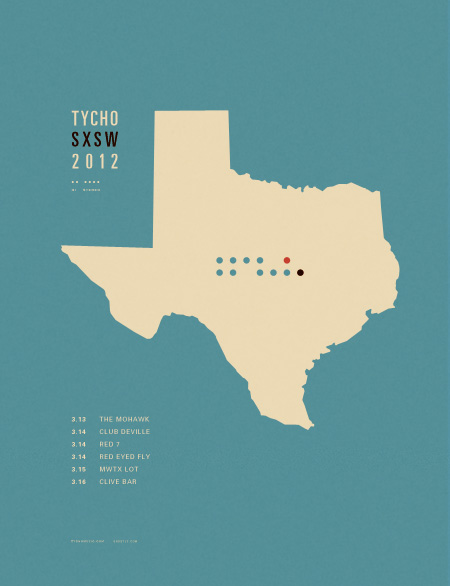
We’re happy to annouce that Tycho will be playing several at this year’s SXSW in Austin, TX. See you there!
Tycho SXSW 2012 Schedule
3.13.12 – Pitchfork Interactive Showcase – @ The Mohawk
3.14.12 – Ghostly SXSW Showcase @ Club Deville
3.14.12 – Terrorbird Party @ Red 7
3.14.12 – IODA Party @ Red Eyed Fly
3.15.12 – MWTX Party @ 1100 E. 5th St.
3.16.12 – Filter Magazine S.O.Terik Party @ Clive Bar
Geometric Illustration by Justin Mezzell
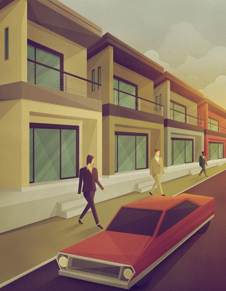




Justin Mezzell’s geometric illustrations are fantastic. His pieces of work that include architecture, have that warm, muted color scheme reflective of a mid-century modern vibe. Also if you look closely in this image, you can see two Eames Lounge Chairs by the window.
For more finds like this, follow Shelby on Twitter.
Solipsist Full Length Film
Andrew Huang’s full length version of Solipsist is now available to watch above. I posted a few weeks ago on the trailer, which I was astonished by alone, but now the full version is up. This piece is nothing short of astonishing from photography and post to sound design. I won’t say too much more, but I will say that you might want to close out of Photoshop for about 10 minutes and fullscreen this.
Also, for those that are interested, here’s the making of that’s equally as interesting.
Canon 5D Mark III Announced

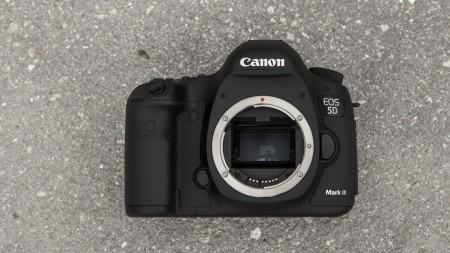

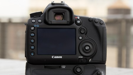
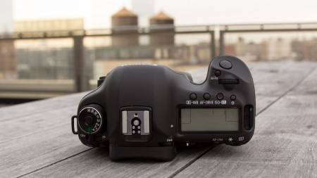
The Canon 5d Mark III that everyone has been waiting for has been announced. The camera brings a handful of improvements including speed, greater resolution, more processing power, and more options for shooting HD video. The full-frame sensor has been upped to 22.3 Megapixels and shoots up to 6 frames per second with a 61-point AF system. What’s great about the new sensor in this camera is that the pixel pitch is smaller, which allows for better low light performance.
For a handful of years I’ve shot on my trusty Canon 1d Mark II but it’s dated. Jumping up to the 1DX would be ideal, but it’s $7000 price tag is unfortunate. So what do I think about the 5d Mark III? The Canon 5d Mark II was an amazing camera, but the 5d Mark III is even better. Coming in at $3500 for the body I don’t see it as being unreasonably priced.
Is the 5D Mark III what you hoped for—would you buy it?
Spec list:
Price: $3500 (body)
Sensor: 22.3-megapixel, full-frame (36.0mm x 24.0mm) CMOS
Processor: Digic 5+
Max ISO: 25,600 (standard), 102,400 (expanded)
Max Image Size: 5,784 x 3,856
Video: 1080p (24/25/30 fps), 720p (24/25/30/50/60 fps)
Display: 1.04-million dot, 3.2-inch LCD
Images via Gizmodo
Large Format Kodachromes

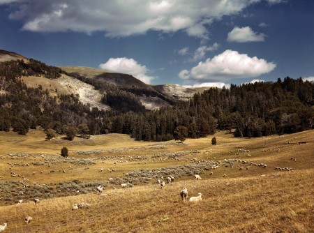


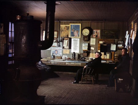





Some vintage WWII / 40’s era Kodachromes. Always amazed at the color and detail of these. Images like these are a stark illustration of the limits of technology. Or at least of what we consider technological progress. True, photography has become more convenient and cost effective, increasing availability and enabling more people to participate. I think on the whole this is worth the cost of the death of film. But the sad truth is that the kinds of images you see above are a dying breed. In fact, I have not personally seen anything approaching this kind of quality come out recently (please correct me if I’m wrong, I’d love to see people doing stuff like this currently).
Although these shots are all beautiful, they don’t hold a candle to William Eggelston’s brilliant work which occupies the same kind of color space in my mind.
On a side note, I just got to Barcelona! One of my favorite cities, so happy to be able to relax here for a few days after our long European tour.
Via Shorpy
