Archive for April, 2012

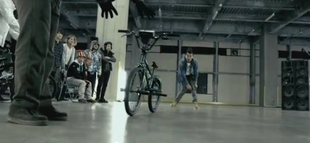
Turntablism meets BMX


Only maybe 2 people on this whole blog could probably do this successfully and know their records while nailing tricks but it would be a great time just fooling around with it. What i’m more interested in is ambient type music with this and adding delay and reverb.

via DjTechTools

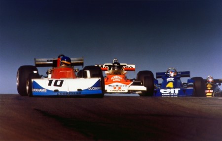
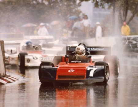
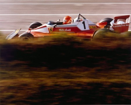
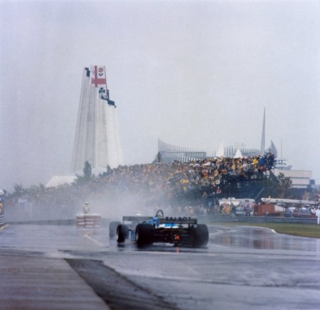
Photography of Allan de la Plante


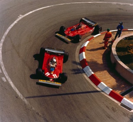
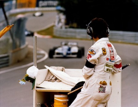
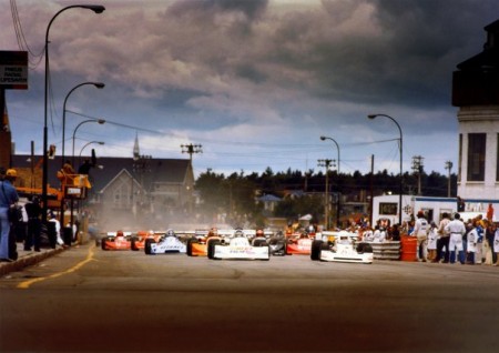
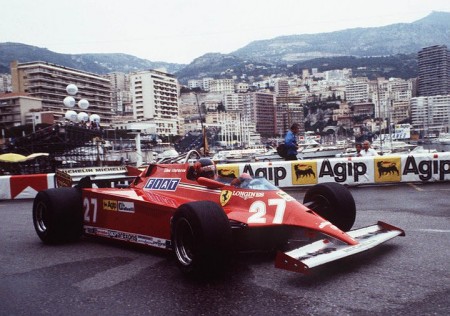
Allan de la Plante was a photographer during one of motorsports heavily transitional eras, at a time when F1, CAN-AM, and Indy Car chassis builders were just starting to grasp what they could do with these fiberglass tubs in the way of aerodynamics. A close personal friend of the late great Gilles Villeneuve, Allan captured alot of beautiful images that turned me onto racing to begin with, he always focused on getting a different perspective from the hundreds of other photographers attending any given race.

-Rory

Matt Lehman


Matt Lehman is really good at logos, and illustrations. It’s been a long time since I’ve seen such a fun and well executed branding portfolio. There are some straight up classics in there, and that Warner Nashville one, wow. I’d love to see this guy get more into poster work, but simplified. I feel like some of his illustrations tend to get a little busy while minimalism seems to be his strong suit. The two included above are good examples of a nice balance of clean lines and texture.

More good stuff over at Matt’s Portfolio

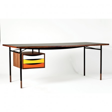
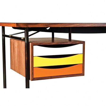
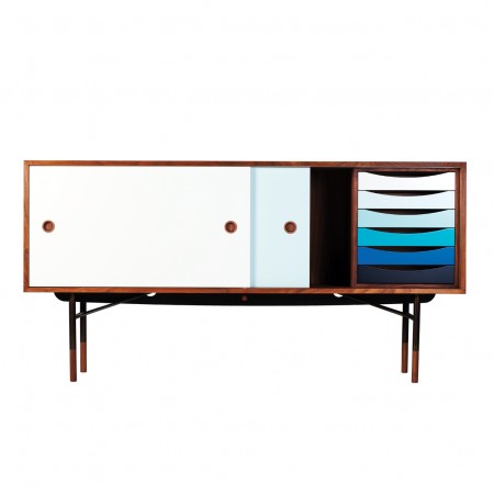
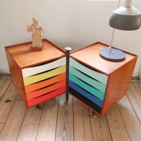
Drawers by House Of Finn Juhl


Lately we haven’t done much furniture postings which when we started I thought would be something we’d beat into the ground with an abundance of posts. Now that the blog keeps getting more and more great posts from the collective i’ll do my best to keep an eye out on some vintage furnishings and new work like these drawers from Finn Juhl which is classy mid modern design with a semi brighter color palette.

Life in a Day


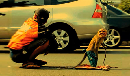
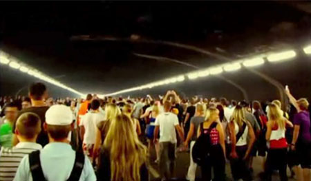
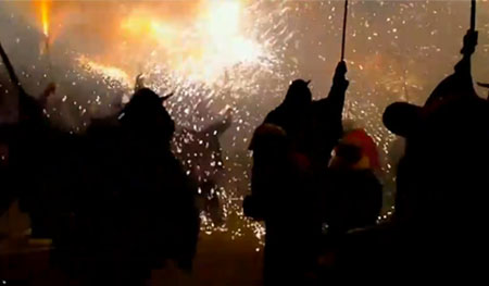
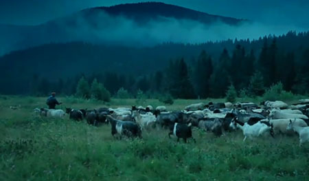
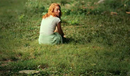
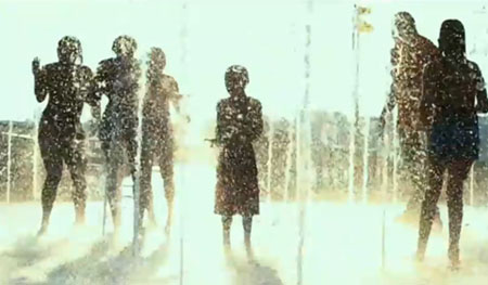
I stumbled on this film the other day, I’m a little late to the scene sometimes… Its a film made from 80,000 video clips that were submitted to YouTube on a single day, July 24, 2010. There were 4,500 hours of footage from 192 nations to sift through and edit into a 95 minute film. This wasn’t completely spontaneous and had some direction but still captures a very personal glimpse of a day in our world.

posted by @hallwood

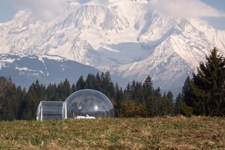
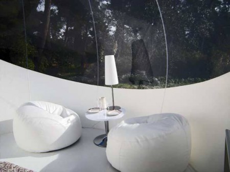
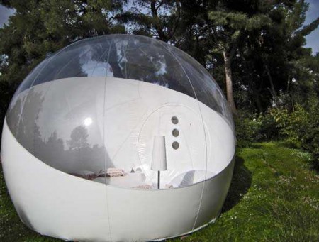
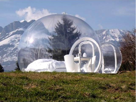
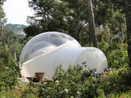
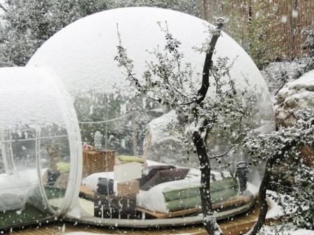
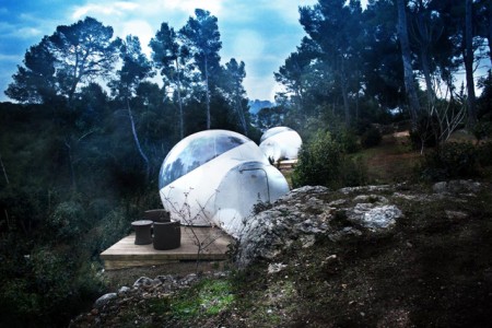
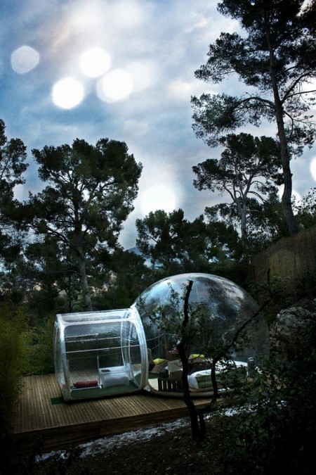
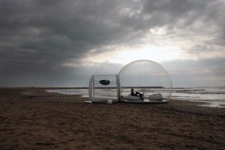
Bubble Tents


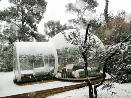
I’m always drawn at the site of micro structures, pods and/or any type of compact-living unit. I guess you could say it’s the kid in me who always loved his club house (I took over a shed in our back yard, and turned it in to my personal headquarters). Also, a few years back, while living in Chile, I took a trip with 3 friends out to Pan De Azucar, a Natural Park where the desert meets the ocean, for what was supposed to be a 2 week camping trip. Fascinated by the sense of community formed by the “tent metropolis” we encountered and later experienced, we extended our stay to close to a month.

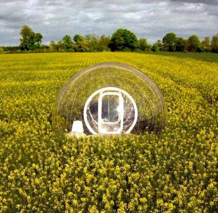
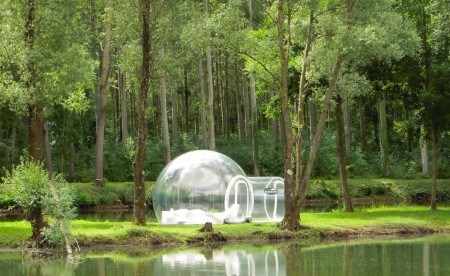
At the time, I couldn’t help but think that we were witnessing what ultimately all living communities and societies would end up turning in to, so when I came across French designer Pierre Stéphane Dumas Bubble Structures, I was brought right back to those thoughts.

Pierre wanted to create a Eco-friendly space, following a single charter:

Proximity to nature, minimum environmental impact, landscape integration, economic integration of social aspects.

He also says his “creations” are “unusual huts for unusual nights”. He explains:

Having a night under the stars or seeing the sun rise and set is not something that many people experience anymore.
A normal tent or camper van means people miss out on these things, so I designed this eccentric shelter with the aim of offering an unusual experience under the stars while keeping all the comfort of a bedroom suite. The ceiling of the bubble has the Milky Way, guests will be able to enjoy this as well as the extraordinary light variation of the sunset and sunrise.

What started off as a few tents that could be found scattered around France, has now turned in to a couple of hotels in the same country, Attrap’Rêves in Bouches-du-Rhone (near Marseille) and Sky River outside of Loir-et-Cher.

Also, if you’re looking for inspiration or a good read on microstructures, I personally recommend Micro: Very Small Buildings by Ruth Slavid. Great projects, photos and layout.

Posted by B3PO

Guest Music Post: Com Truise


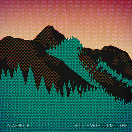
In early May Datassette will hit us with ‘People Without Mouths.’ The 12″ EP will be available on Shipwrec records and the digital version will follow two weeks after with bonus tracks and a a remix by Ilkae. He was kind enough to share the track ‘Don’t’ with us, and it’s a smooth, tingly gem of a track. Sprinkled with vocal stabs and bent percussion. Really stoked on this EP, head over to datassette.net for plenty of other goodies.

On my recent visit to Austin, TX I was lucky enough to catch Missions perform a set. He was surrounded by vintage equipment, a control center shrouded in synth. ‘Darrk/Blakk’ is the A-Side of his upcoming 7″ via Pau Wau Records. It sounds as what I assume an early 80s’ Depech Mode demo would sound like via a walkman running dangerously low on batteries. Haunting vocals seem to sit between towering walls of synthetic goo slowly dripping into your ears. Looking forward to more from Missions.

‘Don’t Open The Door’ from VHS Head was released on a Benefit Compilation for Japan on ICASEA. Contained within is the signature VHS Head sound. He is the master in mining the depths of pre-certification video. ‘Don’t Open The Door’ is a droopy eyed jam, it brings to mind the river of pink slime in Ghostbusters II, and what I might be like to slowly sink into that warm, murky mess. Quality track.

Innergaze just dropped their second LP ‘Mutual Dreaming‘ on Cititrax. Hailing from Brooklyn, this synth wielding duo pants a perfect picture of early dance music. ‘Is This Your Love?’ really had me floored upon first listen. It’s a slightly grey journey inward, highlighted by glittering arpeggios and synthetic stings. Topped off with vocal stabs that seem to pull you in and press you back out. ‘Mutual Dreaming’ will get some heavy rotation from me.

Music Provided By: Com Truise

NAB 2012: Blackmagic Cinema Camera

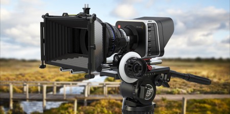
Last week I flew out to Las Vegas alongside the Fiction crew for NAB. The show covers everything from post-production and computer hardware to lenses, cameras and lighting. It’s hard to summarize everything that I saw because I was constantly in overload, so I decided to pick the one product that stuck out, the Blackmagic Digital Cinema Camera.

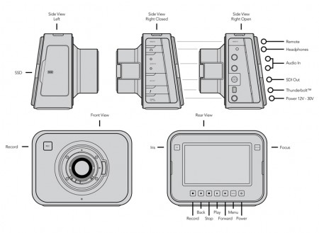
The Digital Cinema Camera is a Raw ( Cinema DNG 12-Bit ), 2.5K ( 2432 x 1366 ) camera for 3,000.00 USD. There’s a laundry list of features that the camera offers but mainly…it’s very, very cheap and it’s output at 2.5K is RAW. They implemented a Canon EF mount, so everyone transitioning from Canon can do so, easily. Also, it’s all touchscreen and uses off the shelf SSDs as media. The sensor is Micro 4/3 so it’s smaller than a Super35mm ( 7D / Red Epic ) and much smaller than the 5D which is close to 65mm ( In film terms, not still ), but they’re claiming 13 stops of dynamic range on it. The camera only shoots up to 30fps, so it’s not a camera that just beats all the others, but it definitely puts an option out there that a lot of people have been interested in.
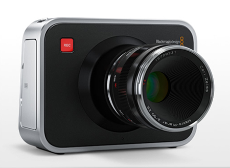
From my perspective, it’s not about what the camera looks like, it’s what it delivers when it’s in the timeline. I think this fills a gap that’s been around for the past few years where the Canon DSLRs work for a lot of stuff that’s non-commercial or internet only…this offers professional level images at a bargain price. I think what I’m excited to see is the creativity and quality that’s about to change. I feel like a lot of motion designers and directors starting out use Canon DSLRs for low budget and experimental work and while it looks great now, imagine if these guys and girls are shooting 2.5K RAW and able to really work footage in terms of color, overlays, etc. The camera ships in late July, and they’re also including Davinci Resolve with it. I’m having a hard time not clicking “Add to Cart”.

Here’s a video detailing the camera completely from DSLR Newshooter. I wanted to get in and shoot a little interview but the booth and the 3 or 4 cameras they had out were swarmed every day I was there.

As of right now, I’m heavily invested in a RED Epic and I’m hoping to get together a techincal post on the camera and answer any questions on it in the next month. However, if I didn’t have it, I’d be all over the Digital Cinema Camera.

If you’ve got some time, hop over to their specs page and check it out.

Also, I hope to never hear the phrase “game-changer” again.
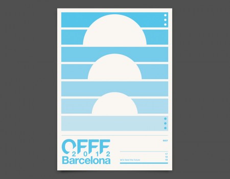
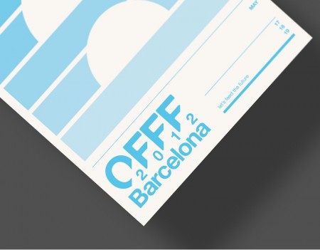
OFFF Poster Submission: Duane Dalton


I noticed OFFF in Barcelona is coming up next month because of Duane Dalton recent post on his Cargo Collective. We really enjoy his work, we’ll have more from him next month. Anyone headed to OFFF this year? The schedule looks great, just went thru some of their portfolios.
OFFF Festival Homepage

Redesigning the Swedish Banknote


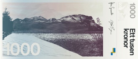
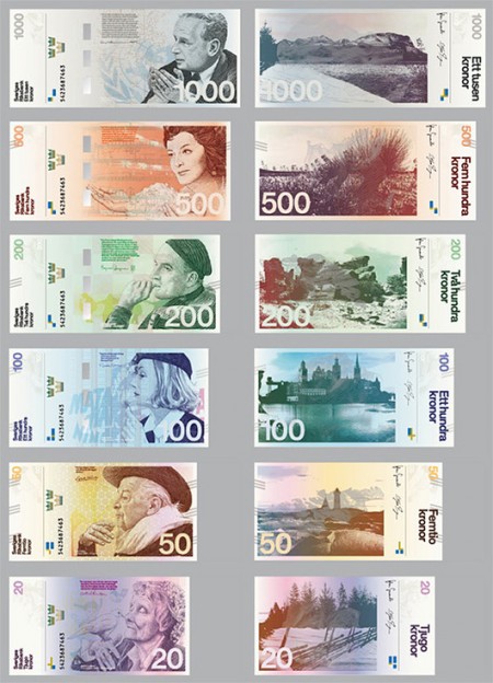
The Swedish National Bank had a competition for designers to redesign the Swedish banknote. The Stockholm Design Lab, was among the 46 competitors and was even among the top 8. Unfortunately they did not win, but their design was promising. I really enjoyed their banknote design because of the simplicity and type.

We’ve talked about currency design before but I’m still rather curious if there is a list somewhere out there that can detail all of the finer points that a new design for currency has to be upheld to. View the full PDF for SDL’s design process.

Do you feel this is a fitting redesign of the Swedish banknote?