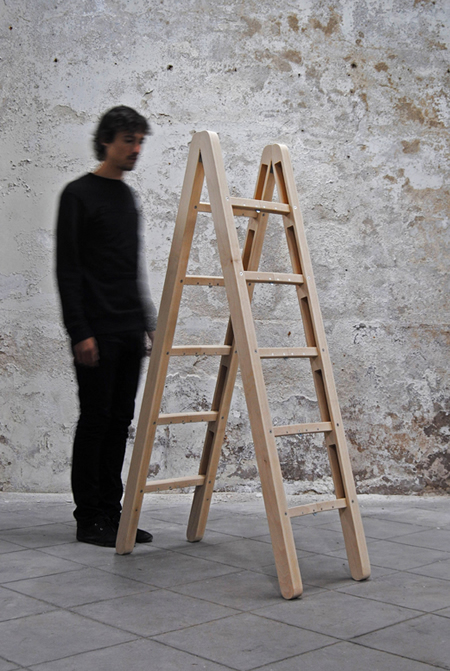
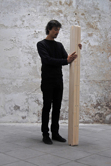
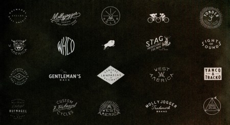
The perfect ladder concept by Co & Co. I don’t care how much weight it doesn’t support, where’s my order form.
Archive for July, 2012
Jakub’s Ladder
Instagram photo favorites: 20th Edition

circa_1983 – Not only should you follow circa_1983 but you should check out his website
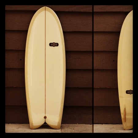
almond_surfboards – Even if you don’t surf they make it look like candy.

johncurley – I love it when someone can make something soo noisy and blurry soo appealing.
Tired Of The Mouse
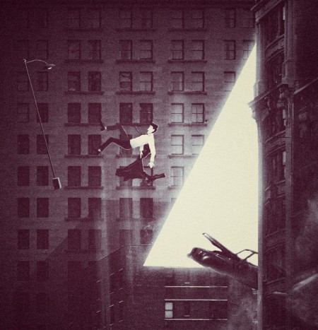
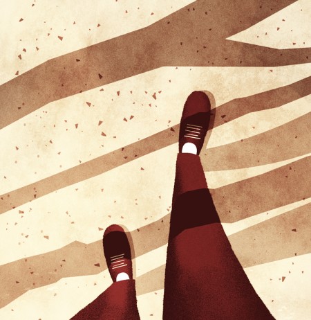
 One of the reasons I enjoy creating on my iPhone, is it takes me out of my usual process. The image above I created with Fuzel It’s similar to Grid Lens but lets you make your own slices that you can load up with images. The lines are the slices I made and then I added a tringle to each slice. (I added the clouds with Blender). This is all fairly simple to do in Photoshop with masks but not nearly as simple to manipulate. Being able to tap points and change their size as I’m moving them around feels much more “organic”. I find the results are less forced and there seems to be a more natural progression of the design. I recently switched from a mouse to a tablet which I find much more natural, but you really cant beat direct contact with the screen. Posted by: Seth Hardie Instagram: @hallwood
Eddie C + M. Eden + J. Maus + Solar Year

[audioplayer post=28709]
Some heat from Eddie C to stretch it out to, scrolling in the Monday intro playlist.
For some reason Eluvium made a new alias: Martin Eden. Eluvium was successful, why switch up? Either way he did a beautiful job with this song thru and thru.
HIGHLY RECOMMENDED ohhhhhhh yessssss John Maus is has created the Monty Python Holy Grail version of a Pop song, its genius in my mind, what a vocal? best part has to be 1:52 and on, my jaw dropped, ballsy vocalist super super ballsy, I love it.
When I first put on Solar Year I just wanted to hear what Grimes did for it but then genuine male vocals came under the chorus pads, it was nice to hear some electronic artists slow it down and just share this release of mood.
The Fox and King
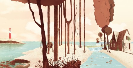
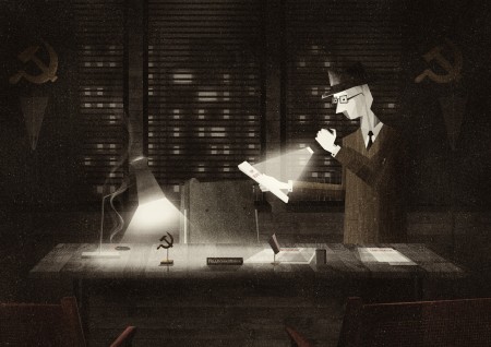
We have featured some amazing illustrators on ISO50 such as Matthew Lyons and many others, but it wouldn’t be right if we didn’t include the amazing work of Glenn Thomas. Glenn is an illustrator and designer know as “The Fox and King”. I am constantly amazed by his use of texture and light as well as his brush techniques. He is also a top notch animator. Very quality stuff. If you get a minute, make sure to check his work out, you won’t be dissapointed.
Posted by Tav Calico
Enter through the gift shop
I’ve just returned returned from a trip to both Munich and London, where I spent time with colleagues in both locations. Cosmic timing really, considering the London 2012 Olympics are on the horizon, and I’ve had Otl Aicher on the mind recently.
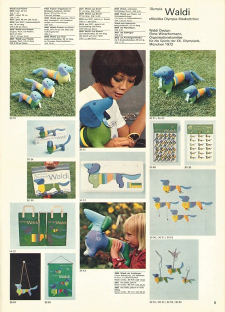
Much has been said in recent years about the shortcomings of the London 2012 graphic identity, but I hadn’t really been paying close attention to all the outrage, and had all but forgotten the design work – so I wasn’t prepared for the onslaught of Olympic schwag that greeted me at the official London 2012 shop at the St. Pancras Station in London. It’s borderline seizure inducing. Having just stepped off the train from Munich, where I spent time in Olympiapark and was exposed to Aichers work throughout the city, this London 2012 noise was especially jarring. And that mascot! Sigh. I took quite a few pictures, and had originally thought I’d post about Waldi vs Wenlock, but I decided I wouldn’t subject you to any of that madness. After all, this blog is here to celebrate beautiful things.
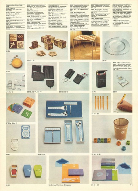
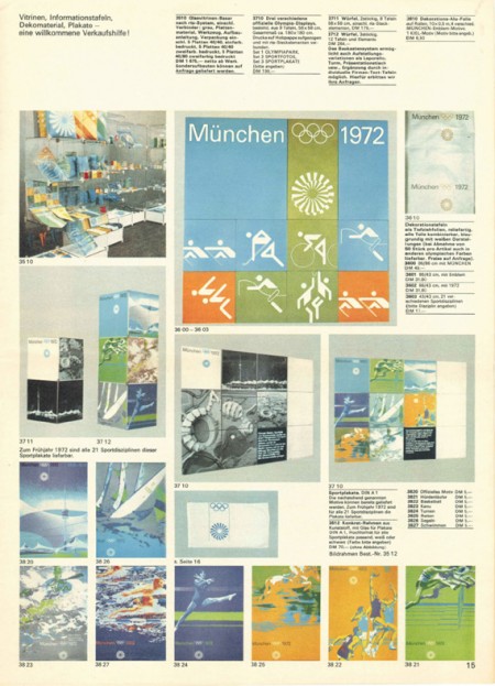
Scott has extensively covered Aicher’s work for Munich ’72 here before (in fact it’s where I was first exposed to it), but I thought the timing was right for us to be reminded just how amazing a coherent Olympic graphic identity and subsequent merchandising campaign can be.
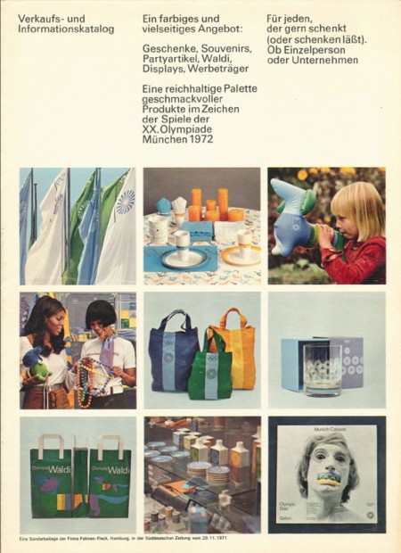
Creative Review recently posted the above scans of the official Munich ’72 merchandise catalogue, and there are a few images of what look to be the official gift shops as well. While Waldi was the only souvenir that was actually designed by Aichlers studio directly, I find it really impressive how cohesive the entire output of the “Olympic Souvenir” department was. This is most likely due to the fact that Aicher dictated a very strict set of rules as to how the logotype and symbols could be used.
It’s easy to pick apart London 2012 when stacked up against the extremely high bar set by Aicher’s work for Munich, but let’s be real here, remember Izzy from Atlanta? NOTHING is as bad as that. What. Is. That. Thing.
I’m not sure if they entered the competition, but if they did I’d be real curious to see what Bibliotheque came up with for the London 2012 graphic identity. After all, they know a thing or two about Aicher’s legacy, having put together an exhibition of his Munich ’72 work over at the Vitsoe shop in 2007, comprised entirely of posters and print from their their own collection. This unofficial Olympic torch poster they did is pretty amazing as well.
Bonus link: While googling around, I found this site that offers up the official Olympic report books as PDFs. The Munich 72′ books span 3 Volumes, upwards of 1200 pages. For the true Munich ’72 geeks.
Posted by: Rob Fissmer
ISO50: Soundcloud Who To Follow Guide: #2
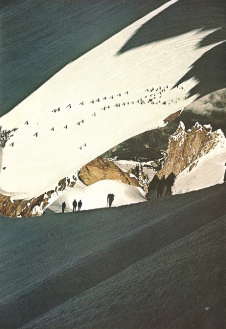
I see even bigger things happening for Soundcloud in the future, mainly the community within it coming closer so I decide to start a guide of people to follow if you like what’s on ISO50. Below I started off with frequent users that make your feed more enjoyable with quality posts.
This week we start with Carpark Records, a classic indie label that gave us Toro Y Moi, Casino Versus Japan and Animal Collective. I added Fact Magazine since they’re one of my few windows into a proper representation of what is going on in the UK. I’ve only featured LA’s MONO/POLY once, has a great ear and has some synth magic put together over some quality beat work, i’m excited to hear more.
ISO50 Blog on SOUNDCLOUD
RECORD LABEL: CARPARK RECORDS
MAGAZINE: FACT MAGAZINE
ARTIST: MONO/POLY
Weekend Inspiration: Nicholas Alan Cope
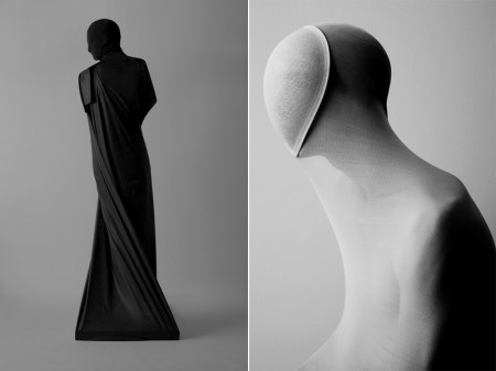
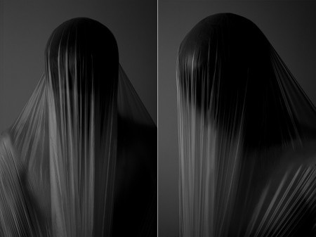
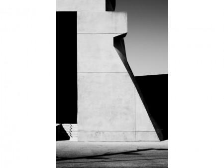
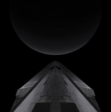
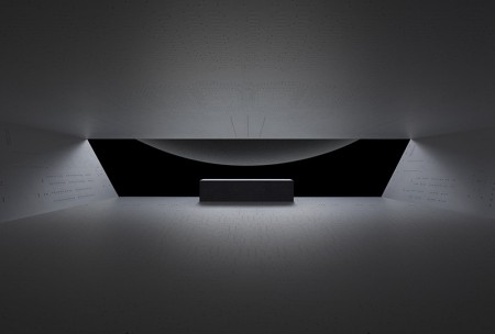
Really enjoying the work of Los Angeles based photographer Nicholas Alan Cope. There is a sense of eerieness in his work, as well as just the right amount of “darkness”, although there are a few examples of his work I came across that were a bit too much and gore for my taste. All in all, impeccable use of lines, tones and texture.
ItalTek+Airbird+BlackMarble+TryToFindMe

[audioplayer post=28616]
The beat world is getting speedy like 150-170 bpm sometimes. You can definitely make it sound good, there’s a few that come to mind like Machinedrum, Africa Hitech, Braille etc. You can add iTAL tEK to that list too, he makes it work, not out of trend but within the style he’s working in.
I’m obsessed over this Airbird(half of Ford & Lopatin) cut, I wish all audiobooks sounded like this.
HIGHLY RECOMMENDED: Black Marble really surprised me this morning, I found myself not being able to stop looping it, just hooky, like if Tanlines & John Maus relaxed and had to do a outro for a soundtrack.
If you follow vinyl only label Golf Channel you’ll be happy to hear they are moving into the digital world exclusively via Juno Download. I personally love their edit 12’s this one especially by Try To Find Me.
Caleb Owen Everitt
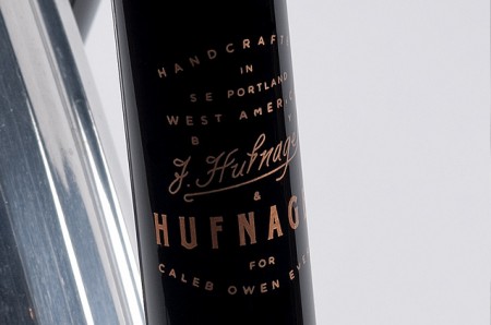
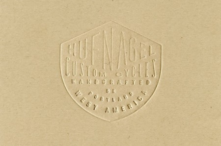
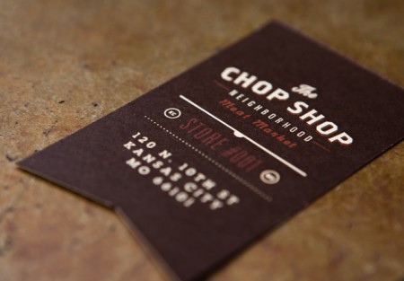
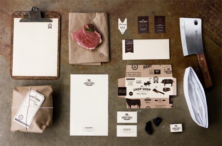
Caleb Owen Everitt is one of those designers who has such a dialed in style, you can almost instantly recognize his work when you see it. Not to mention, he has some of the coolest clients in the game from Hufnagel to Deus Ex Machina and many more. His work is always a great source of inspiration for me.
Posted by Tav Calico
