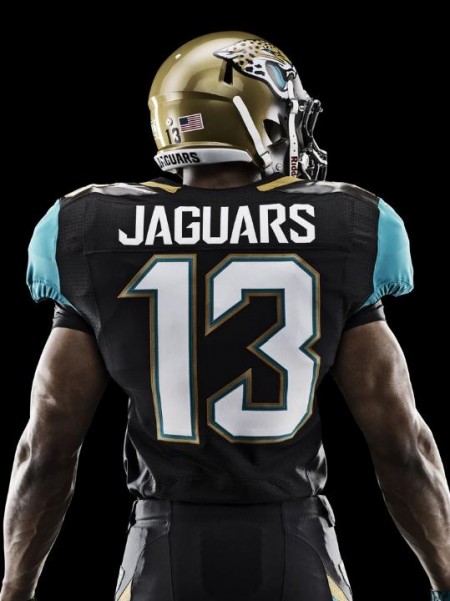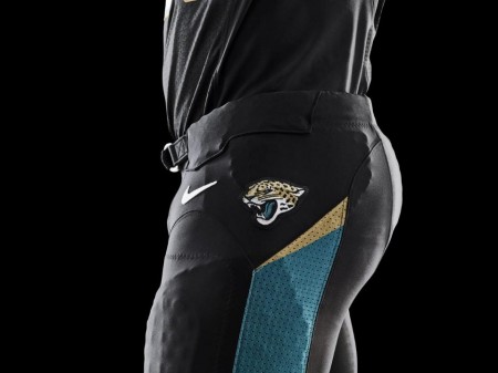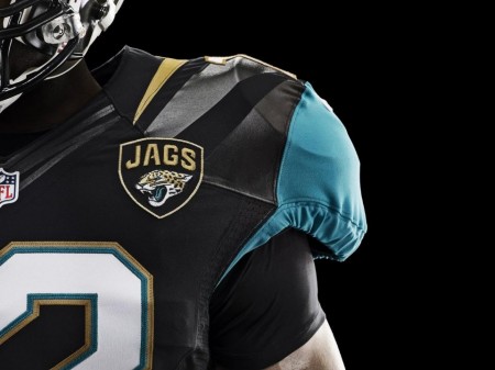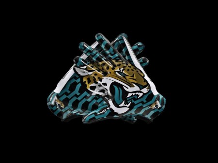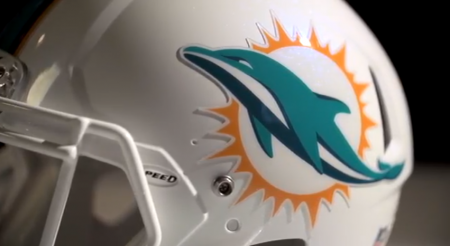

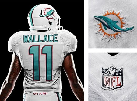
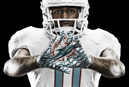
If you know me personally i’m a huge sports fans, i’ve always wanted to bring design and music fans together with sports fans anyway I can. If I had a dream job it would be hopping around in-between all the major sports teams and redesigning uniforms and logos. Nike did a great job here BUT… there’s a problem, a HUGE problem in my opinion, this doesn’t seem like what a passionate design would design, i’m in love with the fabrics, Nike always nails that department out of the park. The issue is that everything is completely evolving from the early 1990’s expansion boom, that gooey round 3D look or the Sin City “we’re the bad guys” thing. Both of these new logos suffer from that influence and thats the big bummer and the color scheme the designers have to work with. Also, i’m not going to lets simple designs get away with it either, look at the Minnesota Wild logo, you would think ISO50 might like it but no way, look at those trees, what a horrible effort.
To end on a positive note, I love what Nike did for the Oregon Ducks. I hope some of you comment in the comment section because i’d love to have a conversation about all of this.
