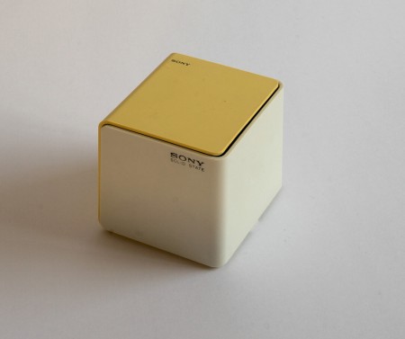
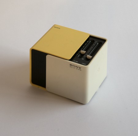
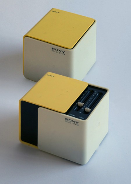
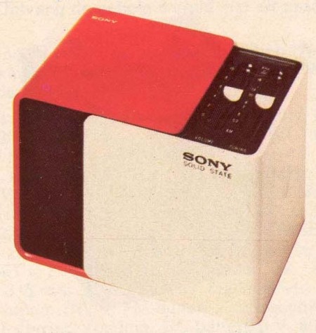
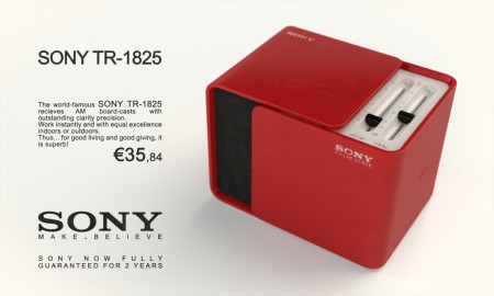
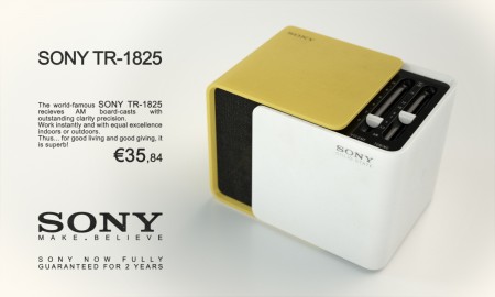
For some reason I’ve always had Sony radios, I’ve had two my entire life and both were Christmas gifts from relatives. Design-wise they have both stood the test of time; the one I had as a kid still sits in my studio as an artifact of quality ID. But neither are anything compared to the TR-1825. Would love to track one of these down, what a great looking piece. My lifelong fascination with all things Braun/Rams has sometimes left me blind to a lot of the other great ID from the 60s/70s, should probably start doing more research on Sony stuff, they definitely have a great design legacy.
Released in 1970, when Sony had become the first Japanese company to list shares on the New York Stock Exchange. Sliding the faces on this cubic radio reveals a speaker in front and controls on top, a unique design at the time. One version of its packaging commemorates the World Expo in Osaka, held in March that year, and many expo-goers picked up the radio as a gift. – Sony Product Design History
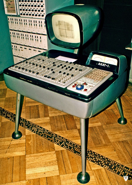


wow, that’s pretty damn good design for the 1970s, way ahead of its time. Does anyone else think today’s Apple products look eerily similar to its design?
I’d say that the general Apple philosophy is similar to what Sony have done with this design. I’ve not seen this radio before – looks pretty damn sweet. Take a look at most consumer electronics today and you won’t see too much that is this neatly packaged.
I’d say Apple (Jonathan Ive) are more in the Dieter Rams circle of influence. Some examples
Just curious but why do the bottom images have Euros. Euro only came into use in 1999. Are they still in production ?
This seriously gave me the chills when I saw it. Another wonderful example of minimalism ID at it’s best. Apple has definitely been more influenced by the work of Dieter Rams for Braun but the general modernist and minimalist principles directly apply to the design Sony had achieved during Mid-Century.
Why do the bottom images have Euros?
I like that third image from the top – where’d you get it? (I made it by shopping the first two together)
i love tr-1825 radio
Also, Sony adopted the “Make.Believe” tagline in 2009. Those bottom two “ads” are bogus.
Woo, Beautiful Sony!