
 Smashing Magazine has posted a great collection of movie posters featuring some of the classics and some newer selections as well. I find the set a little mainstream, they’re all sort of the obvious choices and all related to major motion pictures. I would love to see someone put together a little more obscure selection including some examples that haven’t been through the major studio marketing ringer. I have to say though, I was blown away by the Planet of the Apes poster, I’d never seen that version before and it’s simply amazing. Link
50 Beautiful Movie Posters
10.13.2008


That Planet of the Apes poster is very slick indeed. I have only seen Burton’s remake and found it rubbish, though.
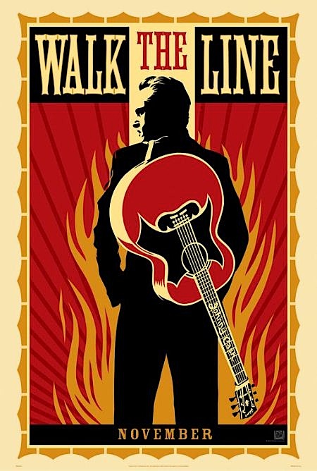
I like Walk the Line and that’s also an excellent poster.
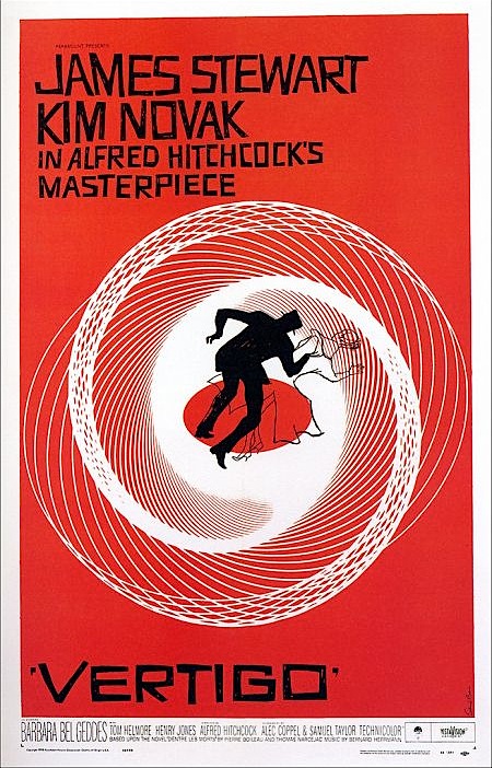
I think the poster of Vertigo is a bit overrated, but that movie is great.
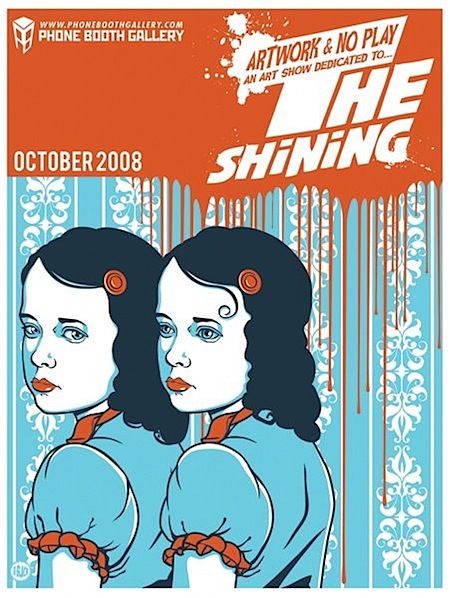
Finally, I really really like the poster of The Shining, thanks for the notice! I ‘m gonna check if I can get my hands on that poster, I’m still amazed what an overwhelming good movie that is.
BTW, I think the posters from Batman Begins are not good at all. On the other side: THX 1138 & The Birds are really impressive. And the rather uncommon poster of The Fountain is pretty cool. Cool post.
The rigors of creating a Hollywood one-sheet do indeed produce some pretty bland and safe designs. The collection over at Smashing looks to be just a bit less mainstream than the typical offenders, though. Once in a while a little gem will sneak through the Hollywood machine, though.
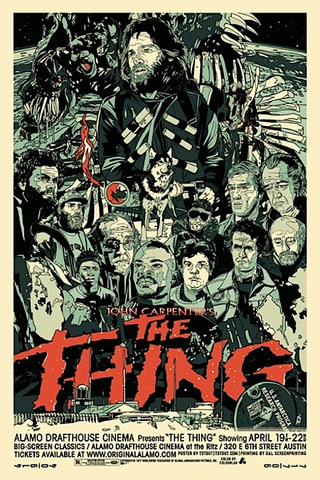
Some of the more progressive ones here aren’t official studio marketing output, but rather posters for current screenings at the likes of the Alamo.
That Walk the Line poster is Shepard Fairey right?
I don’t think those Alamo Drafthouse posters (planet of the apes, the shining, the thing) really count. It’s easy to create a cool poster without any interference from the actual studio, the actors, director, and marketing department.
That new THX1138 image is gross. Every time I see it I think it’s a Britney Spears thing.
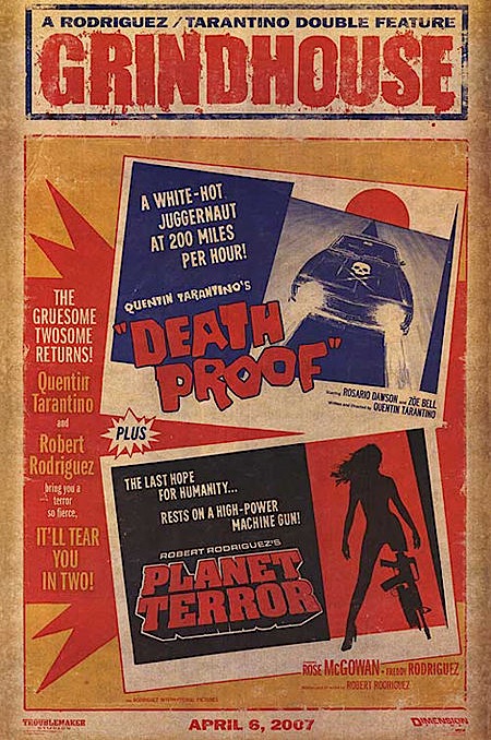
Yeah I wasn’t impressed by the selection.. I like the The Planet Terror posters more than any of the other Grindhouse posters. I agree with Frank also.. You can add The Birds poster to that list of posters without the interference for studios etc.. I have to say there are some really bad ones in there also.. the 28 weeks later one? Also that Bank Job one.. they chose that over the amazing version Scott posted on here a few months ago? Sometimes I wonder about Smashing’s selections.
Having said that I love the Fountain ones.. had never seen them before and dislike the boring ‘head shot’ montage designs that I had seen for that movie.
the thing. GI Joe!
http://www.youtube.com/watch?v=rT7AH4JyuNs&eurl=http://www.synthtopia.com/
Does anybody know a good poster shop which also sends stuff to europe?
I always find it hard to purchase ’em.
Agreed – pretty mainstream, though still a pleasure. Their 35 beautiful album covers is likewise mainstream and less enjoyable – but then I would say that as I publish Sleevage’s little-known competitor, Hard Format!
I absolutely love John Carpenter…I grew up watching “Big Trouble in Little China” and I love that poster, too! Such a great 80’s retro illustration!
Found a link to the “Big Trouble in Little China” poster…..
http://www.robotwalrus.com/wp-content/uploads/2007/12/big-trouble.jpg