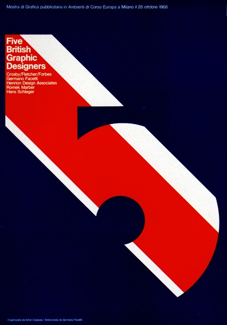
1969 Poster.
"Five British Graphic Designers"
Advertising Office: Studio Coppola
Milano, Italy
Via Pink Ponk

1969 Poster.
"Five British Graphic Designers"
Advertising Office: Studio Coppola
Milano, Italy
Via Pink Ponk
Comments are closed.
Wow, that could have been designed yesterday… timeless
Uh crispy! One should try and design a font based on this concept (sliced mask).
Great “stairway to heaven” type on the top left there, hehe.
Hey Joaquim check the link below. Sort what you’re talking about?
http://www.flickr.com/photos/iammintcondition/1262603583/
Adam B –> Sort of yeah. But I think it would still be readable if it was sliced on both sides… like the nr. 5 up here 🙂 Damn… gotta try that someday. Thanks for the link!
there is a problem with the blue (perhaps maybe in my screen) but it’s so dark you can barely “experience” it. but still, it’s beautiful.
i think big heavy shapes were really popular in designs of that era. i like it.
The Mirror universe episode is on now. ,
Please do not tell us how the keyboard got sticky. ,