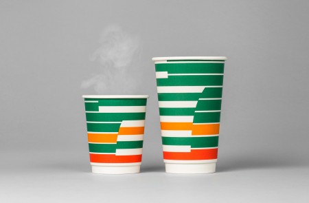
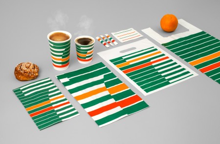
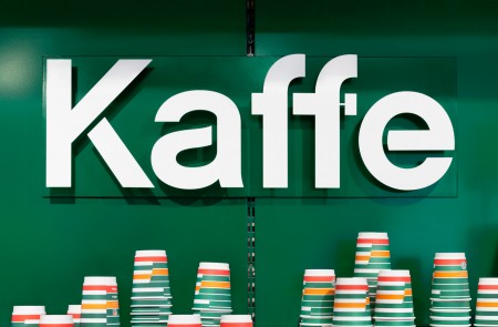
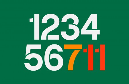
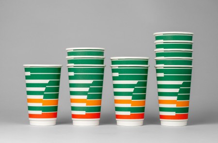
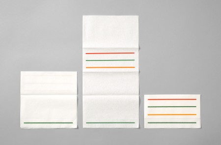

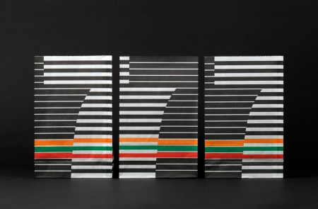
BVD perfectly executes a rebrand for 7-Eleven in Sweden, look at that cup! Projects like these serve as excellent reminders that even an experience as steeped in mediocrity as patronizing a 7-Eleven can be made desirable through good design. I suddenly have a craving for bad coffee.
7-Eleven Rebrand
01.23.2013


Are they really gonna make this, or is it just a concept?
I agree, one of the better re-branding for a company in recent years. Too bad this is only for 7-Eleven’s in Europe though.
Why does Sweden get all the sexy design stuff? It’s always this way! *sigh*
That one at the end is genius.
If only BVD knew they were an underwear brand in the USA
Looks like it’d look great in a design book, and I suppose I’m alone here, but it doesn’t look all that inviting as a consumer brand. Definitely sets them apart, and maybe it’s mostly presentation, but it feels a little cold. Then again, that’s very appropriate when it comes to the Swedes.
The color scheme brings back some memories of my childhood, though I’m not quite sure of what it reminds me. But it makes me feel at ease and desperate for a cup of coffee. 🙂
I’m going to need to disagree with the genius of this redesign. I know most people here like a good throwback and I think that’s fogging your judgement on what will produce a universally desirable brand. This is thrown back to the poorest design decisions of the 70’s. Not only is it generally disorienting in its patterning, it also, most importantly, contains super unappetizing colors. Do you want to drink that queasy-looking coffee? Nah.
I agree with david, and I’m someone who definitely digs throwback palettes.
It doesn’t look like a hint at 70s design, it is 70s design.
Combined with the 7 eleven brand, makes me think of flickering neon lights, saturday night specials and the second half of boogie nights, not someplace I want to shop.
Ya, this is lovely and might fit with the current identity. But, I have thought more than once driving in the city – I think it actually is lovely and respectable that 7-eleven hasn’t changed/ updated its logo. They don’t need to. It still works, 100%, for me anyways.
The pattern looks like piano keys.
Good add.
Great, now I want a Slurpy.
I whole-heartedly agree with with David:
“This is thrown back to the poorest design decisions of the 70′s. ”
Absolutely 100% correct.