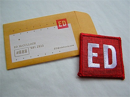
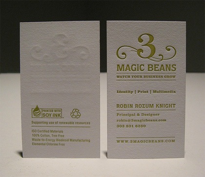
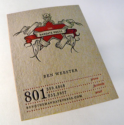
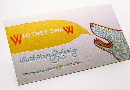
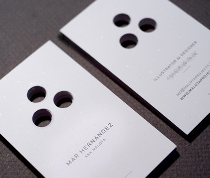
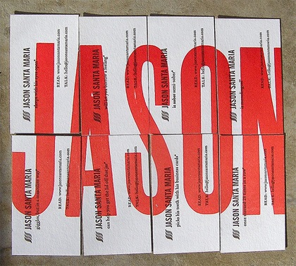
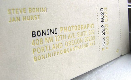
Fubiz has a post up entitled "70 Amazing Business Cards" and while I wouldn’t go as far as to call all of them "amazing", there are some nice examples in the list making it a good resource if you’re looking to make some for yourself. My personal favorites are the embossed style, I love that texture, it makes the card feel so much more substantial.
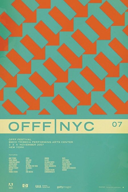
I have always been sort of torn on the subject of business cards. On one hand, I love the type-based examples, they’re so clean and to the point. But on the other hand, that doesn’t always say much about the work the holder of the card might expect to find on your site. For mine, I ended up settling on mini posters on each side with the pertinent info worked into the original poster designs, sort of a quick glimpse of my portfolio.


I really like the embossed ones too, especially the 3 Magic Beans one.
I would like to see your mini poster business card!
The second and third business cards are really sexy. I need to get business cards too, but it’s one of those situations where I have no idea what I’m doing. I’m so lost on price, look, design, etc. o_O
I’m going through the ringer right now about my card. I always settle on something along the lines of my brand, and then print and feel like I want to change a bunch. I guess it’s time to rebrand if i’m so unsettled
this is so crazy – i was designing a business card for myself just last week. i scoured the net for inspiration, and came upon the same site. my main gripe about it though, is that almost all of the cards shown have some kind of secondary process involved (or some other gimmick), so i had to question whether or not the cards were being judged on the success of their design or just a simple “coolness” factor. either way, they are pretty impressive.
regarding your card scott, i think you nailed it. it shows what you do, and is far from being just some generic card with text. i like that it serves as both a calling card and a promo. but it’s common for designers to question their own business cards from time to time; it’s hard to be completely comfortable with something that so often serves as a first impression of your work.
Ah, I really like good ol’s Jason Santa Maria‘s business card. Great bloke.
I personally don’t see how having a poster on the one side of a business card would work very effectively, especially at that small size. It’s kinda of like when photographers place photos on their card, kinda comes off cheap. But then again, I haven’t seen your card. I’d almost expect some wood grain, a walnut of some kind being used on your card.
Nice post. I think cards must stand out these days, so I naturally lean towards the more unique shapes and textures. There’s a few more here:
http://abduzeedo.com/card-contest-voting-the-bullet-giveaway-result
I’ve also had an extremely difficult time coming up with a personal card. I wanted something that was memorable with a decent “cool factor” but I also don’t like the amount of waste involved with the whole process from the print process to the fact that ultimately, 90% of the cards you make will be thrown out… I ended up coming up with a hand-made card out of some nice paper samples sent to my local art-supply store that they were going to get rid of, and setting the type with a rescued typewriter. And the limited-run nature of the cards lets me change things up. There are a few pics up on my
flickr.
I know the labor involved means this isn’t a good solution for most people, but I think it gives it a nice textural element and personal touch that would be out of my price range if I ordered something like this from a print shop. I think that personal projects like this are definitely the most difficult.
These are wonderful. Something about business card design is very reminiscent of being back in art school. So after 8 years I think I need to design my own!
@Ethan: woah, those are rad! when you were describing them, i pictured something grunge-y, dirty, and DIY-ish (not that i have anything against that), but when i saw them on your flickr, i was surprised at how good they look…and consistent too. love the stitching to represent what you do. great job man!
Thanks for the props danny, I know it sounds like it would be kind of a hippie-style card, but I tried really hard to stay away from that style. Overall, they’ve been really well received…
They are all fantastic and all have a unique their own look about them. So much inspiration and talent for such a small 90 x 55 object!! The Jason Santa Maria one is really cool and joining them altogether is such a cool idea.
Great selection of designs. Creativity can be expressed anywhere even if all the room you have is 3.5X2. Good work.
Where the hell can I get nice detailed custom biz cards done? Do most printers have the ability or are there small higher priced shops that make them so nice? Links would be good…
I’m with Alex. Where can you print awesome biz cards – digital, letterpress or silk screened? Links would be appreciated.
Checked out 70 Amazing Business Cards and i agree that not all of them are what i would call amazing either. As for my ideal business card, it’s a minimalist one (like just my name and number or e-mail) and then a paper with rich textures.