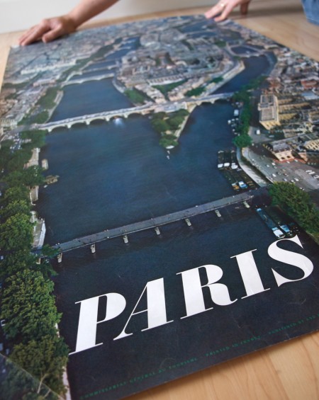
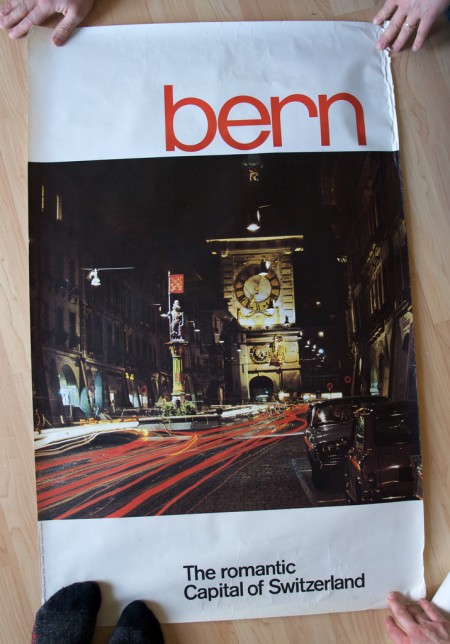
Stephen over at Mid-Century Modernist posted shots of some great European travel posters sent to him by his late father. Apparently the posters had remained in the shipping tube for a few years until discovered during a move. Thanks for sharing Stephen, and thanks to all your friends for holding them down in the shots! (what is that like 3 people holding the Bern print down?) Link
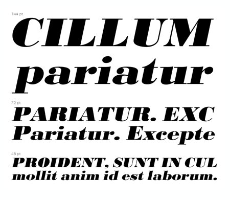
And in case you were wondering, the “Paris” font seems to be URW Bodoni Extra Bold Extra Wide Oblique. There are some slight differences but I am assuming these are artifacts of the digitization perhaps? I hate it when I see a classic font used like this and then find the modern version and it’s just a bit off. “Bern” seems to be PL Brazilia Three.

Hah, that’s just my brother’s hands up top and my feet on the bottom. The posters were tough to lay flat after all those years in the tube.
Thanks for mentioning these! I think you’re a bit off on the type. Sent you an email. Let me know if it arrived.
That first poster & type is awesome!
Oops! The apostrophe in your headline is an open quote.
I don’t think those faces are artifacts, tho I’m not exactly sure what they are. “Bern” is definitely not Brazilia Three, note curves in the “e” especially. “Paris” is close to the Bodoni you mentioned but there are still noticeable differences. I’ll let you know if I find a better match.
Here’s what I sent to Scott via email:
First, the Bodoni can’t be URW Bodoni because that version is a purely digital interpretation — all the widths and obliques created on a computer. I think the best match is a pre-digital Poster Bodoni. The large sizes of metal and wood type were generally designed with more contrast (lighter thins and heavier thicks) so that can explain much of the difference between the type on the poster and the Poster Bodoni digital fonts available today.
PL Brazilia. It’s close, but a little squashed.
The most likely bet is hand lettering, as most large headlines and other display lettering was done by hand in the early ’60s. Otherwise, I’d say it’s a photocompositor font — one of the many replicas of Helvetica that came out in the 70s — but 1963 is too early.
I make a few other comments on the type under each image on Flickr.
thanks for the updates stephen. yeah, I guess if you want to do a lot of fonts these days it’s always going to be a compromise for the details. everywhere I looked, the tails of the “s” in bodoni were wrong, all angular, not swooshy like your poster. and the forward facing tail on the front leg of the R is pointed up too high. I think it you combined a couple of the variants of bodoni and then did a little tweaking, you cold get close.
either way, loving brazilia and sanzettica right now.