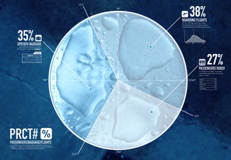
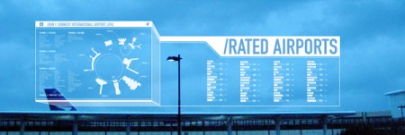
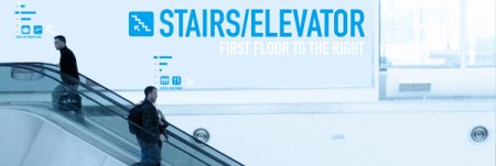
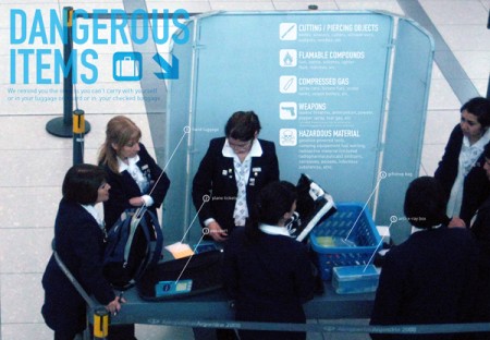
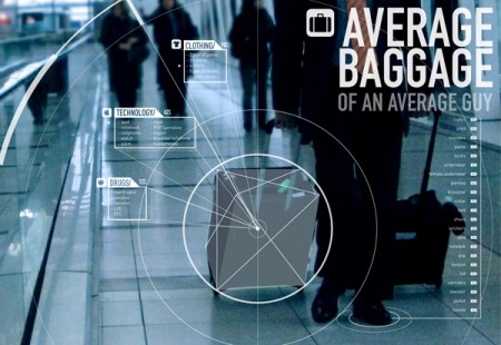
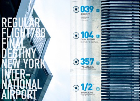
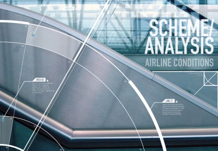
While this has been around the Behance block, I can’t help but admire this piece by Francisco Andriani. The use of typography in these pieces is gorgeous. The noisy photographs and large type along with a relaxed but secure color palette also really sets the mood of airports.
Seeing these info graphics makes me want to see this style implemented nicely in the terminal. Large monitors showing arrival and departure times with this style would be stunning. Especially if used on large installations like these. With a little collaboration I could see Tyler Thompson’s boarding passes and Francisco’s info graphics alongside one another in the near future in airports.
But part of me asks: how relevant would this style of design be to the traveler?


Whilst I really like all these, they do come across as being a little ‘hostile’. They fit the futuristic prospect of the future that’s often been shown in various forms of media (observe the cool blue shades in iRobot, Minority Report, etc.), but I have a hard time seeing them being used in reality. Most advertising, including for airports, is focused on pleasantry, showing smiling stewardesses on a sunny day. Although these posters may be more accurate at depicting air travel than their actual counterparts, they have a ‘big brother’ feel to them, something that nobody really wants to be exposed to.
Very nice. What’s the typeface?
This reminds me a lot of the font stylings found in the Will Farrell movie “Stranger Than Fiction”, which might have been why I love that movie beyond just the unique plot.
http://ramoscreative.com/images/blog/strangerThanFiction3.png
http://ramoscreative.com/images/blog/strangerThanFiction2.png
Lucas, glad you brought that up. I really enjoyed that movie partly because of the constant number graphical overlays.
Really nice. I like the idea of combining info graphics with photographic images. While I do appreciate info graphics, I feel like I see a lot of them that just seem so stale. These kinda remind me of Minority Report in a way.
MK12 for the UI win, not only Stranger than Fiction but Quantum of Solace, too.
Very “Jet Blue” in some ways, reminds me of Terminal 5 at JFK.
Gorgeous post.
The future does appear to be very light blue, similar to the Microsoft vision: http://www.youtube.com/watch?v=HvA9lA7_5FE (which is an INSANE video, by the way.)
I think this aesthetic style would be relatively relevant to the traveler. Its rather soothing, yet sterile and kind of impersonal. It wouldn’t create a very warm environment, but I feel like you would feel more relaxed than the anxious, schizophrenic nature of airport design now.
more of Stranger than Fiction …., this is good but not wery bright and certainly no very creative.
+♥
great design
I think you’re getting into muddy waters when you start mixing words like “style” with “information”… speaking of practical/functional information design that is.
Nice looking work… not sure how functional it would be for sheeple however.
Not to mention that there is nothing extraordinarily new or relevant here… I mean that arrow thing, geez, I’ve never seen that before…
This post is a little….hmmm, different.
i’m sorry but this is just another bunch of meaningless, self serving, style over content nonsense. yes, it looks pretty but is it good design? no.
this comment from tim pretty much sums it up:
“Very nice. What’s the typeface?”
and then “relaxed but secure color palette”. what?
“scheme analysis airline conditions” what??
let’s see work that is less concerned with shallow aesthetic and more about effective communication of a worthwhile idea. we see enough of this sort of rubbish pretending to be design on good.is.
I love the look of these graphics — they really communicate a mood and the typography looks great. However, although they contain information, I’d hardly call them infographics.
What does the layout of information do to help me understand the data they communicate? These examples really stick out as valuing appearance more than efficiency of communication. (As a side note, the tendency of many designers to use small text suggests an insensitivity to the balance between readability and the actual real estate available for the composition as a whole.)
Another recently linked graphic that looks beautiful but is a complete failure in communication is this “Colors in Cultures” graphic.
http://www.informationisbeautiful.net/visualizations/colours-in-cultures/
The info it contains is compelling, but the radial design and the coding of the characteristics (e.g., 68 = radicalism) makes this information difficult to work with. A simple cartesian X-Y grid would communicate the information more clearly. Both the Colors and Cultures graphic and the Welcome Aboard series seem to exist conveniently in a world devoid of actual users.
To end, I’ve gotta share this snarky take on so-called “infographics”:
http://www.flickr.com/photos/philgyford/4505748943/sizes/o/
It looks lovely; the desaturated colours really invoke 60s/70s photography. Of course the concept art is way more cluttered than the actual infographics would most likely be, but that doesn’t detract from the design at all in my opinion.
On the other hand, while I’ve never been to any US airport, I doubt the cold colours reflect very well the interior of these places. There are food courts, stores, sunlight coming through the windows, travellers with colourful outfits etc. all of which would probably clash with the displays implemented this way. In an empty airport on a rainy day, these might work very well. Maybe an option to explore different moods for the displays depending on the weather? How would this affect recognition of the displays though?