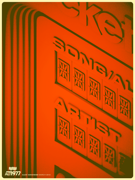
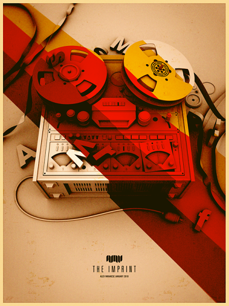

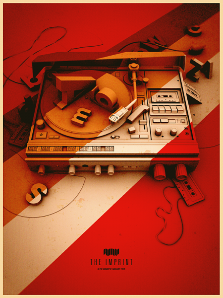

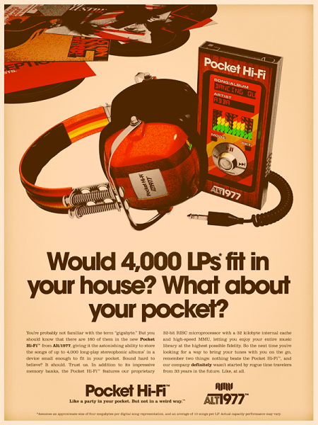
We’ve posted on him in the past, but I’ve seen Alex Varanese around a lot lately so I thought I’d put up some more of his work. He made a splash on Reddit yesterday, making it all the way to the front page (which, for the uninitiated, is sort of a big deal — at least among geeks and programmers) with his recent Alt/1977 series. This sort of overt retro-ism doesn’t always settle well with me (Yes, perhaps the pot calling out the kettle, but I’m a fan of restraint in these circumstances), but Alex executes so well you can’t help but take notice. His mastery of the orange spectrum is unquestioned and while there is a bit of borrowing from the James White bag of tricks — and with some of the type-centric work, maybe more overtly so, Alex Trochut — it is a very focused and impressive collection of work. I don’t think I’ve seen 3D meld so well with this sort of textured print aesthetic in a while and the noise he’s getting in those color fields is spot-on.
Check out more at Alex’s Behance and check out this process piece Alex did for Signalnoise.


I came across it yesterday and I have to say that I was pretty impressed with the Alt/1977 series too!! Very inspiring work!!! Great concept!!!
“His mastery of the orange spectrum is unquestioned” haha!
Does anyone else think the cover artist of Jay-Z – The Blueprint 3 was inspired by Alex Varnese’s Imprint Series?
I only recently discovered the work of Alex Varanese but I truly enjoy it. It’s kind of vintage surreal, gotta love it.
He’s obviously talented. The orange thing is a bit curious though. Maybe it’s because we view SO much design work daily that we’re a little spoiled so to speak, but personally, looking at a portfolio that is comprised primarily with one color becomes somewhat monotonous.
Hey Scott! Alex wrote a process piece for my blog a little while back, talking about how he builds the elements and 3D and works the texture. Super interesting, definitely a cross-disciplined guy.
http://blog.signalnoise.com/2010/03/03/signalnoise-exclusive-alex-varanese-process/
i agree it is great work. but it is staring backwards with amber tinted glasses. to revision the past is not showing us the future. retro revivalism and nods to the bygone are all well and good, but where is the next (non derivative) vision coming from?
James-
cool, updated with the link… thanks!
d||-
I think the Jay-Z cover came first, Alex talks about it here: http://www.alexvaranese.com/blog/71
I’m curious about the idea of “restraint” when referencing retro themes. I know this is an area where yourself, and James, really approach the aesthetic in two different ways. Do you feel there’s a Minimalist/Maximalist road you can take when using textures or choosing our color palettes, when referencing the retro look?
I guess this goes for Scott or James as you’re both here 🙂
Chad-
I have been to both extremes in my career and looking back I just feel that there’s something to be said for pursuing an ideal, but knowing when you’re indulging. Creating something that looks like it was made in the 1970’s and borrowing some aesthetic cues are two different things entirely I think.
I guess a good analogy would be distressing. When I first started playing with textures and distressed elements in my work, I went way too far, I overdid it in a lot of respects. It took a while until the novelty of the idea had worn off for me to be able to step back and evaluate whether it was actually serving the design, or just obscuring it.
I guess when I say restraint, I mean taking a more minimal approach to the application of stylistic cues (like the retro stuff) in your work. So much more can be said with subtlety than beating people over the head with a concept.
But this is just how I saw these concepts working within my own design. It’s different for everyone and there’s no right answer. I’ve just become more and more a fan of minimalism over the years and this has slowly changed how I see my own work and other’s. But the beauty of art for us as creators — and, to a certain extent, those who consume it — is in the evolutionary process. If I thought the way I think now about design when I was starting out, I probably never would have created a lot of the work I now see as my best.
Awesome response! I’ve been battling how far to push distressing and using aged paper to color balance pieces, so this helps for sure.
Thanks!
Thanks so much for the post, Scott! I was a fan to begin with so this is very cool to see.
My take on “retro” is that it probably hit its saturation point as a design trend years ago, so there’s no real question that it’s an overdone shtik. I’m of the mind, however, that what really counts when it comes to art isn’t so much sophistication or even relevance, but simply sincerity. For whatever reason, despite not even being alive during the decade from which I’ve pilfered so shamelessly, I have a soft spot for its trappings that I just can’t seem to resist.
Another part of my fascination with the retro look is the ironic way it pays tribute to modern technology; there’s something very surreal about the ability to “enable or disable” an effect with the click of a button that used to be an inescapable limitation of the times. What a photographer or designer had to “put up with” and “accept” in 1977 is a something we can explore for the sheer fun of it in 2010, and that never fails to blow my mind.
On a similar note, I feel that art can do one of two things; it can show us something that doesn’t [yet] exist, such as the future, or it can help us encapsulate and hold on to something we don’t want to lose. There comes a point after going to enough indie rock shows and hanging out with enough hipster girls that retro-themed art becomes a way to hold on to the life you’ve lead up to that point. Case in point is the writeup that accompanies my “Urban Cartography” series:
http://www.alexvaranese.com/work/uc
I know it reads like a bunch of pretentious rambling about nothing—and it is!—but it couldn’t be a more honest assessment of everything that went “into” those pieces. So for me, art is about turning your experiences into something you can share.
That being said, I can’t begrudge anyone who holds the argument that the style is not only played out but used all-too-often as a crutch to distract the eye from an otherwise dull or poorly-conceived design. That’s really what drove the Alt/1977 series in the first place; the idea that the only way to squeeze new life out of “retro” is to resort to literal time travel. So it’s arguably a satire about design as much as it is an instance of it.
Or whatever, I dunno.
Scott.
Thanks for the link. Holy Sh-
I wasn’t sure or not who came first. To be safe I went with artist who pulled the idea off the best. But it’s uncanny. I kept getting the feeling – I’ve seen this before.
alt/1977 is an absolutely brilliant concept for a design project. Congratulations to Alex. I love designs and I love all the commentary here. I particularly enjoyed reading Scott and Alex’s insights on designing retro. The funny thing with me is that I was a child in the 1970’s (born in 1969) and I thought it was the worst decade ever. But I can’t get enough of the artwork you guys produce. weird eh?
Alex-
Well said. Just to be clear, none of what I said was specifically directed at you or your work (not that your comment sounded as if you took it that way). I just have a very close relationship with the retro style, it’s something that has certainly defined large parts of my career and nostalgia has played a big part in most of my work. So when I see someone going after it like this, I can’t help but be moved and also have very strong opinions. I think your work is excellent and the passion behind it shows. I wouldn’t have posted on it or took the time to comment if I wasn’t moved by it. I guess most of my feelings about the subject are really rooted in how I see my own past works and the sort of evolutionary arc of my output to date.
Personally, I feel that I went where I was trying to go with my own take on the retro thing. I followed it to it’s logical end as far as how it fit into my work and it’s always hard to put something to bed that you were once so passionate about.
Scott and Alex, what a great exchange you just had… amusing and inspiring… just what I needed as I’m on my way to OFFF in Paris…. BTW, it was OFFF NYC back in 2007 when I first discover your work Scott.. will you be there?
Truly excellent collection of work. Until I read the posting in detail I genuinely thought this was a collection from the 70’s.
On a topical note, it seems 3D has become fashionable again both in print work and in media
The last photo/ad is PRICELESS–I love it!!!
No worries, I totally understood your meaning. But it really is interesting how so much can be hidden behind a trend that is so often blown off as superficial or trite.