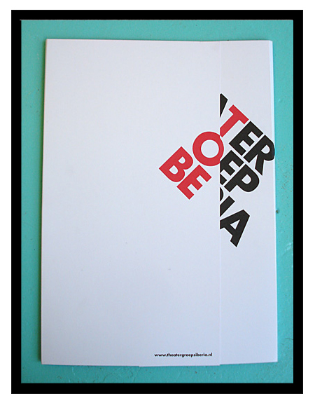
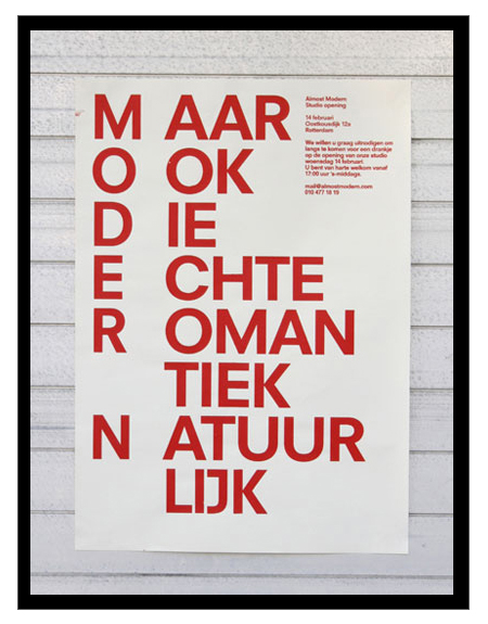
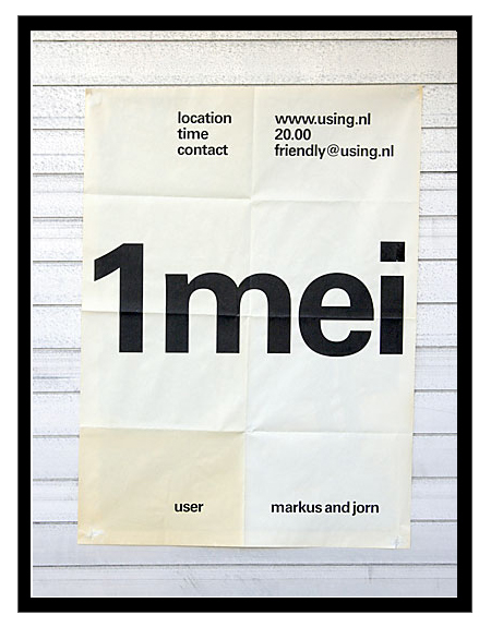
Just got turned onto Dutch studio Almost Modern this morning. I’m definitely a fan of their poster work; there are some misses here and there, but most of it is simple, minimal, and very effective design.
Almost Modern
02.26.2009


Just got turned onto Dutch studio Almost Modern this morning. I’m definitely a fan of their poster work; there are some misses here and there, but most of it is simple, minimal, and very effective design.
Comments are closed.
It really reminds me of a much more subtle version of some of the old Designer’s Republic stuff, before their site made me start having seizures. I have to agree with you that there is some stuff that throws me a bit. The second poster is nice, but is probably pushed a bit too far. Very nice stuff all in all.
Love it. Makes me proud to see another good dutch studio working on some minimalistic typography focused material.
Alex, Great post!
The first poster is interesting but doesn’t do a whole lot for me. I enjoy the third one the most followed by the second.
Hi,
Nice post. Im from holland.
The second poster says “But also the real romantic ofcourse”
I love the first poster; How the name of the theatre group and the play are incorporated. The 2nd one is too much and the last one is a bit too boring for me.