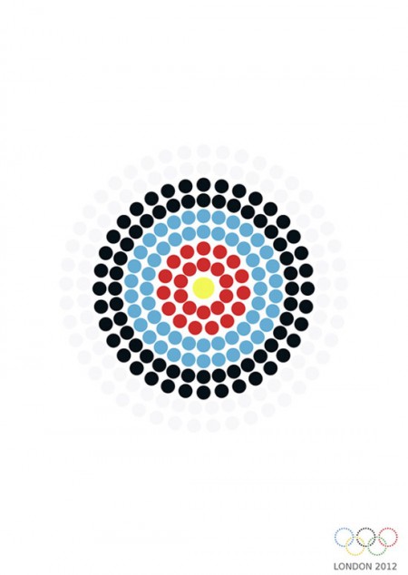
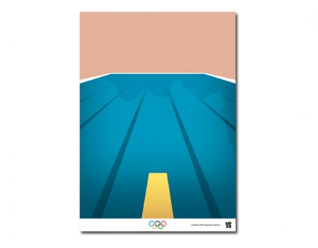
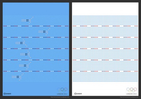
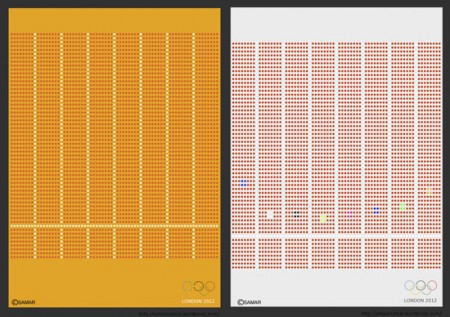

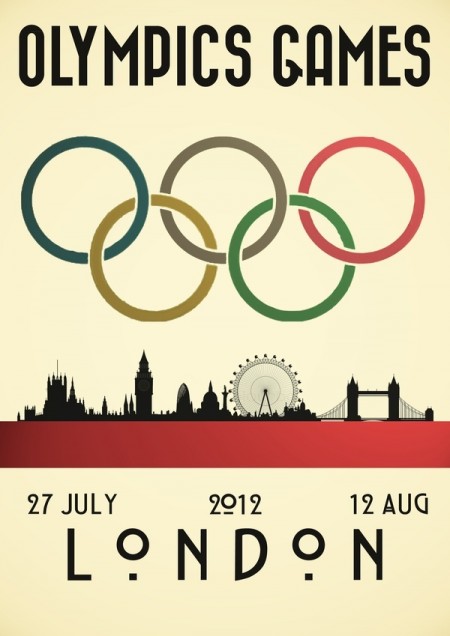
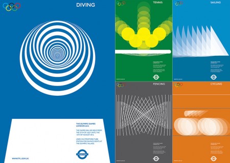
If I was a right out of university for graphic design my first projects for myself before working on my own would be grabbing up a project like this for exercise. The olympics have a great history for amazing posters and branding and fine color scheme to work with so why not see what you could do and test out your skills. I personally like the empty pool swimming ones but the font couldn’t be any smaller which pretty much knocks it out of the running to be a real poster for the public.
via kathykavan


Nearly anything is better than the actual schemes they went with for London 2012.
These are good and I like them, but there’s just something refreshing about the official branding for me.
I second that DAN. That’s why I needed this visual break
@CHRISTIAN you mean the wacky one that barely looks like the numbers 2 0 1 2?
These posters are too sterile to arouse any excitement – complaints about current branding were well heard six months ago. This is old hat.
I really like the last ones, the action sequence-freeze frame ones. Instantly inspiring
http://society6.com/LukeStoufferDesign/Olympic-Rings-Solid-Poster_Print
Another New Olympic Poster
These are great Olympic posters, but you missed the fantastic Tour de France daily posters from last month. Each stage had its own unique poster design. Check it out http://www.facebook.com/pages/Tour-de-France-Daily-Poster/140150545996555
Thank god! I think these are great! And no offense to the designer who came up with the Official Logo, but its just horrible. There is really nothing COnstructive to say about the 2012 London Olympics Logo. Im so confused at how it was able to pass through for approval. And who would approve it?
These samples display a very clean design. And I happen to be a fan.
Again, Im sorry for being so negative but someone has to say it.
Ash
@JAKUB
Yep, although once you see it you can’t un-see it. I think if the logo was displayed inline rather than as a square block it would be much better.
The shape itself isn’t brilliant but the colours and break away from predictable branding is what I like about it.
Apart from Salt Lake the rest of these are really dull to me
http://www.dtail.com/2011/03/olympic-logos-from-1924-to-2016/
Which is why I don’t mind the 2012 logo so much