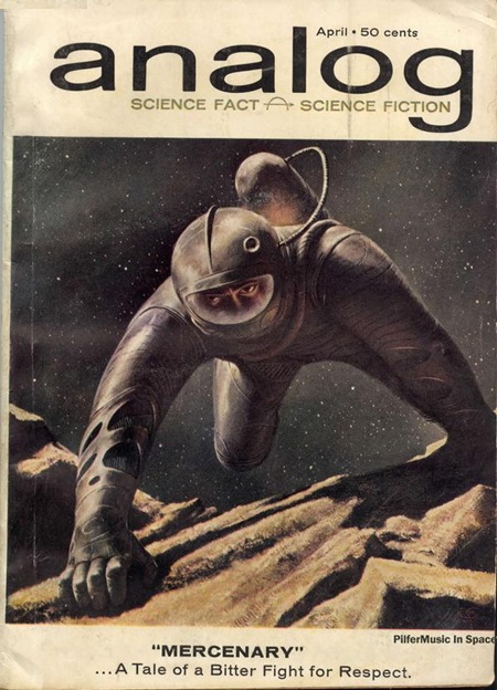
Not a lot of info on this one. Looks like Trade Gothic Bold Extended for the logo, very nice.
Analog Magazine
11.20.2007

Not a lot of info on this one. Looks like Trade Gothic Bold Extended for the logo, very nice.
Comments are closed.
the lower case ‘g’ is different
Good call…any idea what it is? Maybe just a custom logo based on TG?
I don’t think is Trade Gothic, although is definitely a Gothic style.
I didn’t researched that good but I believe the title ‘analog’ is set in Brazilia, with some change in the width parameter, making it look more extended than already is. You can check at:
http://www.myfonts.com/fonts/agfa/atbrazilia/
bb
That is an awesome image, I love old school “in space” esthetic!!
C.
it looks like a stretched out akzidenz grotesque. the thicker versions of the font get the tear shaped “a.” but it looks stretched un-naturally. and obviously the “g” has been modified. but i dont really know, i didnt go to school for type, i just care too much.
Jesse is correct. The logo type has been stretched (probably on a photocompositor, judging by the era). You can tell because the vertical strokes are noticeably thicker than the vertical strokes. And I think your first hunch is right, Scott. There’s no reason to believe it didn’t begin as Trade Gothic Extended.