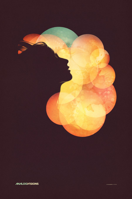
As promised, here’s the final poster for the Analog Visions show on Friday in Toronto. In case you missed it, I’ll be doing a solo show at Function 13 Gallery this Friday, November 20th. I’ve been working out concepts for how to hang the posters throughout the past week, I’ve decided against frames and want to go with something a little more raw feeling for this one. The work that I’ll be showing are all printed on Hahnemühle German Etching paper which has this incredible texture. I don’t want anything to get between the viewer and the piece. I have been working with Bulldog clips and nails, spray painting the clips matte white and using longer nails to let the piece stand off the wall a little. I think it’s going to look nice, but I’m still open to any suggestions, if you have any ideas for alternative poster hanging methods, let me know in the comments.
As for the poster design itself, I spent way longer than expected on this one. It was meant to be a quick promo poster for the gallery but the deeper I got into it the more I realized I had to finish it off properly. Once you hit on a concept you kind of have to decide whether to go all the way with it or save it for when there’s time to do it right. It was a stretch, but I was able to get it done in time (deadline was this morning) so it’s pretty nice to finally see it in it’s completed form. As you can see, this is another take on the Nocturne poster, featuring the same model. Seeing as how these events are the same night I wanted them to be related, but not exactly the same. I wanted the Nocturne design to be a little more divergent from my earlier work while this one was meant to sort of bridge the gap between new and old given the nature of the gallery show. You can see a larger version of the image over at the studio site.
The version above is probably the fifth or sixth, not counting the various in between states. The final file ended up around 4GB, 24×36″ at 300dpi but I did most of the heavy lifting with low resolution smart object stand-ins so it wasn’t too slow. In case anyone was wondering, this is the project I was referring to in the Photoshop Question / Problem post. All of the circles were smart objects based on the same photograph. As stated above, I worked with a model I shot here in the studio for the silhouettes, but I worked with another photographer for some elements of the background. I used some shots from Jacob Sargeant’s beautiful Experimental Set on Flickr for the detailing and color shifts. Thanks to Disign Police for turning me on to Jacob’s work.
Time for a day off and some much needed rest, hope to see you out in Toronto.
» Scott Hansen / ISO50 Solo Show @ Function 13 Gallery
» Tycho Live – ISO50 Gallery Afterparty @ Nocturne


beautiful
Stunning.. Pity i live in Ireland or id be visiting the exhibition.. 🙂
impressive! looking forward to the show. any idea on what time you will be playing at nocturne that evening?
I plan on coming out to the show on Friday night. Any chance one of these will be on display there as well as the gallery show?
This is stunning, as Is the Nocturne poster. Your work never ceases to impress me. I’m considering forgoing giving out Christmas presents this year and instead buying a collection of your prints for myself.
Looks really really great. I love the lighting on the model, and the background hues are spot on. the emotion is perfect…as always great work!
such elegance, I love this
Wow! I think this is one of your best posters yet. The colors are stunning and I think this bridges the gap perfectly betwees your old and new work. I’m looking forward to the pictures of the gallery
Wow, nice work. I like that there’s still some detail in the silhouette, how the light wraps around her face. I also love the organic feel.
Wow, you’re an amazing designer, that’s gorgeous.
Jaw-dropping.
Nice work Scott, that really is stunning! 🙂
It’s absolutely gorgeous. It’s wonderful to see your versatility and your evolution as an artist. You have really been changing your styles as time goes on. All of it has been brilliant. Debating purchasing the 14″ or the 18″.
So excited that you are coming back to Toronto. I will be at the gallery show and the after party. Huge fan of both your personas 🙂
Can’t wait for Friday. This is stunning.
Work is really great, as always… Its simplicity is just amazing, but at the same time it’s full of detail.
As for hanging, consider magnets for example. Glue one on the wall and put the poster between that and the next, this way you have a standoff and a bit of a more shiny modern look. but i don’t know, it’s your art, you know what you want 🙂
Glad to hear you collaborated with Jake S. on the project. It’s funny, when I directed you to his portfolio I hadn’t realized at the time how much the two of your design ideals overlap. I’m always glad to help a fellow Utah-grown artists get more work out, he is super talented.
I am seriously loving the new stuff though. I have been following your work now for about 5 years and it’s been great to see the evolution process. I think your work has definitely stepped up to the next level. Thanks for representing the design community well. Your commentary on design, art and our surroundings have been especially insightful and have really brought a level of consciousness to design that are now becoming more evident in the design community. Hard work pays off. Great work!
wow, this poster is really amazing…think it’s my favorite of the silhouetted images. great work scott!
stellar
jesus, scott, that is beautiful. i love the direction you’re going in with these recent posters.
totally addictive style here..
F**king awesome!!
This is very beautiful !
awesome…definitely digging the type and subtlety in textures…
Really beautiful poster. I love all of these, but wonder if you might ever branch out beyond a poster having a Tycho connection and simply be something that can stand on it’s own? Your style is really impressive; I have no doubt that you could put out a few posters here and there that were just artwork and have them sell pretty well.
My point is kind of that I’d like to buy something that is not tied to an event and that has less type on it. I have a thing about not buying posters for events or concerts I never went to.
I’d love to see something in landscape one of these days. I’ve got a blank wall above my bed that could use something wide. I like the colors going on above, also the colors on the Coastal Brake prints.
Incredible.
This is excellent!
Amazing new design direction. This is beyond gorgeous. Can’t wait for the show on the 20th.
woooooow ultimate eye orgazmix
So i had a vision while reading your post as to how you could hang the posters in a different way.
Why not hang them all on the ceilings. But the way you view them is through a series of mirrors that would be perfectly angled so the viewer is looking at a mirror on the wall.
as usual – fucking dynomite. the jawline and hair details are especially good. would love to see this at a large scale – 4’x6′ ish.
Scott… just needed to say this has to be my favorite iso50 piece… or even one of my favorite design pieces ever…
thank you for the continuous inspiration for a young and upcoming designer… you out do yourself every time…
This is absolutely amazing.
Will the event poster be on sale at the show? Any idea on price? (so I can bring some cash). Till Friday.
that blue element at the top is what makes it. wonderful.
I second the magnet idea, there’s more options than binder/bulldog clips, and the magnets that contact the front of the poster can be extremely small.
Securing a square metal bar to the wall at the top and bottom of where the poster will contact.. I’m imagining some nice brushed metal.
Or, what about securing 4 cylindrical contact points to the wall, and using those instead of a metal bar.. Could look pretty sweet with those 2 or 3 inches long.
I think a tiny, little woodern shelf with a slit etched on the top would be quite nice to prop the raw posters up against the wall. Especially if it was like an American Walnut or something.
You just might need something to fasten the top, but then again, you’ve probably not going to have any wind in a proper gallery.
yeah nice work, would buy a print
scott-
you should really consider making a couple of desktop wallpapers out of these recent posters because i’m craving this one for my laptop…pretty please!
Yo, the whole piece is fresh, but I’m really digging that logotype you cooked up. Gotham with a bit of that Herb Lubalin flavor, no?
Wonderful, as usual! I’m working with Gesa Hansen. 🙂
You have a talented family! It’s amazing.
This is really inspiring. Thanks!
Very nice! 🙂
I could look at this piece all day long, I can’t wait till Friday see you in Toronto.
T
When I get a proper studio I’m going to have to dedicate one wall entirely to your posters. Hopefully I can purchase one of those enormous posters sometime.
oh, that’s beautiful!
Excellent work!
Absolutely stunning. Solid work!
Going to check out Audion / Matthew Dear on Saturday night in Toronto Scott?
a m a z i n g .
lovely lovely
simply amazing.
Aparently there’s a guy in Greece who’s such a huge fan of your work that he’s actually recreating it! WTF!?
http://www.lightform.gr/project_template.php?page_id=153