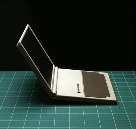
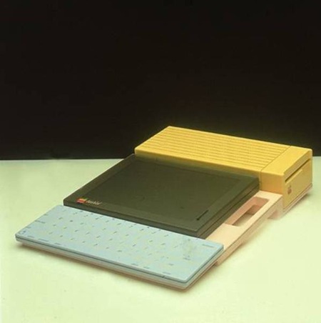
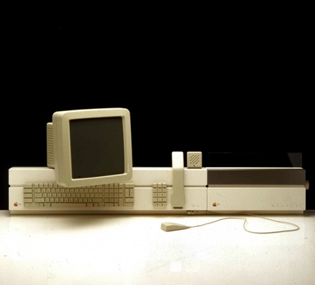
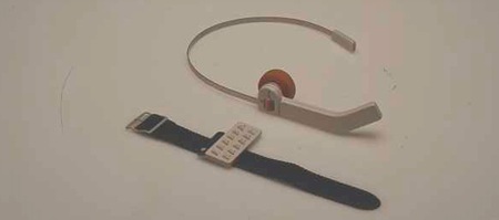
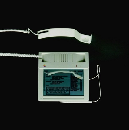
With all the recent hype about Apple’s forthcoming products, I thought I’d post some pre-Ive-era throwbacks. These were posted as "The Origins of the iPhone" at Fudder.de. Via FFFOUND
Apple Concepts
06.16.2008
Comments are closed.
arrrrrrrrrrrr these are amazing.
brrrrrrrrrrrrr so sterile. I prefer stream-line design
The green grid makes the first photo look totally awesome.
crrrrrrrrrrr what you prefer is stupid.
does anyone else see the black ‘painting’ in the background of the first image (the notebook)?
I wonder if it’s just artifacts from an old photo or some CIA type redaction…
Wow…1337 h4x0r headset and matching watch for the win haha…
This stuff is great. Yup, the headset & watch win it.
The second picture is revolutionary(or should be).
Using Colours on computer cases instead of the steril gray(or b&w).
Computers could be part of the interior. that would be sweet:)
drrrrrrrrrrrrrr modular pastel mac II nano system win!
errrrrrrrrrrrrr which way did he go?
gahhhhhhhh The green grid totally makes it that much better…
I worked at frogdesign for 7 years, and there was a huge file cabinet filled with slides of models just like these. Literally hundreds of visionary ideas that were impossible to implement at the time. frog was paid a monthly retainer just to come up with cool stuff until Steve got booted. Whenever we thought we had a revolutionary idea, Hartmut would go and dig in that cabinet and pull out something very similar done 5-6 years earlier. Apple’s culture of design excellence was nurtured there.