
httpvhd://www.youtube.com/watch?v=rqC2xpCaG80
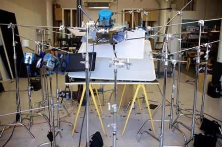
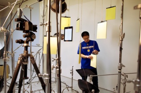
The Verge has posted an interview with Apple product photographer Peter Belanger. Amazing how much work goes into the process. As evidenced by this video, there’s a lot more than straight up photography going on, which is to be expected. Was a little surprised they went as far as to accentuate the chrome on the bezel but I supposed it’s par for the course with this sort of thing.
Overall I was a little underwhelmed with the process. I would have assumed Apple did this all in-house in some space that looked like a set from 2001 with airlocks and cleanroom suits.


Why not create a 3d model of the phone if you’re going to edit it that much in post? Seems a bit overkill when all you’ve really kept of the photograph is the overall shape.
From what I understand, this isn’t actually an Apple product photo session, but a MacWorld magazine session…
Funny to see how ugly the final magazine cover turned out. This video is great at showing step by step how and where the ugliness crept in.
very good article, i certainly enjoy this site, continue it