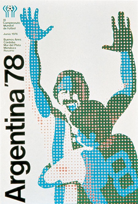
Very cool poster from the ’78 Argentina World Cup. If anyone has info on the artist behind this post it in the comments.
Argentina ’78 World Cup Poster
10.24.2007

Very cool poster from the ’78 Argentina World Cup. If anyone has info on the artist behind this post it in the comments.
Comments are closed.
soy de Argentina, no conozco el artista, pero lo que se, es que ese mundial se caracterizó por los puntos en los diseños, como la señaletica, que eran carteles agujereados.
Scott, I think it was a competition, but i don’t remember who was the artist. Anyway, I’m from Argentina, and believe, no-one wants to talk about that world cup or that year. I was a shit moment for the country. The design is great but nobody want to discuss that around here…
thanks for the post…
🙂
This is fantastic and hails from a time when the world cup and the olympics spawned beautiful art.
Not like the trash we get these days. there seems to be a competition now between the football world cup and the olympic games to see who can generate the most controversy with bad logo/poster/promotions design.
Here’s an example: Germany 2006 World Cup Posters
Nice post. I love the blog. Keep it up.
that’s some italian posters ot the world cup in 1990
http://www.igu.ro/latrecut/wp-content/uploads/2006/03/italia_90_346562.jpg
i remember like yestrday when they decided this controversal mascotte….
yes, indeed. it came out from a 1978 contest in which designers all over argentina sent their ideas. ive none information about the name of the artist, in fact, chances are he/she’s not alive.
for those who can read spanish, here’s a link about it:
http://www.re-type.com/notaweblog/?p=62
ps: cant wait to buy some of your prints. have you sent some to an argentinian customer yet? im not sure they’ll ever make it to here.
mau.
I’m from Argentina and at the year 1978 my country was under a dictatorship. They say that the agency responsable was “Mandatos Internacionales” but we really don’t know if it really exists, because many things about that period are dark… and many bids and business were corrupt.
Hi, i’m argentinian too. I agree, it’s quite good, but it’s far away from being beautiful, every public or official design of those years are everything design must not be. It represents lying and massive media manipulation. The whole championship was hidding thousands of kidnapped, tortured and dissapeared people, young ones, old ones, good ones and bad ones, 20.000 exactly.
I think it is necessary to talk about that and teach young designers what “bad design” can do, in this case it was hiding death.
“Argentinians are rigths, and humans”, it was the “Slogan” that the military process announced to the world by those years.
Escuse me, not so exactly, it was 30.000 disappeared
(first excuse my bad english)
In response of what was written by Horacio “no-one wants to talk about that world cup or that year. I was a shit moment for the country. The design is great but nobody want to discuss that around here”. I really dont know why he said that or what was his intentions, because its not true.
This should not happen again or any kind of violation of human rights, for this, the majority of the argentians wants to know, discuse, talk and remember about what happens or at least (its my opinion) must. Still after all these years we reclaim for justice and punishement for all the responsables. And for that the victims, for us & for those who come we can ignore or forget. Dont let ignorance make us blind.
Ariel-
I was unaware that this image had such a terrible story behind it. I will do some research and put together a new post about propaganda and the darker side of design.
thanks for enlightening me.
-scott
2idWio wrerrerreteee