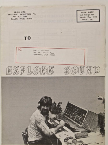
I believe this is a catalog for Aries Kits, a company which manufactured modular synthesizer kits during the late 70’s in Massachusetts. I love how the limitations imposed by 1970’s printing technology actually fostered good design in a lot of cases. I wonder if the designer put much thought into the layout of top portion; it looks very purpose-driven. That “Explore Sound” wire-frame logo was probably super high tech at the time.
I forgot where I found that image, any ideas? (Tineye was down at the time of this posting)


They way he has his cabinet propped up on the keyboard is hilarious.
Sweet! I bet that cool logo was a font. This would be right in that “wacky fonts widely available thanks to phototypesetting” period.
The wireframe font is an old Letraset face called “Bombere” designed in 1973 by Carla Bombere.